Product Design for a Plant Care App
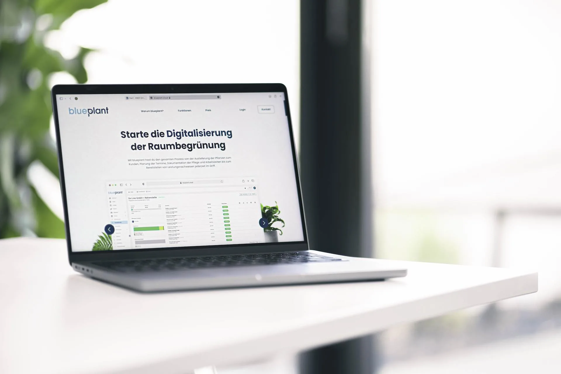
From development to design at blueplant
I originally worked at blueplant as a developer, handling code refactoring and UI optimizations on the CRM system, among other things. As I shifted from development to design, I increasingly looked at the product from a UX perspective too.
blueplant is the software for professional plant care service providers, with a CRM system, a website, and a mobile app for the care staff on site. Between 2022 and 2026, I worked across all of these areas, plus product photography and print design.
Website relaunch within the existing design system
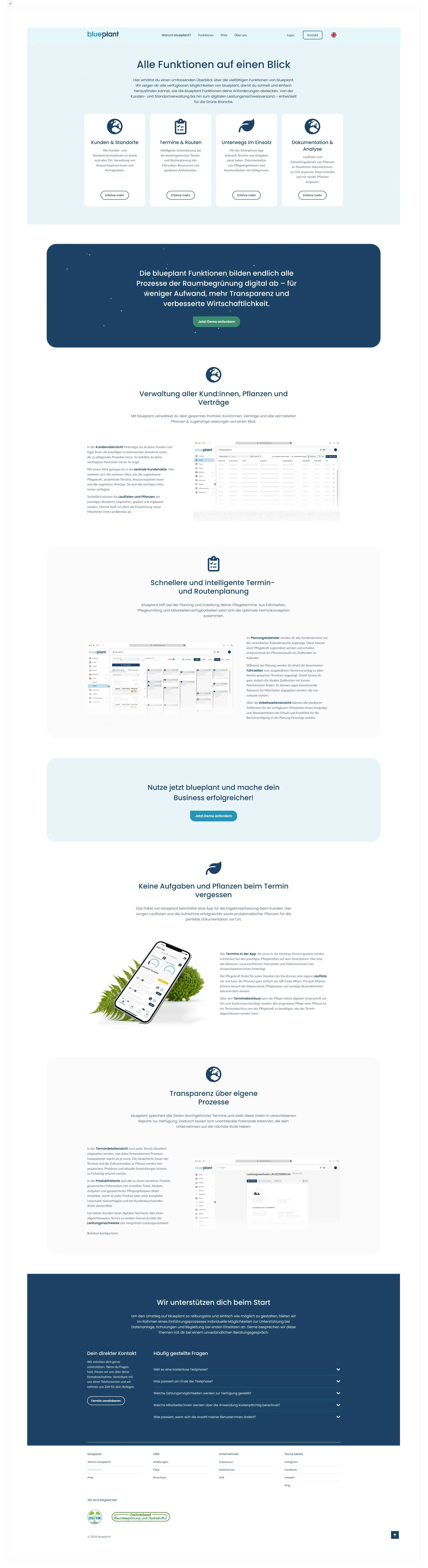
The central problem with the previous blueplant website was headings that were too large and too much white space, which left too little room for the actual content. Another goal was to use one consistent system across all our websites, so nobody working on a website would need to learn a completely different system on top. Since the KMH website was already running on a working design style of its own at that point, we decided to rebuild blueplant in that style, fixing the oversized font sizes along the way so blueplant's offering would be easier to grasp at a glance.
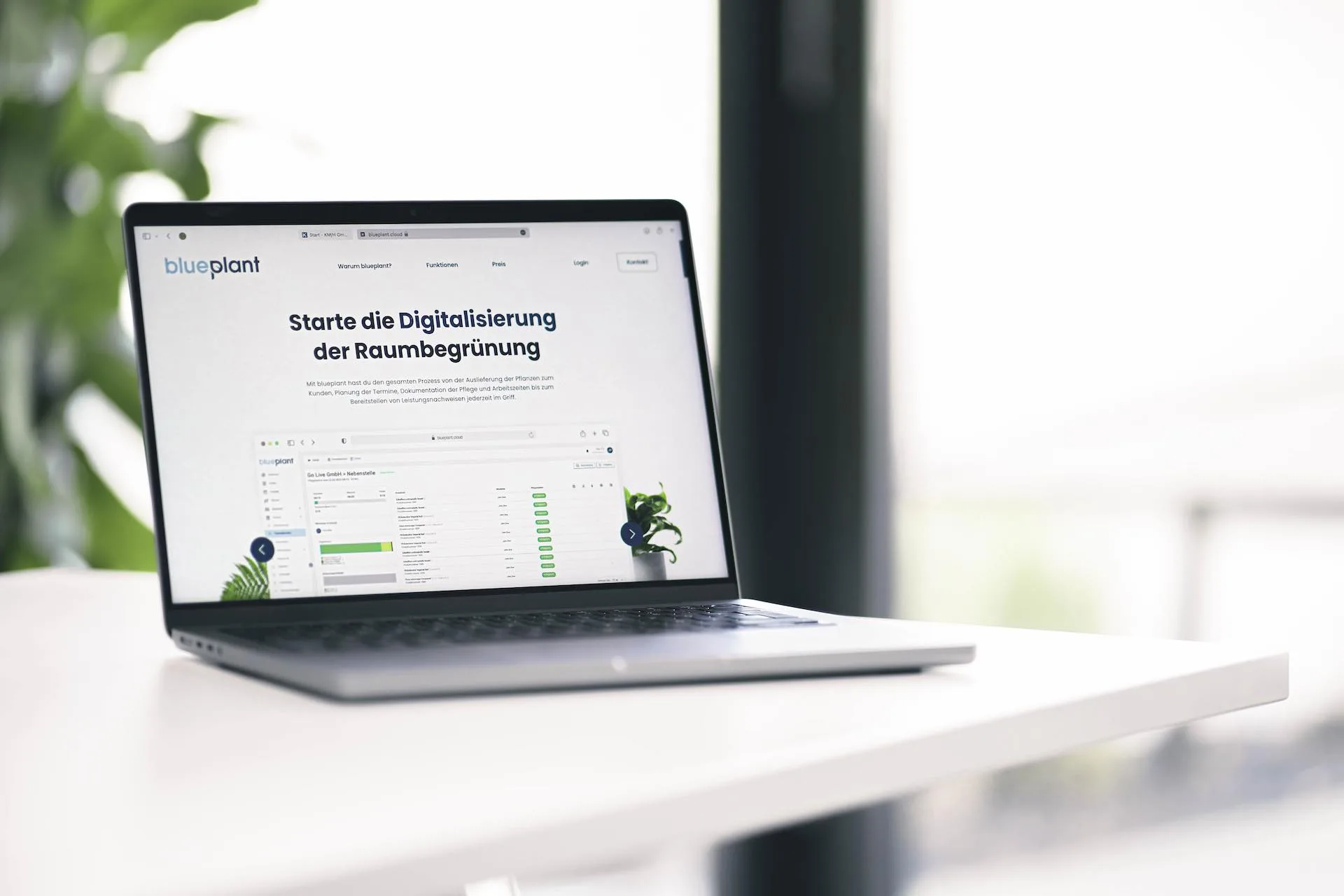
On the content side, I picked icons to describe the features, created mockups for individual functional areas, added my own photographs of the blueplant app, and integrated customer testimonials. The website overall took shape in close coordination with marketing, including the selection of trust-building elements like key figures and a video in the hero section.
Color adjustment and CRM redesign in the new look
In the first rebuild, we initially chose orange as the accent color to help blueplant stand out more. We noticed, though, that orange didn't have the effect we'd imagined and didn't work well in marketing either. In the next iteration, we decided on green instead and had to find a shade of green that worked with our existing blue. Adjusting the primary and secondary colors themselves was out of the question, since we'd already produced a lot of print material with the existing colors.
Finding the right shade of green wasn't easy, since blue and green can quickly clash, so the thinking leaned toward a blue-green blend. What helped most was setting up several UI drafts in Figma and adjusting the shade of green globally with a slider, to see at which point it looked coherent with our existing corporate design. In the process, I also revisited the structure of the website and checked options for presenting individual content differently. The introduction of green as the accent color also triggered the larger CRM system redesign. To make finding the right color easier, we even read up on the book "Das ABC der Farbe: Theorie und Praxis für Grafiker und Fotografen."
My original idea for the website rebuild was something a bit more organic and airy, with new, more intense yet also brighter and thus more readable tones for both green and blue. This draft was generally well received, but given the resources available, we ultimately decided against a fundamental shape and design overhaul and in favor of a simple color adjustment.
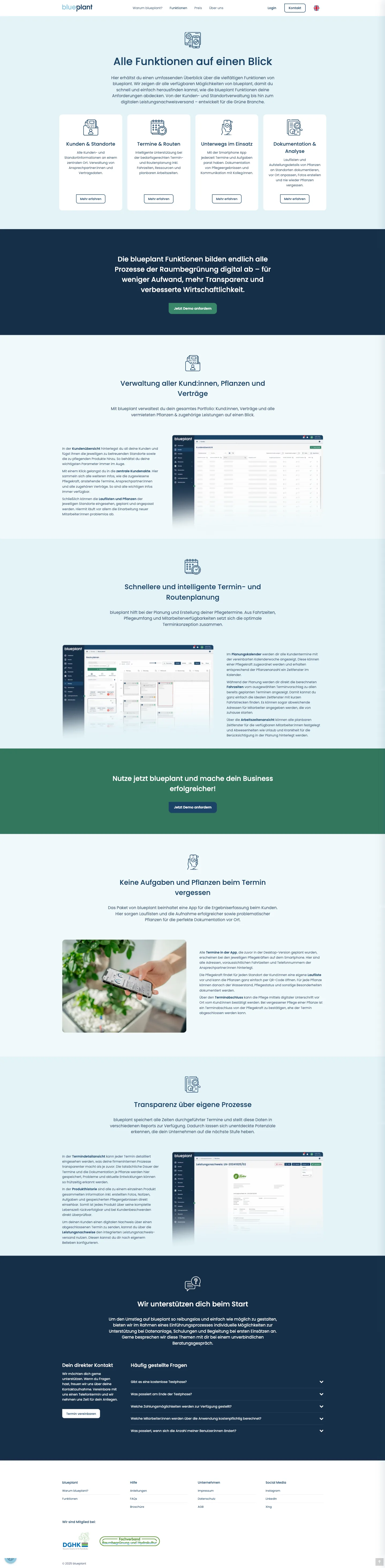
In parallel, I reworked the CRM system and developed prototypes and mockups for it, which were then implemented by the team. This wasn't a user-research-based UX redesign in the strict sense, since no user research was conducted for it — it was based mainly on established design principles and a heuristic evaluation of the existing interface. As a result, the interface follows the new design language much more closely and feels more focused than the previous version.
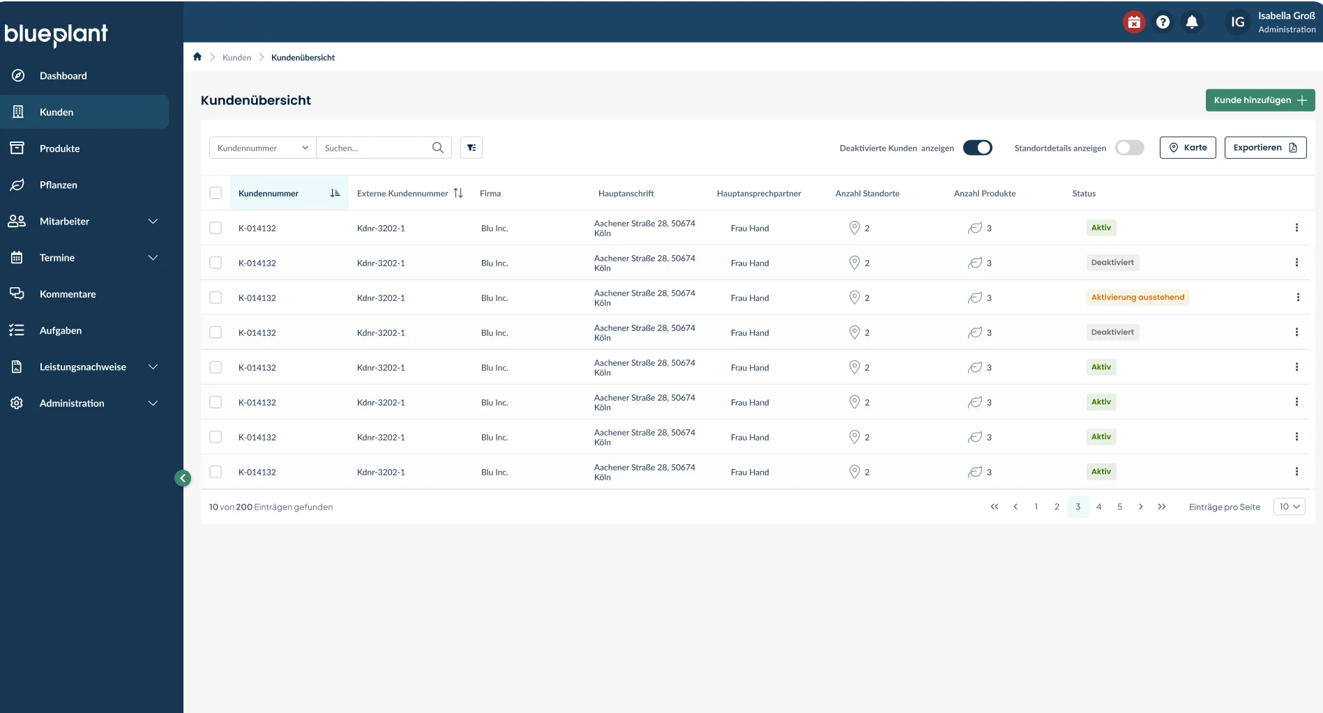
That heuristic review already produced initial improvement suggestions that were later implemented in the redesign, for example for the customer overview: a clearer separation of navigation and content through contrast, a more meaningful status instead of a simple checkmark, and reworked pagination. The proposal shown is a high-fidelity mockup I created in Figma.
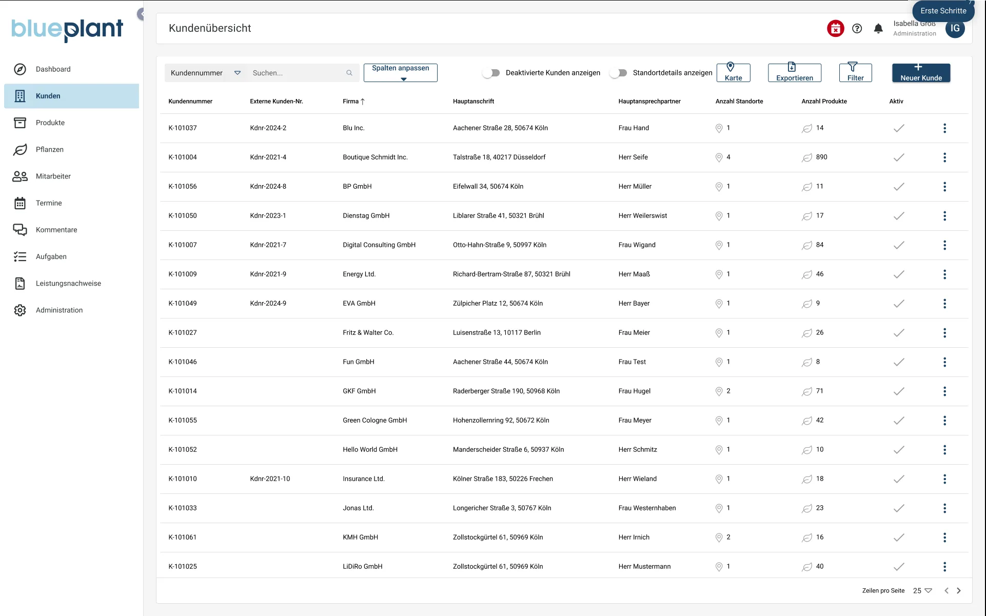
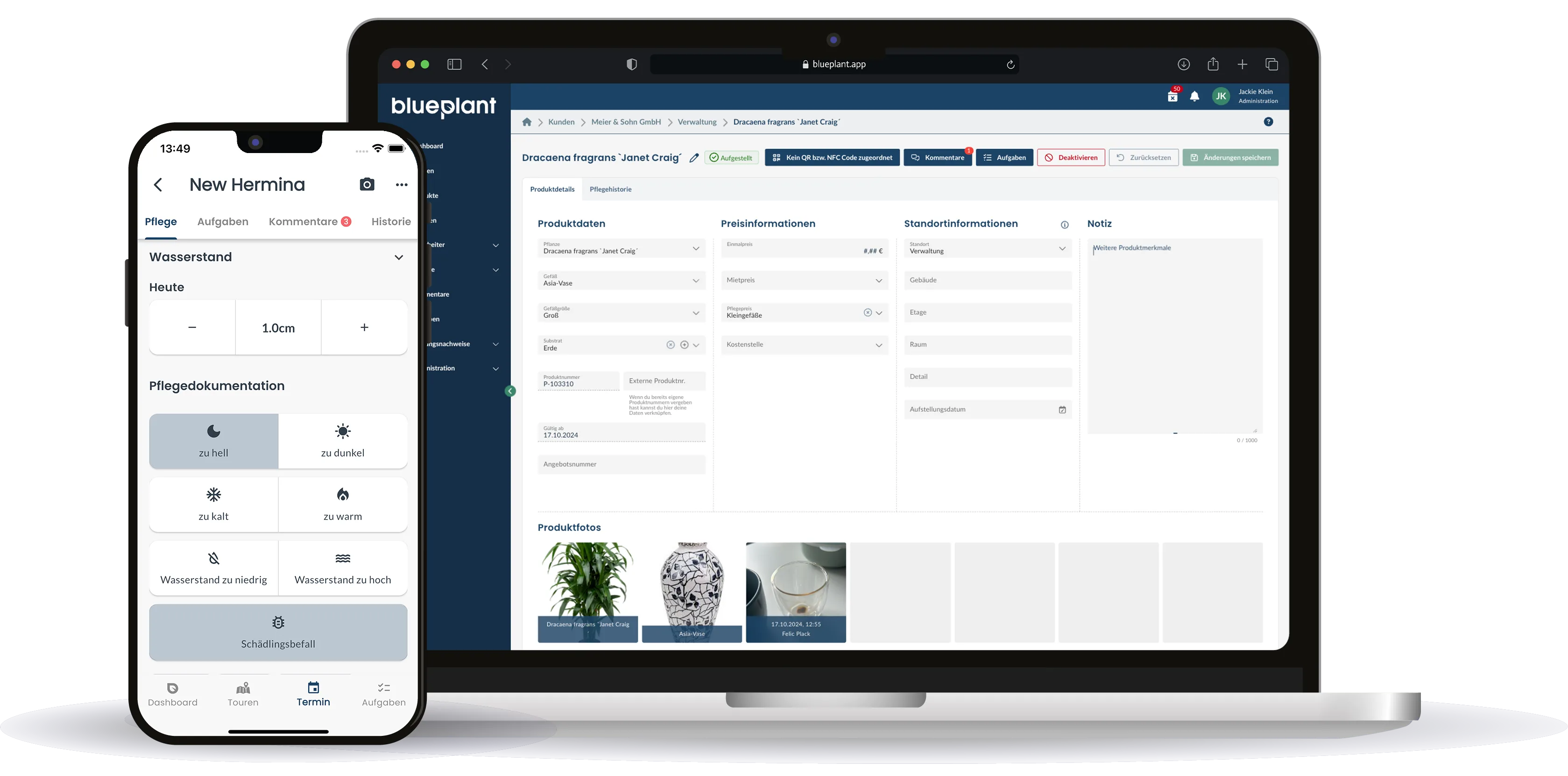
Part of my job was also to provide, edit, and crop mockups for marketing. With the resources available, I created my own mockups to make promoting the product possible.
UI design for the product detail page
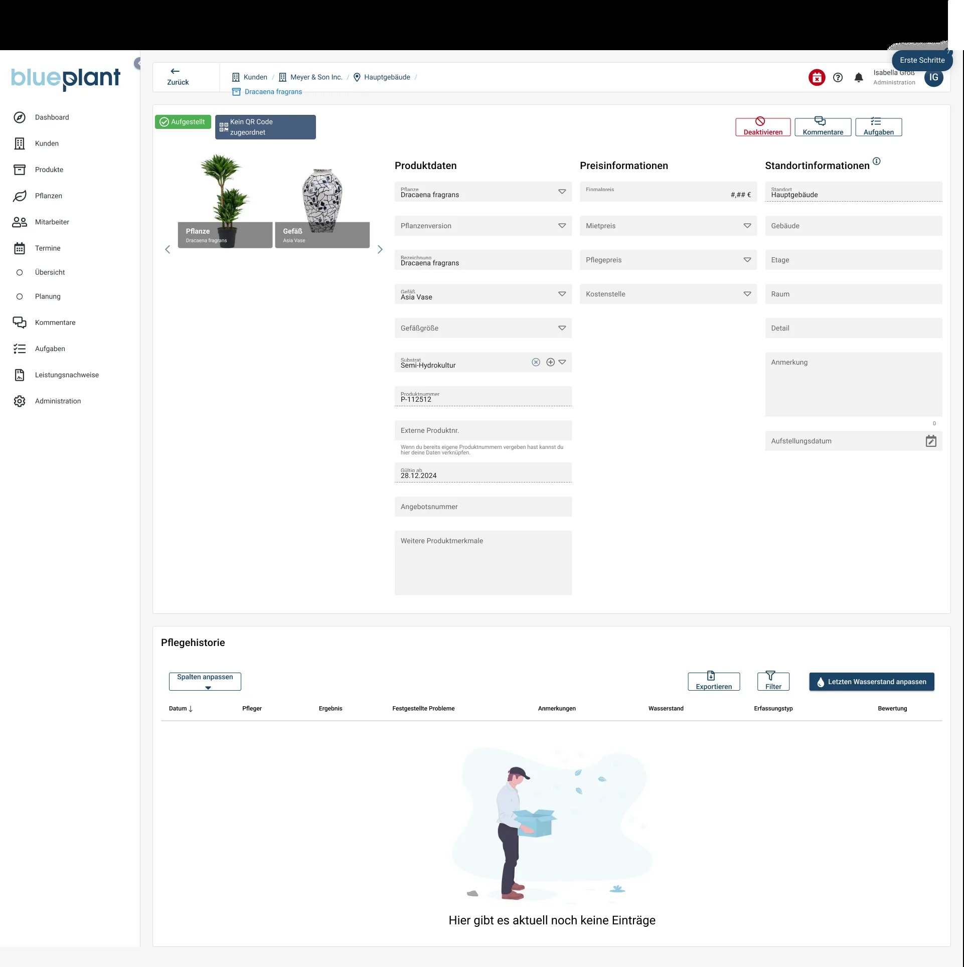
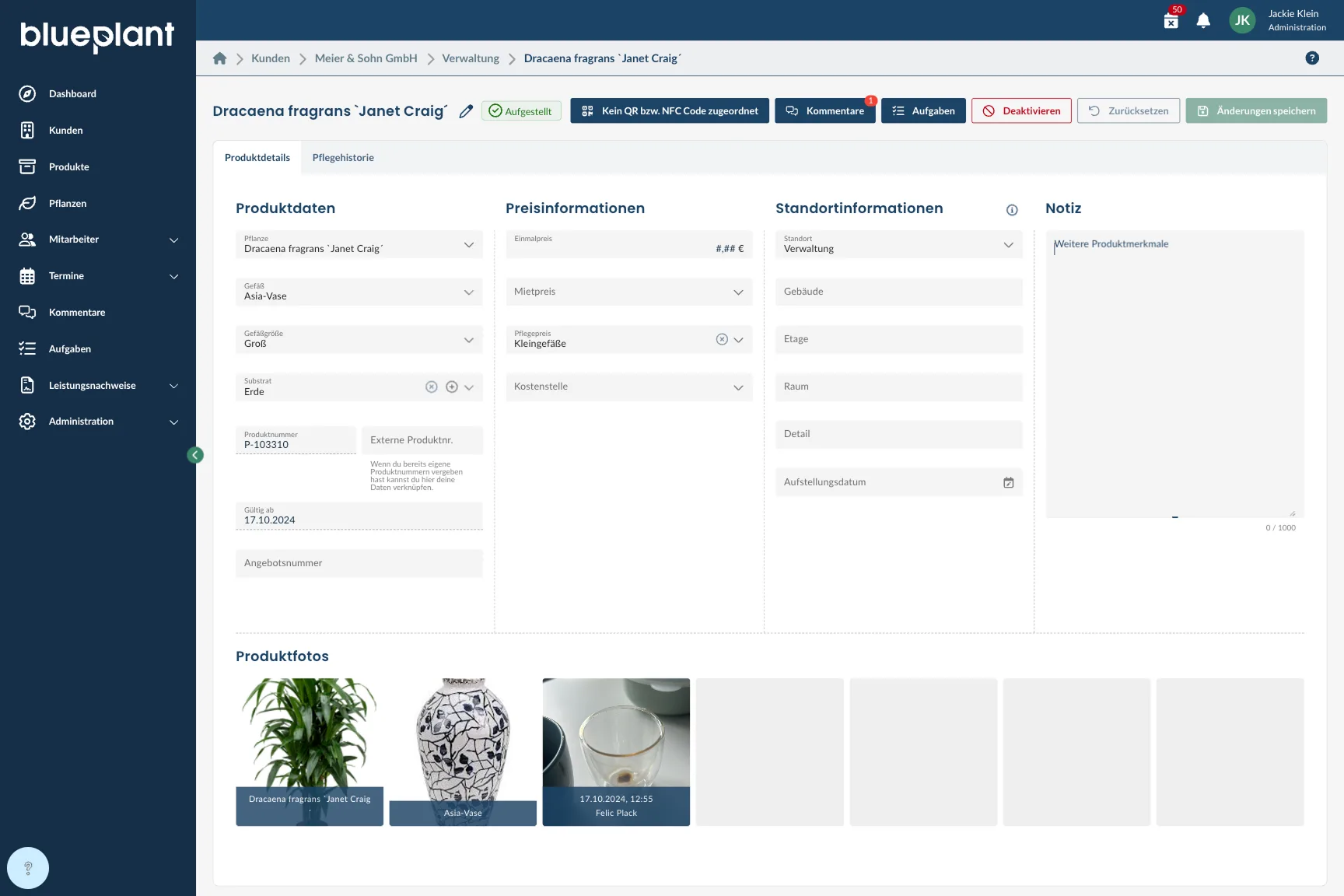
After the website, my next focus was the CRM system, specifically the product detail page. It wasn't very well organized, so users couldn't take in all the information at a glance, and there were also some sizeable white space gaps. Above all, it wasn't clear which information and actions were actually relevant to users, since we weren't collecting any metrics at that point to see how often a given field was actually used. So I assessed, from a heuristic or expert perspective, which information should be immediately visible and what was probably needed less often. Based on that, I moved the product photos further down, reduced the white space by outsourcing or removing individual input fields, worked more with color hierarchy, and moved the care history into its own tab, since users probably don't always need it right away.
In practice, toolbars with that many items should really be avoided. Since the team had differing hypotheses about actual usage, we decided to keep the full display until we had a data basis for usage, partly through the metrics and event tracking we've since implemented. My recommendation is therefore not to jump straight into UI implementation, but to first clarify how a feature is actually used, and always weigh that against effort, value, and risk: with low risk and low effort, a change can make sense even without complete data, while high effort without clear value or high risk generally shouldn't.
Redesign of the comment overview
As part of the color adjustment, there was a requirement to make the comment overview more user-friendly, especially in the side view on the product detail page. As a UX designer, I see it as my job to give recommendations when I notice problems. So I asked myself the following general questions about the comment feature: Can this problem be solved differently? Why did the toolbar get this long in the first place? Where does the actual problem lie, and how can the page overall be made clearer and more user-friendly? I noticed that the long toolbar most likely came about because, before the tab system was introduced, there was no other way to fit in all these functions, so I directly factored in that underlying problem when designing the UI.
Finally, there was another bug in the sidebar where the onboarding visually overlaps, covering important functions and interfering with the comment feature. That also needed to be fixed, though as a separate step.
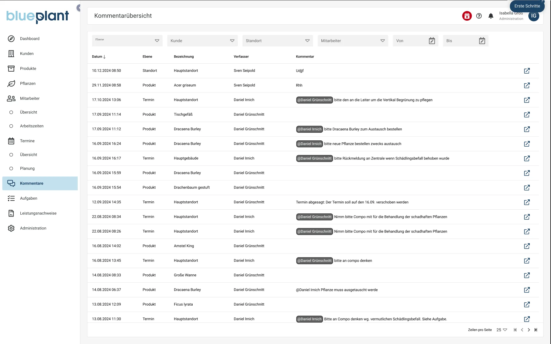
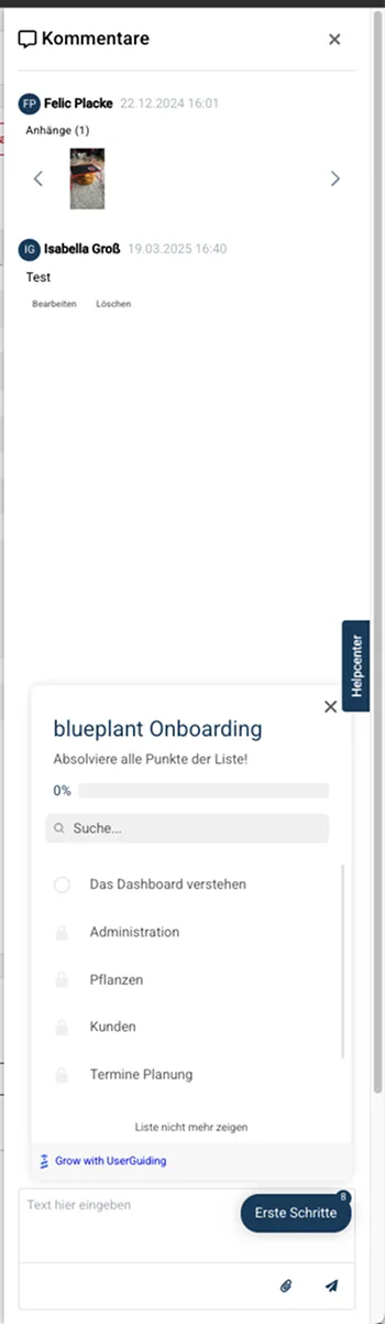
The following optimization was developed based on my own mental model of comments: people who can write comments generally expect this to behave similarly to comparable products from a work context, such as project management tools, usually paired with a notification system.
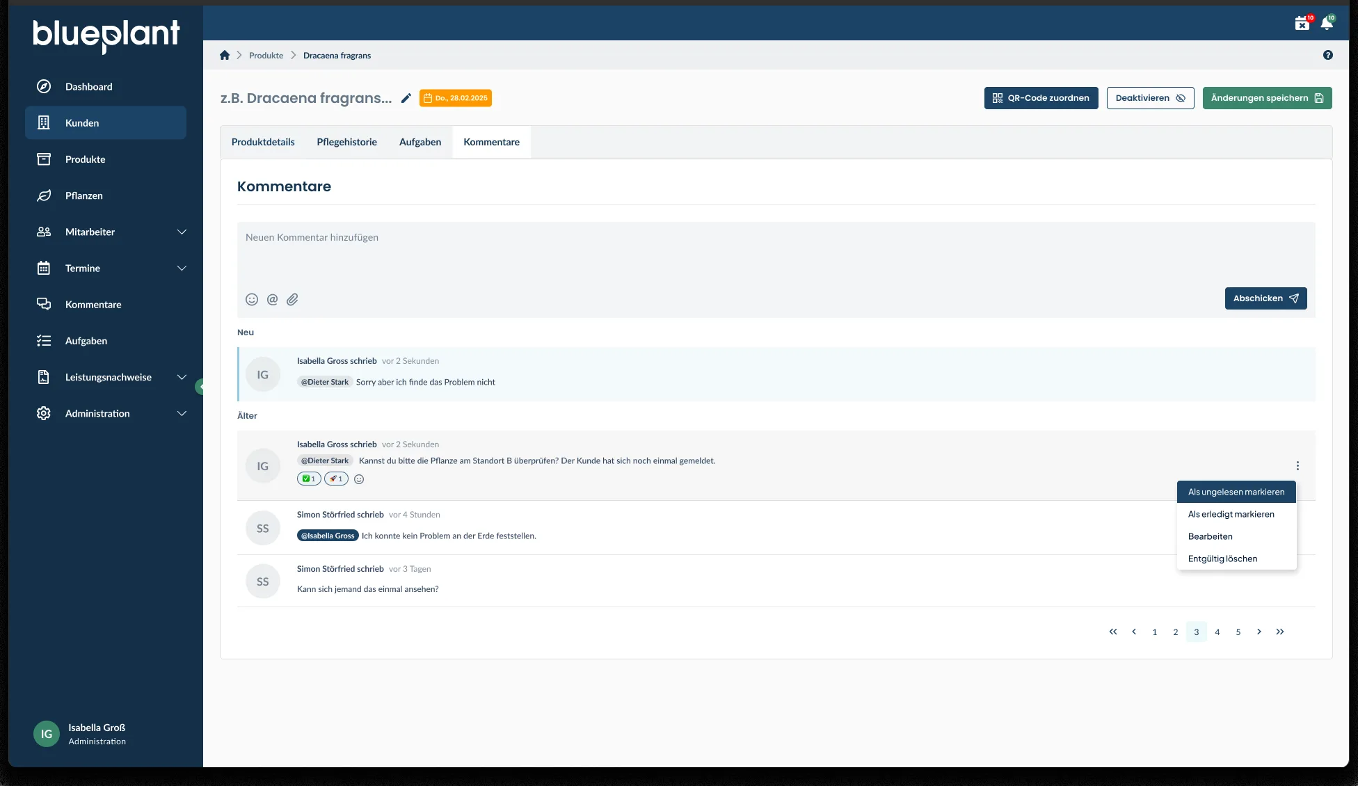
That led to two ideas: first, to move comments and tasks, both of which are more like links than standalone areas, into the tab system that already existed on the product detail page by then, along with shorter microcopy for the "Assign QR code" button. Second, to additionally design a notification system, so users no longer need to actively check the comment overview but get informed directly and can react quickly, instead of working through a long list of unread comments later.
For the comments directly on the product detail page, I chose a typical layout where new comments can be written at the top, with existing comments displayed below, grouped chronologically into "New" and "Older," so it's immediately clear what's already been read and what hasn't. Each comment can also be manually marked as read or unread, so it can be revisited later. Own comments can be edited or permanently deleted, comments can be reacted to, and, as before, users can be mentioned and attachments added.
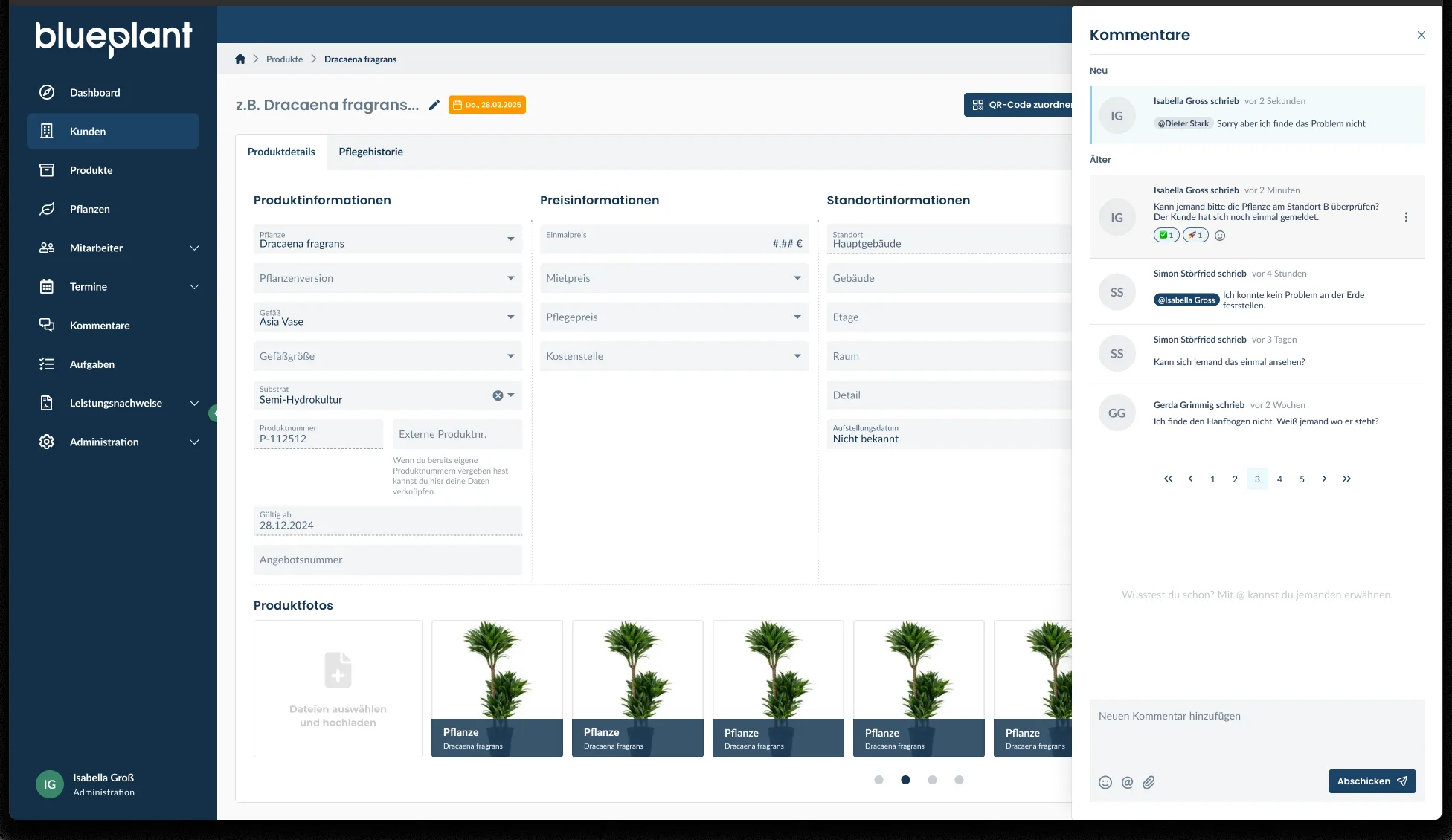
I also show what the display could look like via a sidebar, as an alternative for cases where the previous structure should be kept and comments should still be accessible via a button in a sidebar. This would have the advantage of still being able to compare comments directly against the product information next to them. In hindsight, I would flip the order of comments in the sidebar compared to what's shown in the following screenshot. A new comment would then be written below the existing comments, making it directly visible in the context of the current comments, similar to a chat history. In the tab display, it's exactly the other way around: there, the input field for new comments sits above the existing comments, so a new comment is shown directly below it.
In general, people's mental models can differ regarding the order in which comments are written and read, which is why some products offer features to reverse that order. Mental models can also differ quite a bit between regions or countries. For blueplant, I don't currently see much risk in not knowing the specific mental model at play. Depending on the product and target audience, though, that can become quite important — ultimately it comes down to knowing your users, through user research if needed.
If there's leftover space in the sidebar, it could also be used for small pieces of help, for example around the @ mention feature shown in the mockup, to subconsciously familiarize users with the tool. If there isn't enough space, pagination would be shown instead.
What I particularly like about the new display is that the area for writing a comment is clearly recognizable. Users immediately see where they can add something, the icons used are familiar, and the primary button for submitting a comment is now prominent and unambiguous, making the display feel more user-friendly overall.
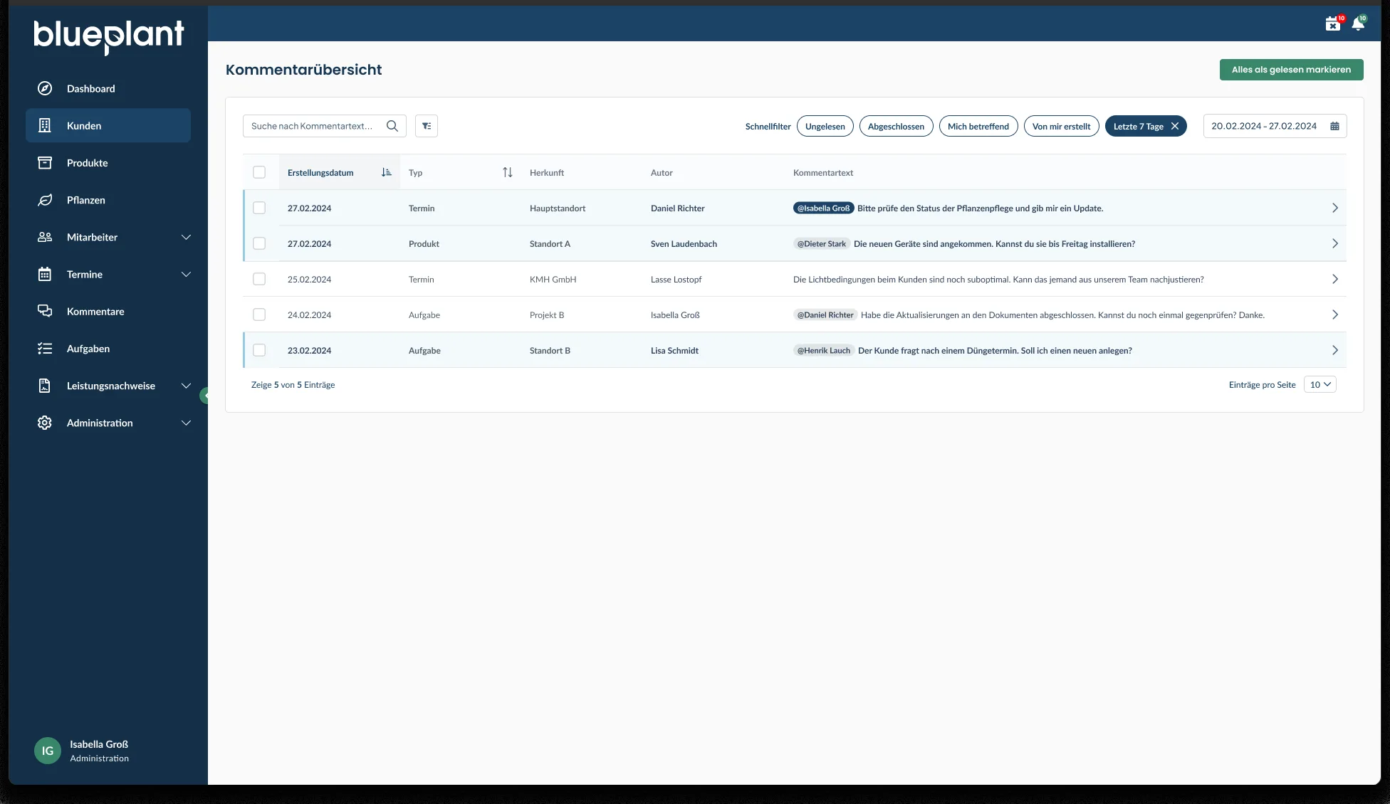
For the comment overview itself, I decided on quick filters to make it easy to filter down to relevant comments: unread, resolved, involving me, created by me, or added within the last seven days. Own mentions and new, unread entries are also highlighted more visibly, while general mentions are shown more subtly in gray. Search, sorting, and the table itself are also noticeably clearer than in the first version.
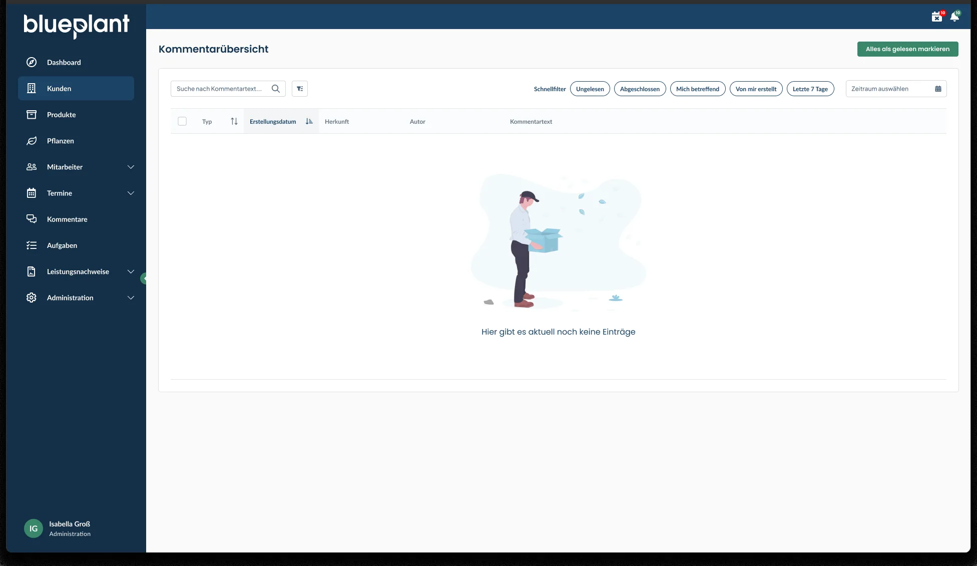
I also designed the empty state, which is used consistently for every empty table in the application — here for the case where no comments exist yet.
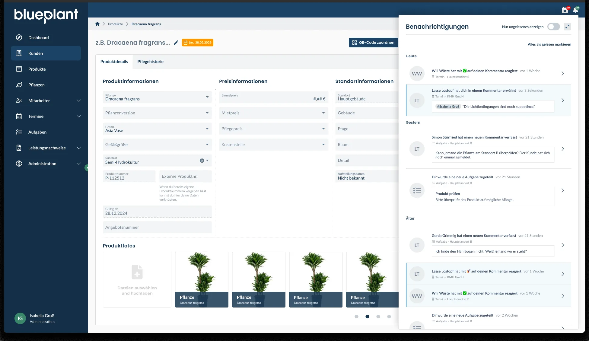
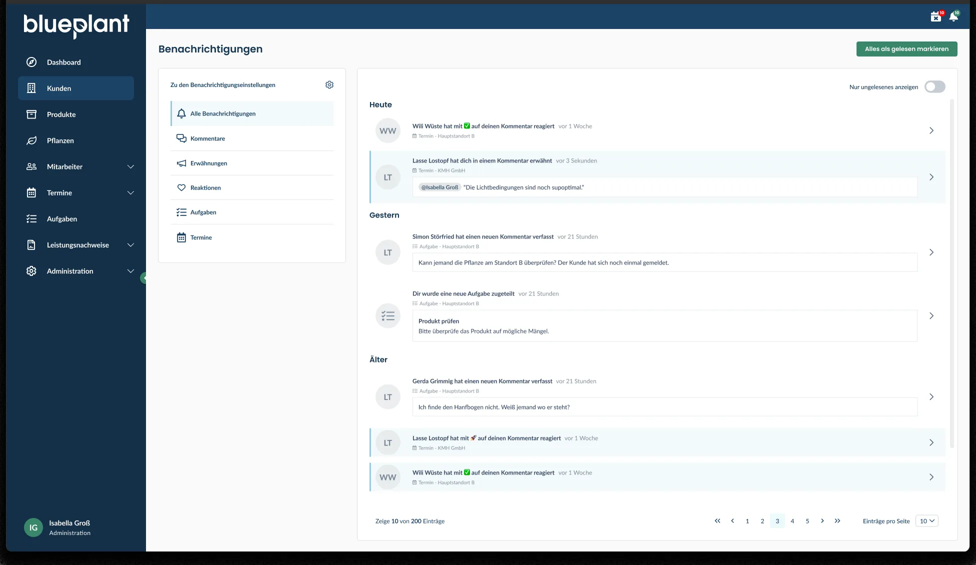
The second idea was the notification system mentioned earlier, which informs users as soon as a new comment comes in, someone reacts to one of their comments, or they're mentioned in a comment. This enables both faster handling of comments and a timeline: you can see at a glance what happened most recently, without having to click through the entire application. In my view, that makes it easier to use the application and to handle and follow up on tasks and events, since notifications can be sorted by time and category, all new and unread ones can be clicked through, and marked as read or unread again as needed. Reacting to comments should also help communicate the status of a comment, for example in the sense of "read," "well done," or "done."
UI specification for marking premium content
Over time, blueplant was meant to gain premium features that would only be accessible with a subscription. So that users from the plant care industry could first try blueplant for free, it was important to make it immediately clear during use which features are available and which require a premium subscription. This specification for labeling was created for that purpose.
The implementation was comparatively quick and manageable in scope, but once finished, it runs through the entire application.
For this, I created components that can label the premium feature in different contexts, such as with little or a lot of space, when an action is behind it, or when a piece of content simply needs to be marked. Pro features, for example, get a Pro label that can be shown, depending on context, compactly as its own badge with an icon, as an icon alone, or as text; for an interactive feature with a lock function, the entire button is marked accordingly instead. For connected premium features, I also designed a paywall: the feature is shown, teased but disabled, and clicking it opens a modal showing the benefits of premium, the price, and the call to action to upgrade.
The following screenshot also shows a token documentation of the labeling. We currently do without one, though, since our development team has direct access to this information via Figma's Dev Mode, which will also save effort going forward.

Occasional support for the mobile app
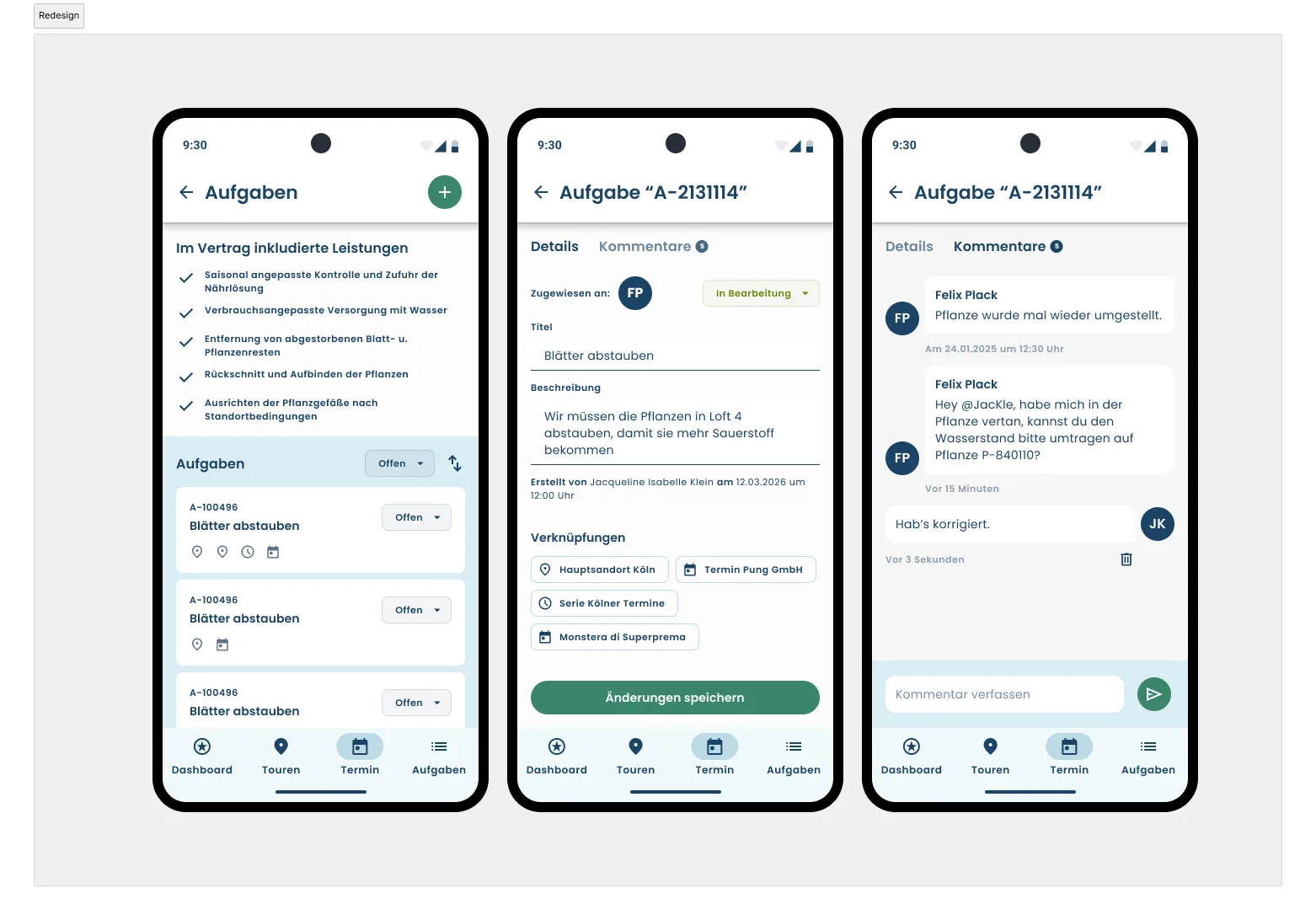
For blueplant's mobile app, I was only occasionally involved in an advisory capacity, including working with our mobile app developer, from whom I also learned a lot about the possibilities of app design with Flutter. For one feature, the task overview, I was specifically brought in for a UI design in 2026, where I worked with Material Design in Figma for the first time. The high-fidelity mockups shown were created by me in Figma.
The task overview was meant to be extended with new information about individual tasks, which would have been difficult to fit into the previous display given the cluttered information and lack of hierarchy. In the process, I also noticed that the comment display on the task page wasn't self-explanatory either. So I redesigned not only the task overview, but also the comment display on the task detail page.
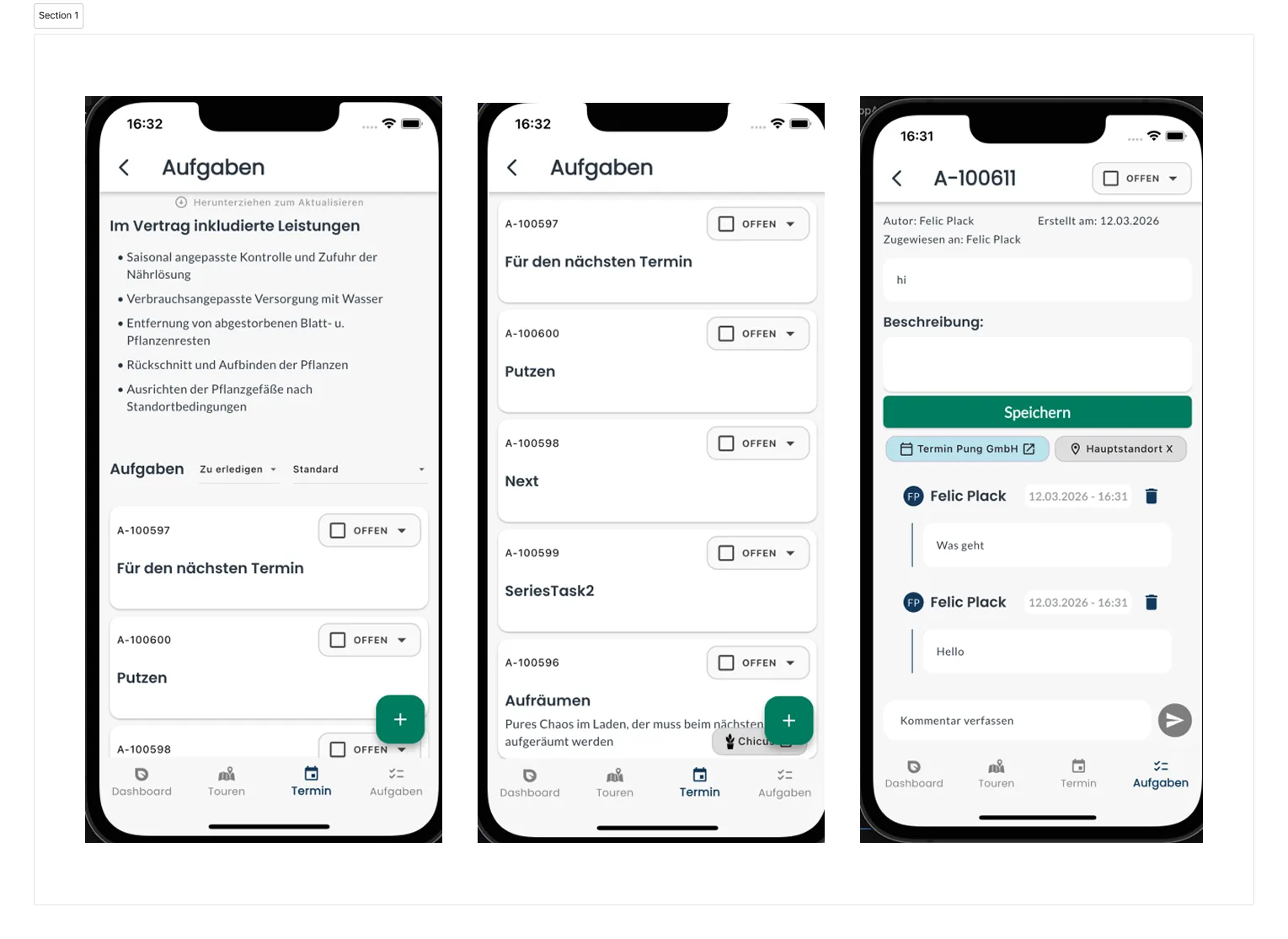
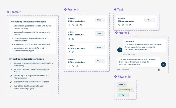
As with every other UI design, I set up the Material Design library for this, aligned it with our design system, and added my own components on top so it could keep being used for further app mockups. I built the mockup itself with Auto Layout.
My solution was to place the button for adding new tasks less prominently and anchor it more firmly in context, next to the "Tasks" heading, instead of as a prominent, content-covering floating button in the bottom right as before. A change like this should ideally be verified with a usability test, to see whether users understand the switch from a floating to a fixed button. The advantage would be that the button no longer covers any content, reducing the cognitive load from hidden information.
Further adjustments to the task overview, among others:
- Status as a colored, directly filterable badge instead of a plain label, to filter tasks by status faster.
- Sorting as an icon, to save space.
- Tasks split into sections, so tasks from different pages can be distinguished more clearly.
- Active page in the bottom navigation menu highlighted in color, so it's easier to see at a glance where you are.
- Font sizes staggered more clearly by hierarchy, with spacing generally reduced and deliberately enlarged in a few places.
- Colors taken from the existing design system, to keep the brand consistent across all touchpoints.
- Links to appointments, locations, and products shown as icons in the task overview, so it's clear at a glance which links exist for a task; tapping a given task shows them spelled out.
- New tab system, to reduce scrolling and keep information manageable at a glance, for example to see directly whether comments already exist for a task.
- Comments in a chat layout, to tie into the mental model of classic messenger apps and make the display self-explanatory. The history shows at a glance whether a comment came from yourself or from another plant care worker, along with name, date, and time. Own comments can be deleted directly with the right permissions, and new comments are added via an input line at the bottom, as is common in other apps.
Product photography for CRM, app, and water level sensor, plus print
In addition to employee photography, I also organized and carried out product photoshoots. The goal was to present our products on the website more strongly and authentically in use, so people could better picture how to use them, and to also create image material for social media.
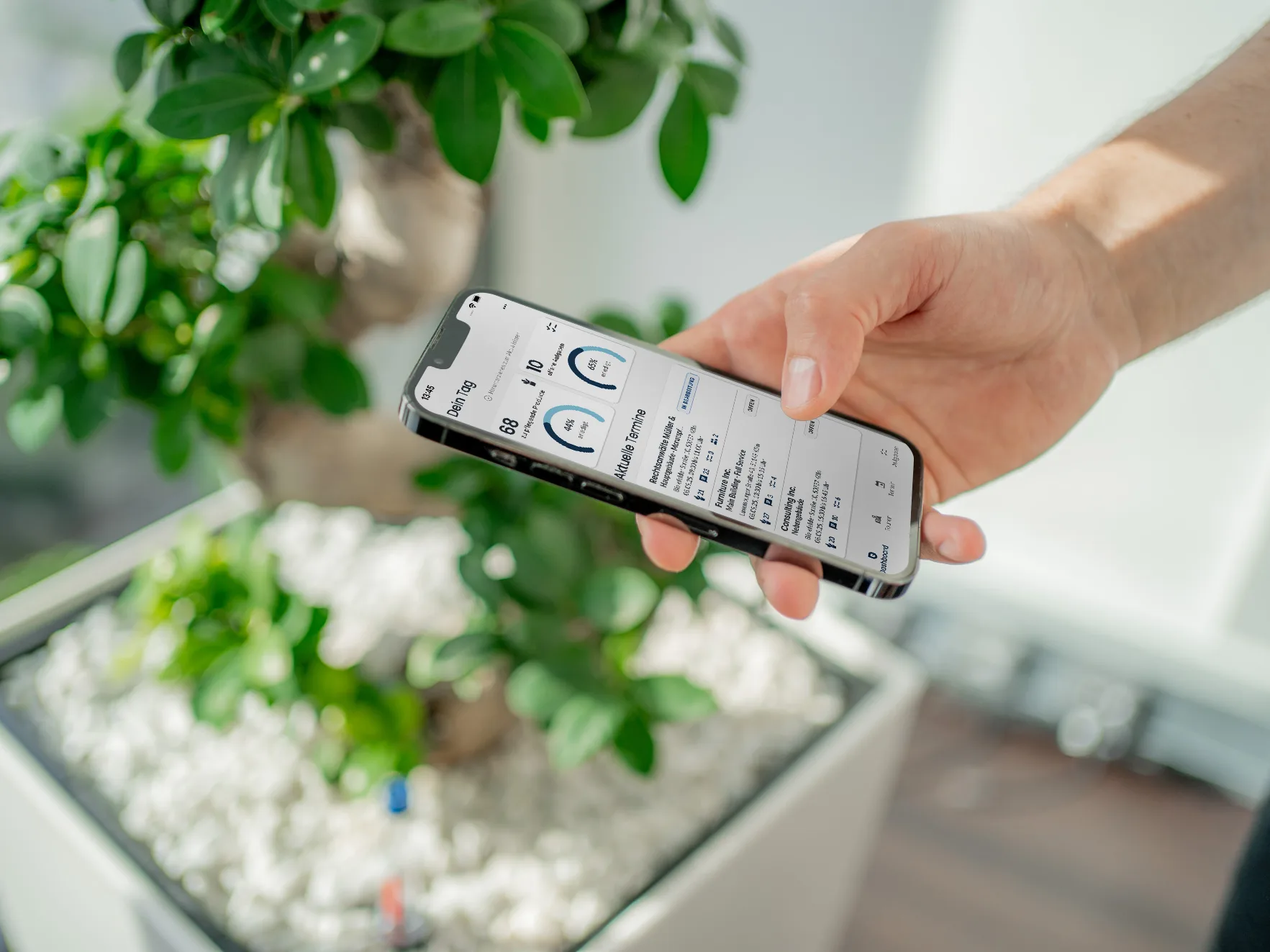
We started with shots of the app and the CRM system.
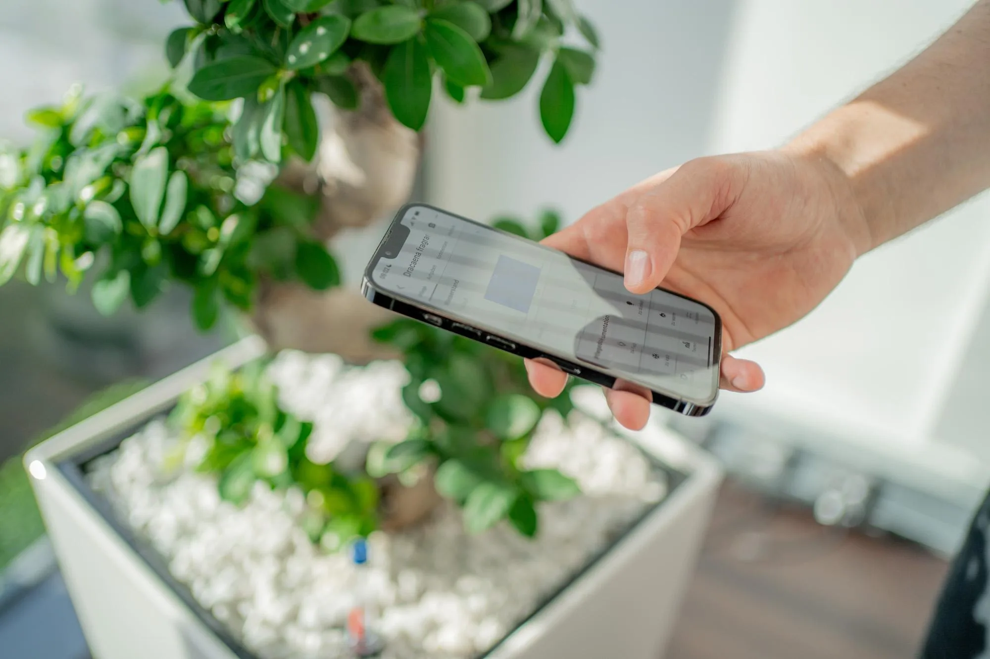
To show how I edit photos like these, here's the unedited raw shot of the smartphone mockup compared with the final image: the UI visible in the raw shot isn't what ultimately gets shown — it's added afterward. Depending on the camera settings and the display's light frequency, photographing a screen also produces stripes like these, which is why I had to place the actual UI design on top and retouch the shot accordingly.
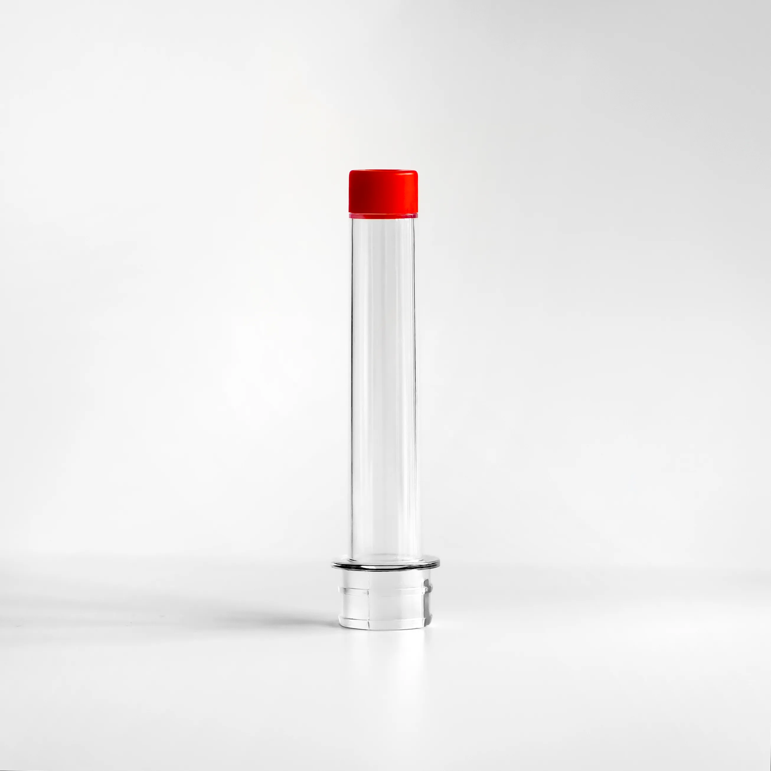
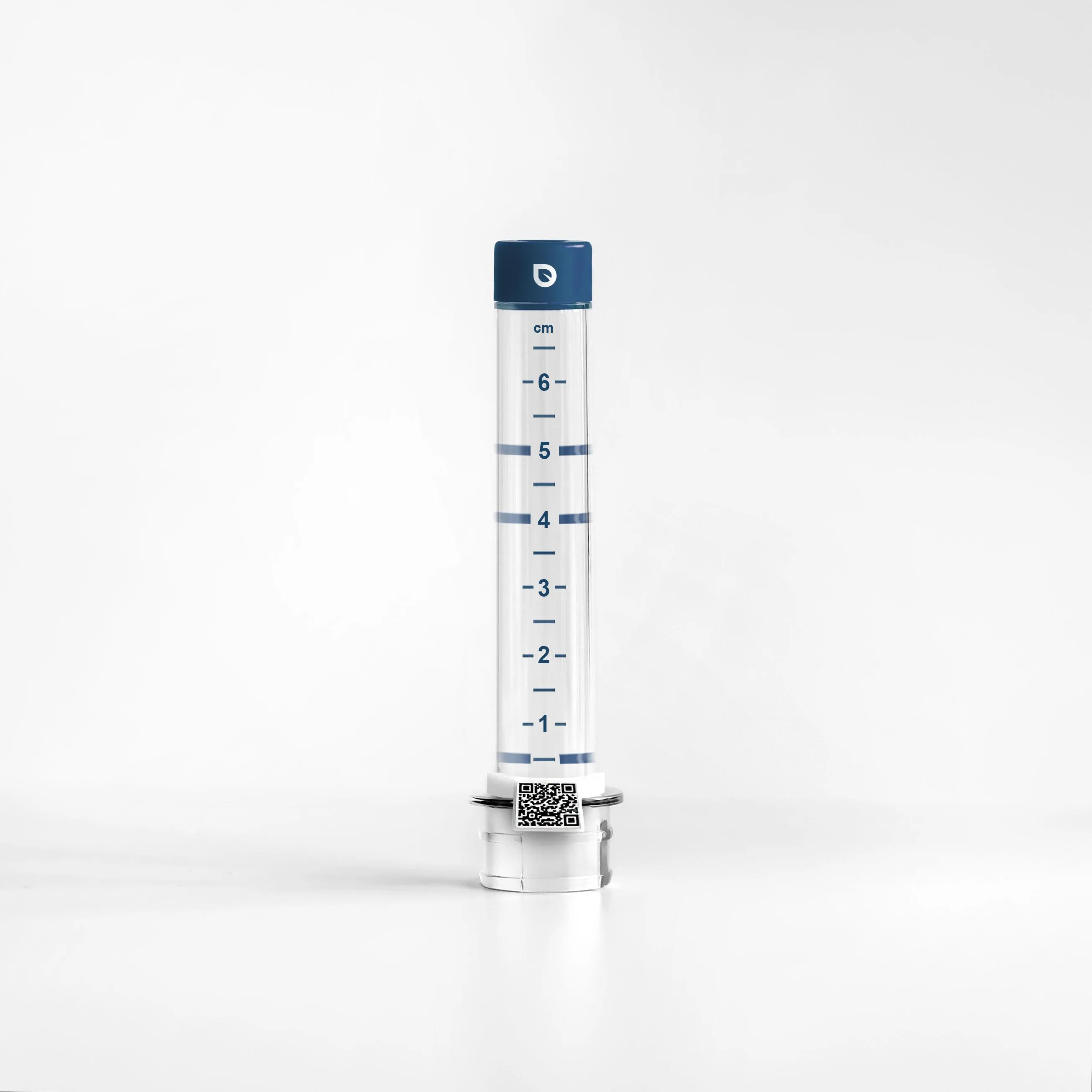
Another part of the photography covered our product, the water level sensor. It wasn't in blueplant branding yet and was meant to make capturing the plant's condition easier via a QR code. That required print design as well as product photography, the latter of which I took on.
For this, I set up a sheet of paper on a table, placed the water level sensor with its red cap on it, and photographed it with my Sony A7 III and an 85mm lens at the table by the window, so the product was lit by indirect window light. What I like most about this shot is how the light and shadow fall, and how clean and soft the transition through the paper looks.
Based on this product photo, several drafts were then created for how to label the water level sensor, including in our primary and secondary colors, in a uniform color, and in a combination of both, each with a measurement scale. We ultimately settled on the dark variant, since the dark blue is closer to our primary color and is also easier to read from a distance.
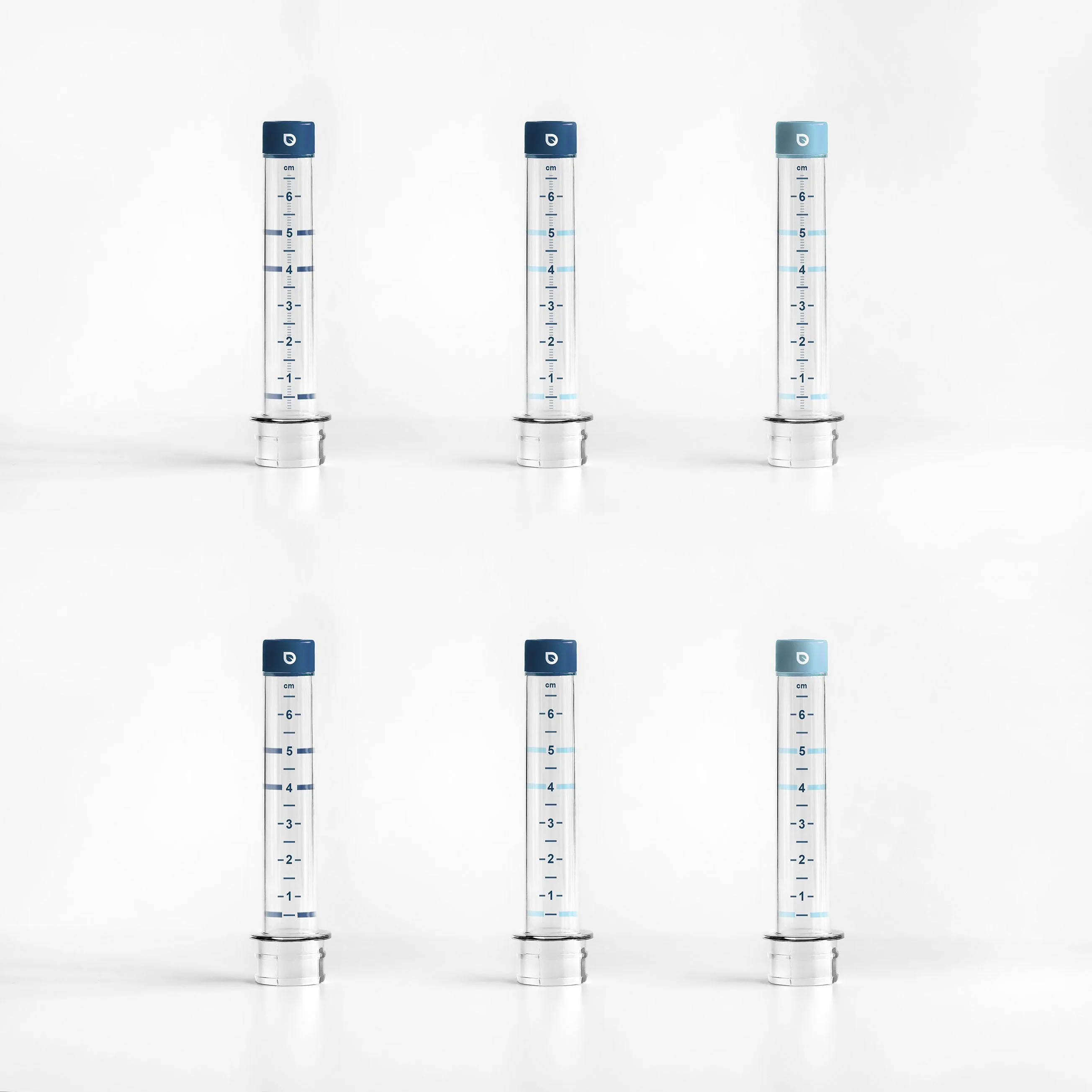
I then added the QR code in Photoshop. That idea has since been developed further: plant care workers can now capture the care status via NFC and no longer need to scan the QR code.
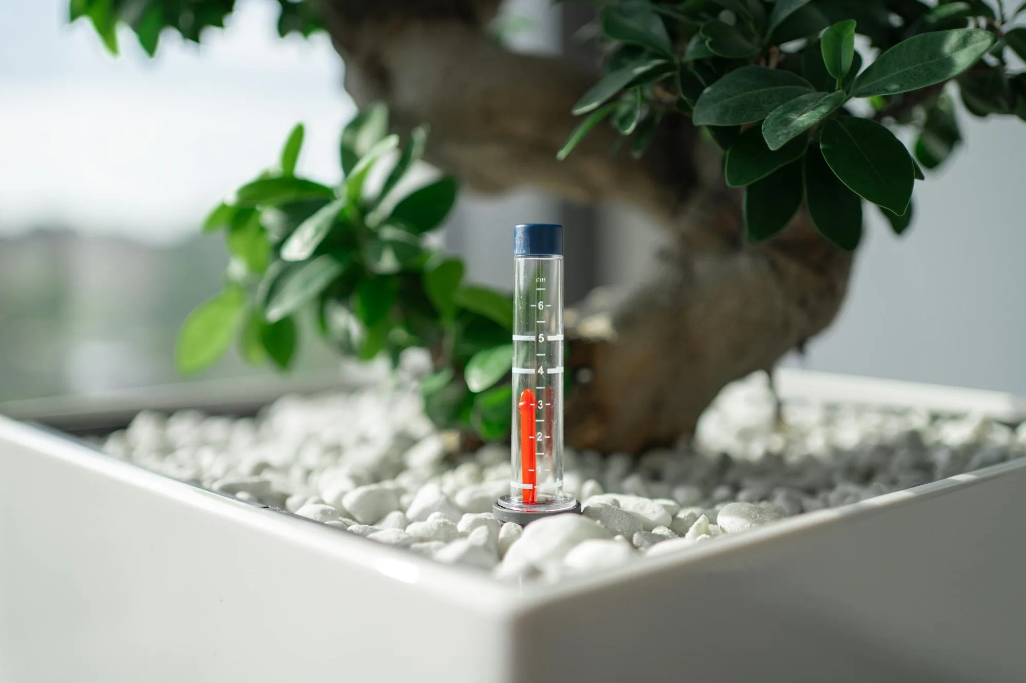
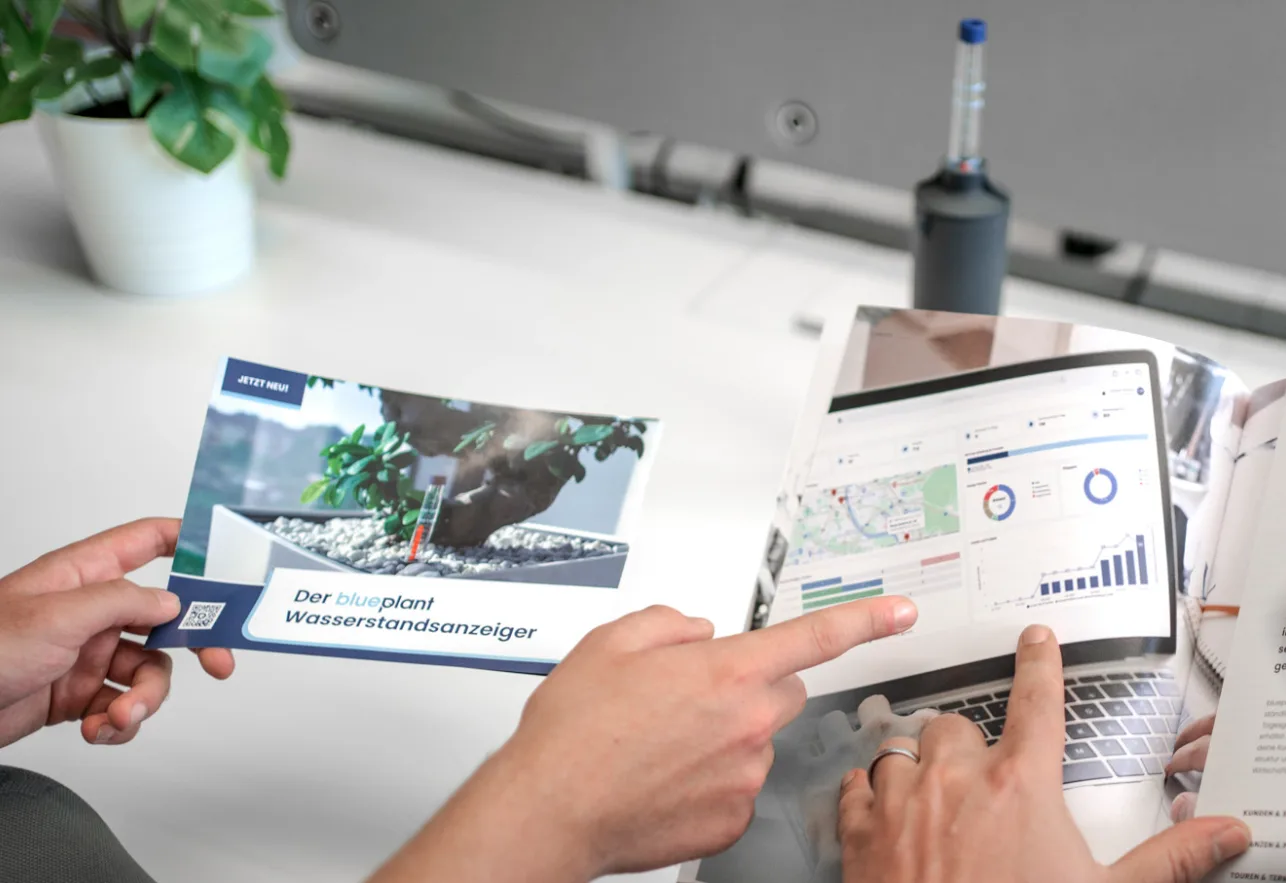
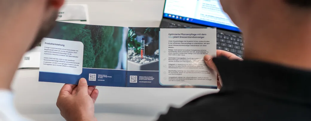
To promote the new product, I also helped build a landing page on the website where the water level sensor could be ordered, and designed a flyer to promote it. I could no longer find the flyer's print or image file itself, but I did find these photographs of it, showing the cover as well as the two inside pages, including the QR code that links to the landing page.
A photo campaign for blueplant on social media
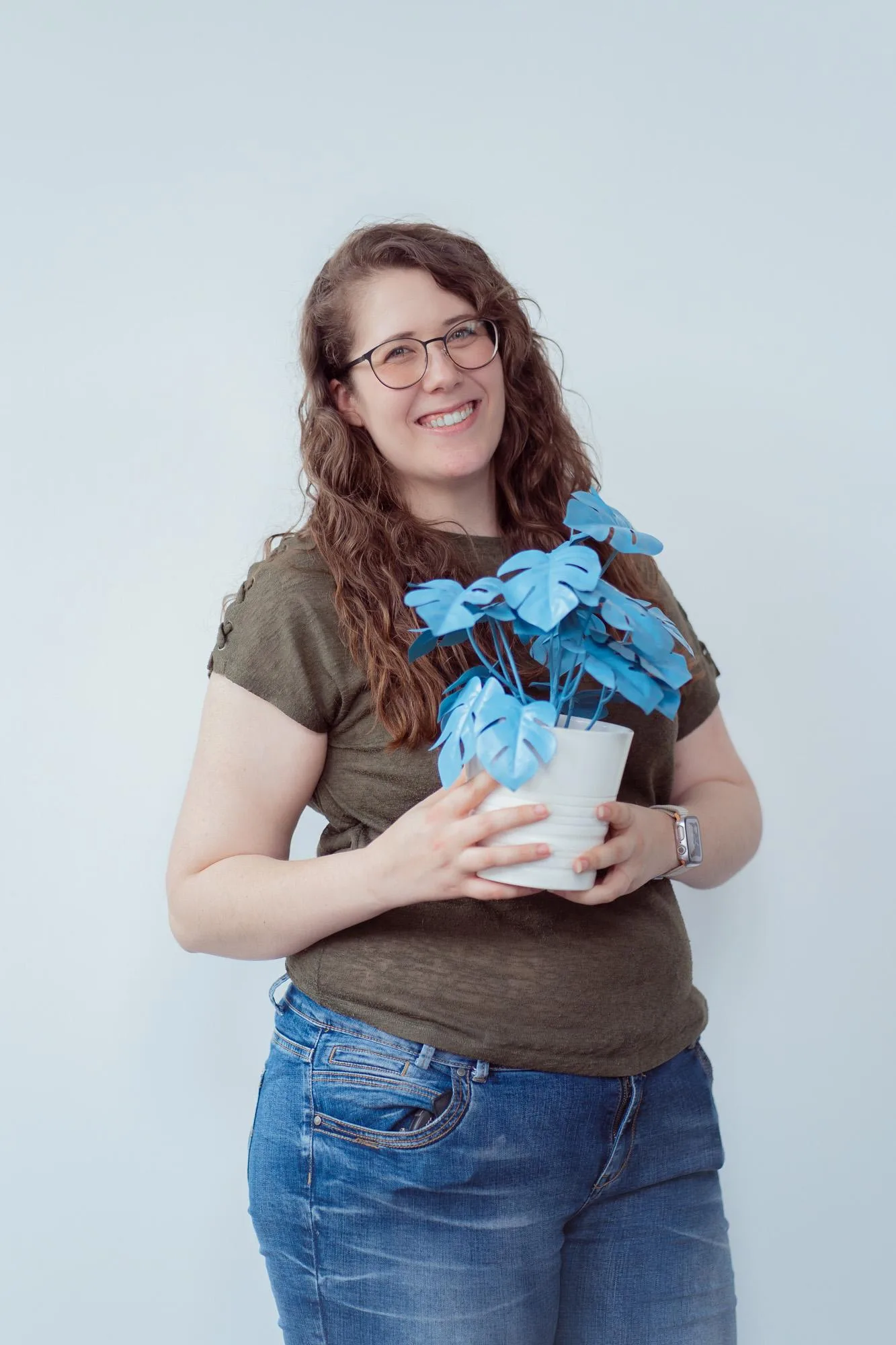
To promote blueplant more strongly on social media and build trust with our target audience, we wanted to introduce the team behind blueplant. The idea came from the marketing team: every team member held a blue plastic plant for a photo, a recurring motif associated with blueplant. The campaign was well received, partly because everyone brought their own idea for how they wanted to pose with the plant.
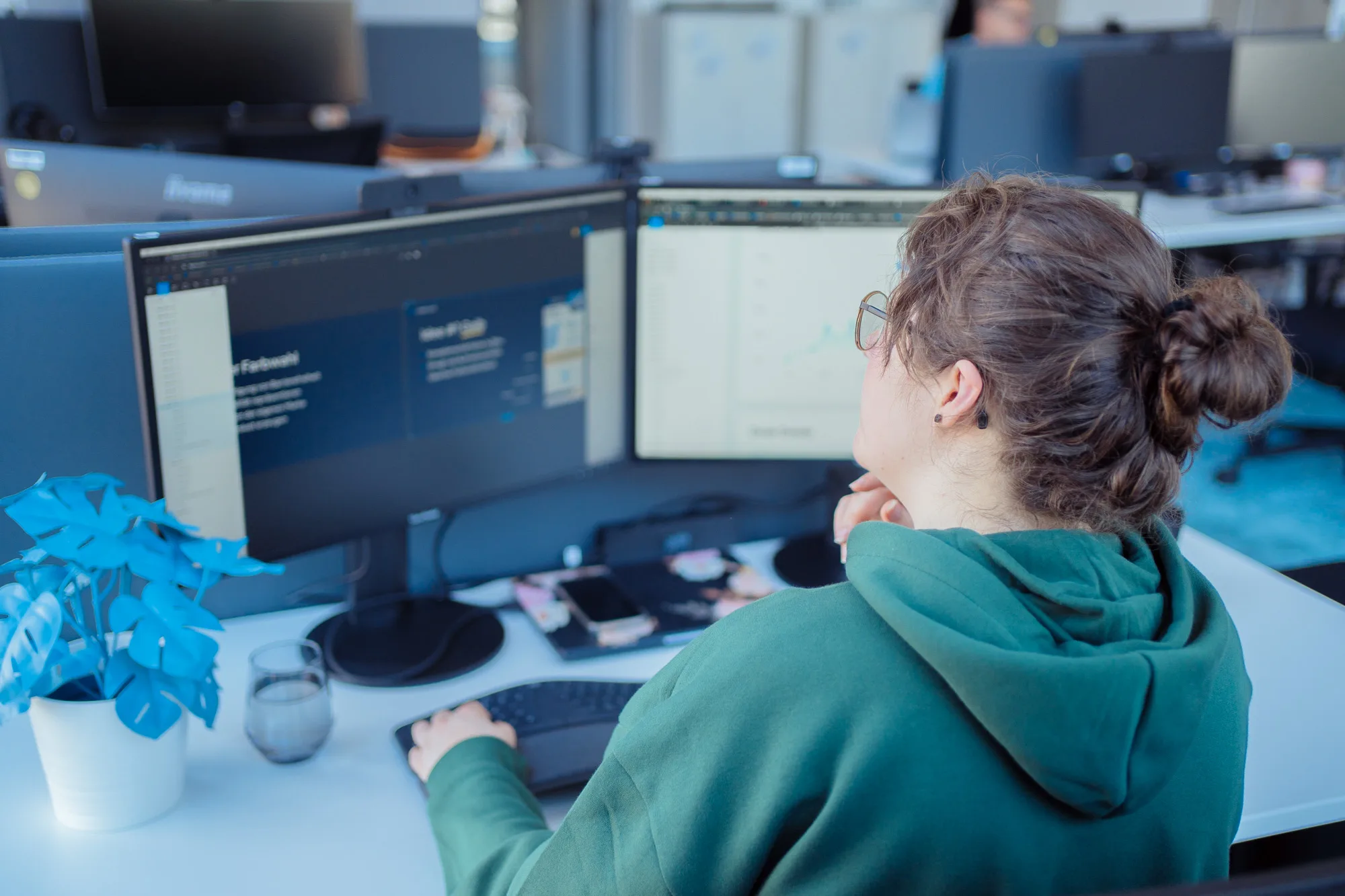
In a second round, we expanded the format and also photographed employees at their actual workplace with the plant in the shot, to give an even more authentic impression of everyday work.
My role was to photograph all of blueplant's team members, both as portraits and in their work context, plus a few group photos. The shots were taken against a white wall and were then edited by me in Adobe Lightroom Classic with presets I created myself, matched in color to the blueplant context, so the coloring stays recognizable across all the shots.
Since the resulting photos show colleagues, I'm showing pictures of myself here instead, kindly taken by a colleague with my camera as part of the campaign.
How things continued for me at blueplant
Work on blueplant went more sporadically than continuously over the years, but I enjoyed it a lot, because I found the product idea itself genuinely exciting. One community event has stuck with me in particular, where I got to talk directly with customers and hear their perspective. That feedback reaffirmed our work once more: there are already plant care businesses that have achieved real results with blueplant, keep using it, and told us what value it provides them. That's exactly the potential worth continuing to build on.