Website relaunch, corporate design, and employer branding photography for KMH GmbH
Missing outward presence as a risk to hiring
The starting point for this project was the final task in my application process at KMH GmbH, a software company serving the telecommunications and energy sectors. I was asked to draft a proposal for relaunching the company website. At the time, the market for skilled tech and development talent was highly competitive, and KMH wanted to carry more of its hiring through its own outward presence instead of relying on external recruiters.
As in many development-driven companies, the company's own web presence had long taken a back seat to client projects. It essentially consisted of a photo of the office, a few job listings, and brief service descriptions.
From an applicant's perspective, my analysis found that exactly the signals that typically support an application decision were missing: faces, a sense of the work environment, and a feeling for who works there and how. That analysis, and the solution I derived from it, convinced KMH during the selection process and got me hired. I then took on the implementation as part of my role, which combined design, photography, and full stack development.
The core idea of my proposal was to solve employer branding specifically through original photography instead of stock imagery, and to build trust across four layers:
- People – employee portraits, to show faces and personalities
- Space – glimpses of the work environment, to make the working atmosphere tangible
- Work culture and benefits – to show what you can experience during working hours at KMH
- Products – through reference clients and testimonials, to substantiate what the company delivers
These four layers went on to shape the content structure for the website, the photography, and the corporate design alike. Throughout the project, implementation was repeatedly a team effort, for instance in coordination with management and in exchange with employees themselves.
Corporate design for an agile, product-driven company
KMH builds custom software for the telecommunications and energy sectors and works agile itself. Out of that agility, I chose a dynamic visual language: instead of a classic, static grid, I worked with tilted, dynamic shapes to carry movement and agility through as a design principle.
I deliberately kept the existing primary color, petrol, to preserve recognizability, and added a new yellow as an accent color, a nod to the energy sector that also adds contrast and memorability. Concept, UI design, and technical implementation of the website were entirely my responsibility, from the first mockups through the color and shape language to go-live.
In an earlier draft, I experimented with highlighting CTAs and other important areas using additional yellow surfaces, to draw attention to them faster. Combined with the petrol, that felt too loud and colorful, so I ultimately went with the more monochrome version seen in the final layout. In hindsight, I'd probably reconsider the yellow here, though with dark rather than white text on it for better legibility.
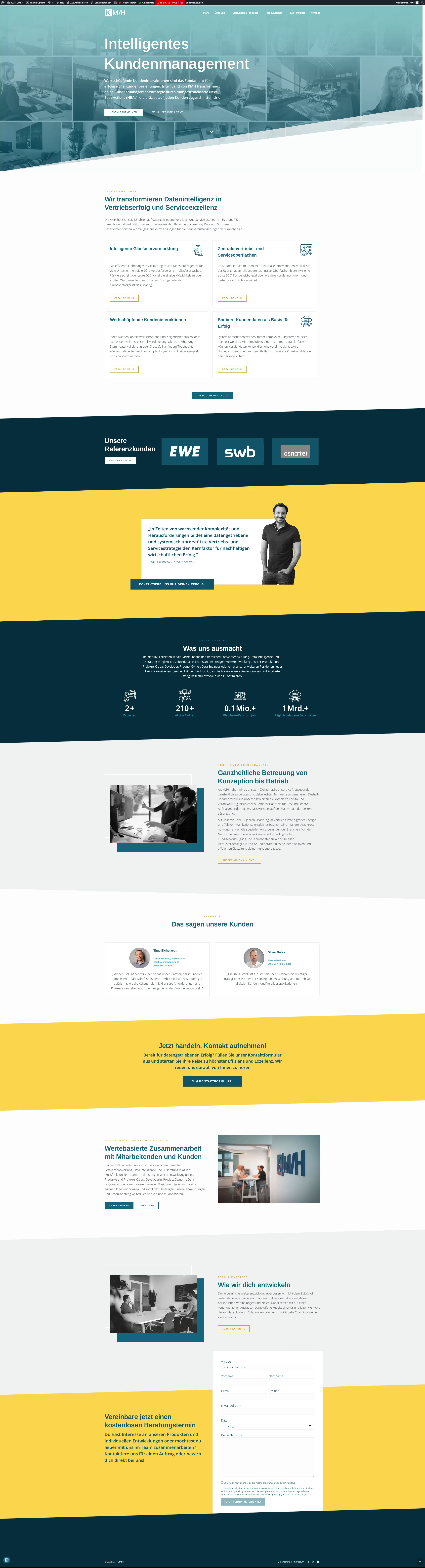
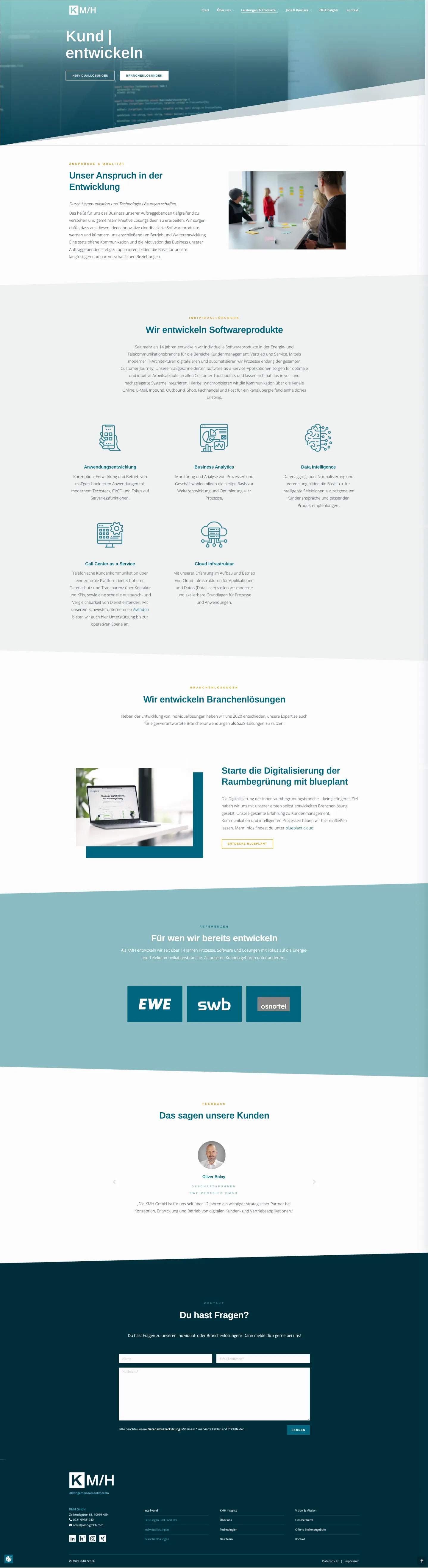
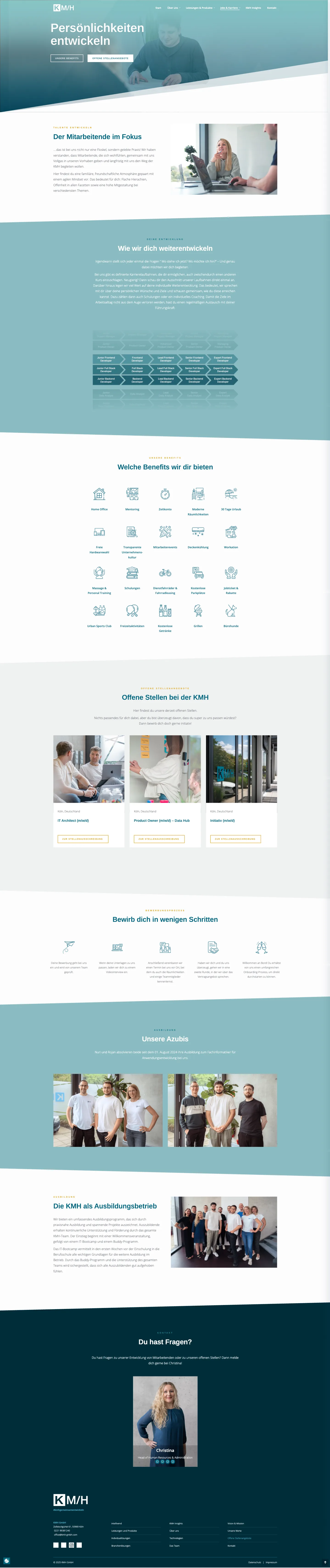
Two examples of the final, more monochrome implementation. Screenshots of the former WordPress site.
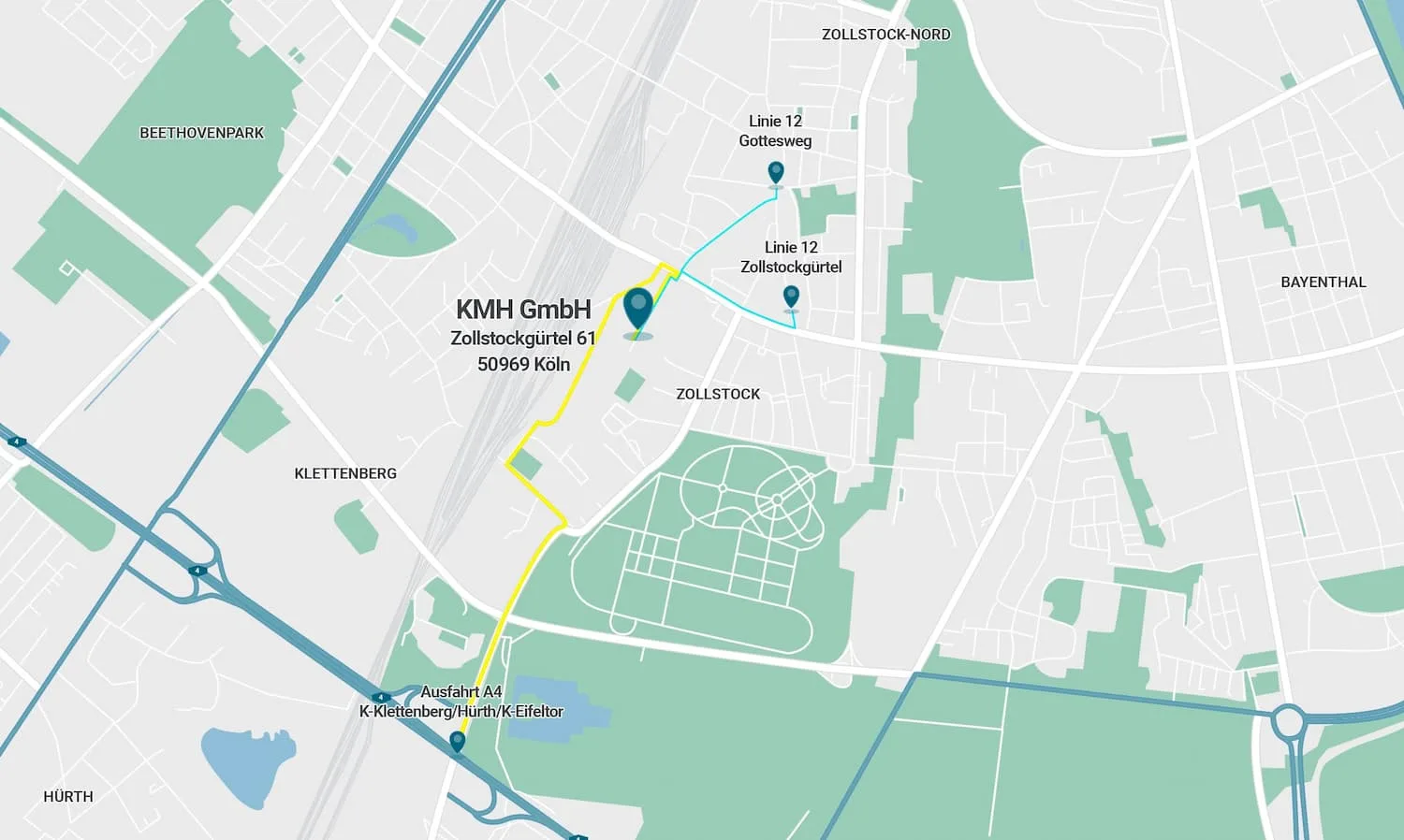
For privacy reasons, and to carry the website's petrol and yellow visual language onto the contact page as well, I designed the directions graphic myself instead of embedding a Google Maps screenshot. I built the map and route sketch in Adobe Illustrator based on our design system.

Beyond the website, I was responsible for building a consistent corporate design across digital and printed applications. Digitally, this included a unified email signature for all employees, a redesign of the presentation templates in the new visual identity, and photo editing of employee portraits for the website and presentations.
In print and merchandise, I created print files for KMH merchandise, including logo t-shirts and a printed water bottle, and developed a lanyard design for trade fair appearances that's consistent with the identity's geometric shape language. I also advised on the ordering process for the printed products.

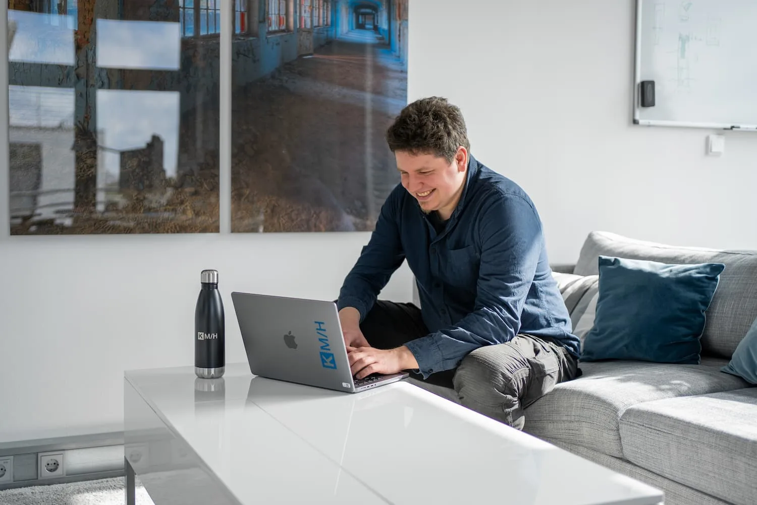
KMH merchandise, water bottle and logo t-shirts, in use at a desk.

I also designed wallpapers for our work devices and Teams backgrounds for recognizability, drawing on the website's visual language, where our headers repeatedly showed employees or glimpses of the company to spark curiosity about our culture. KMH has since moved away from that visual language again, so the motifs shown here date from the period when I built the corporate design.
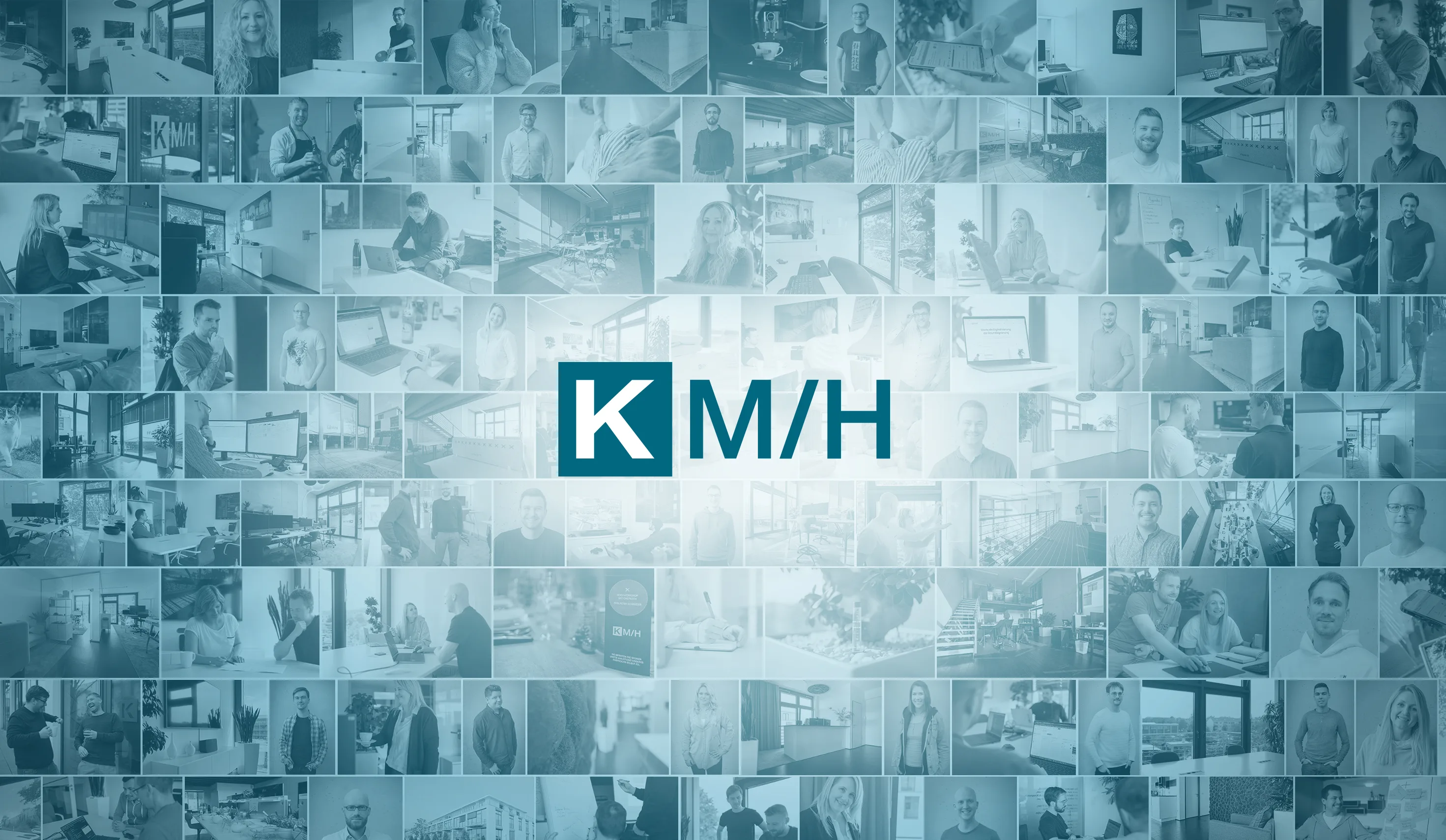
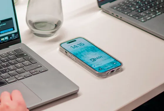
Digital wallpaper, drawing on the then-current website's visual language, and in actual use as a lock screen on a company phone.
Layer 1 – People: original, authentic employee photography instead of stock images
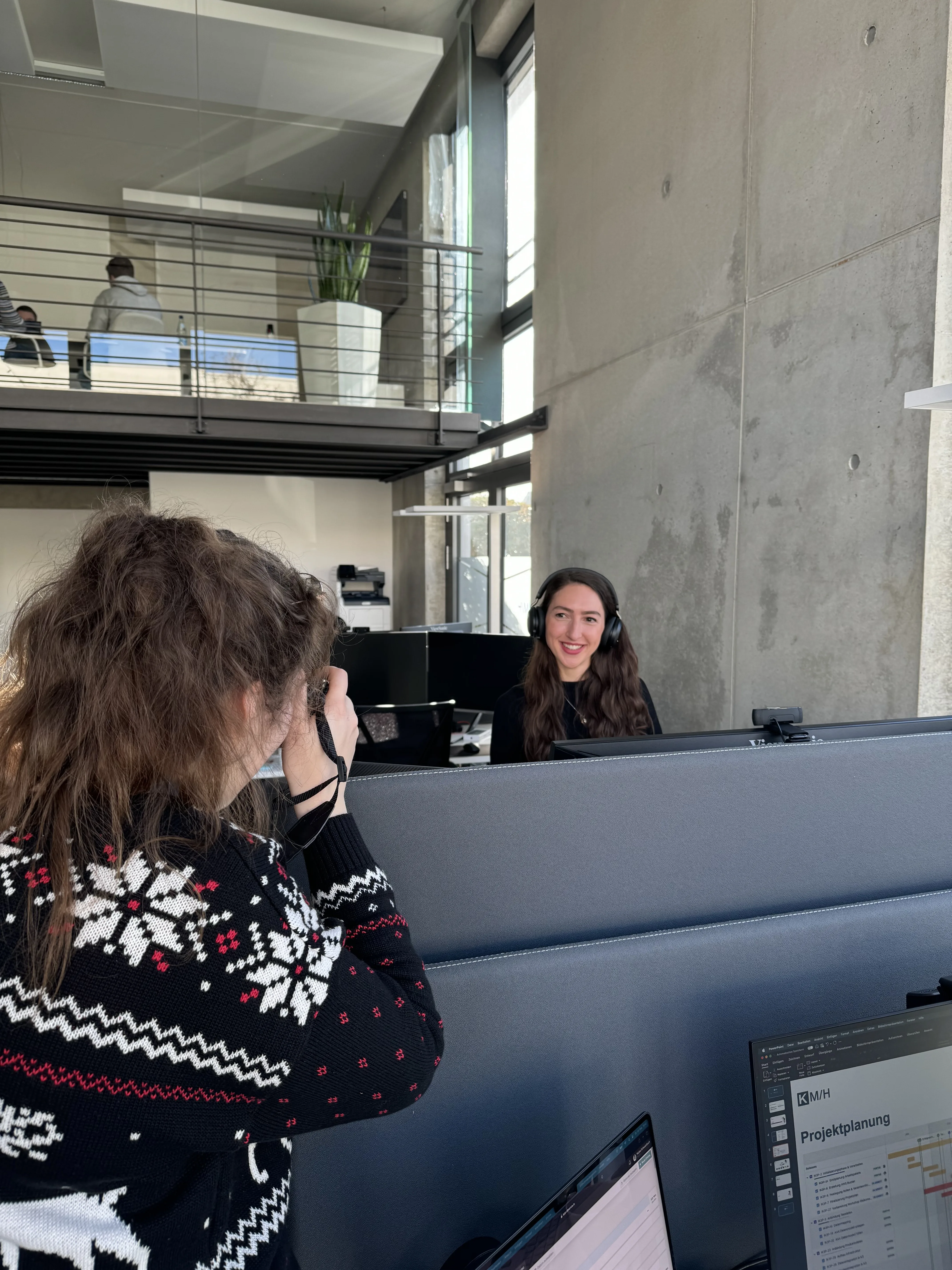
Once the concept was in place, I started photographing all employees myself. The first step was planning shoots that would cover two things: the KMH premises, and employees at work, to give a real sense of how work happens at KMH. It mattered to me to consistently avoid stock photography and work exclusively with authentic, self-produced imagery, because that served the actual goal, a credible impression of the company, far better.
Building on that, I developed the format for the team page: each employee was portrayed in two shots at the same fixed spot in the office, once in a classic pose and once in the context of a personal hobby or interest. The second shot was meant to create an additional layer of identification for applicants, beyond the professional role.
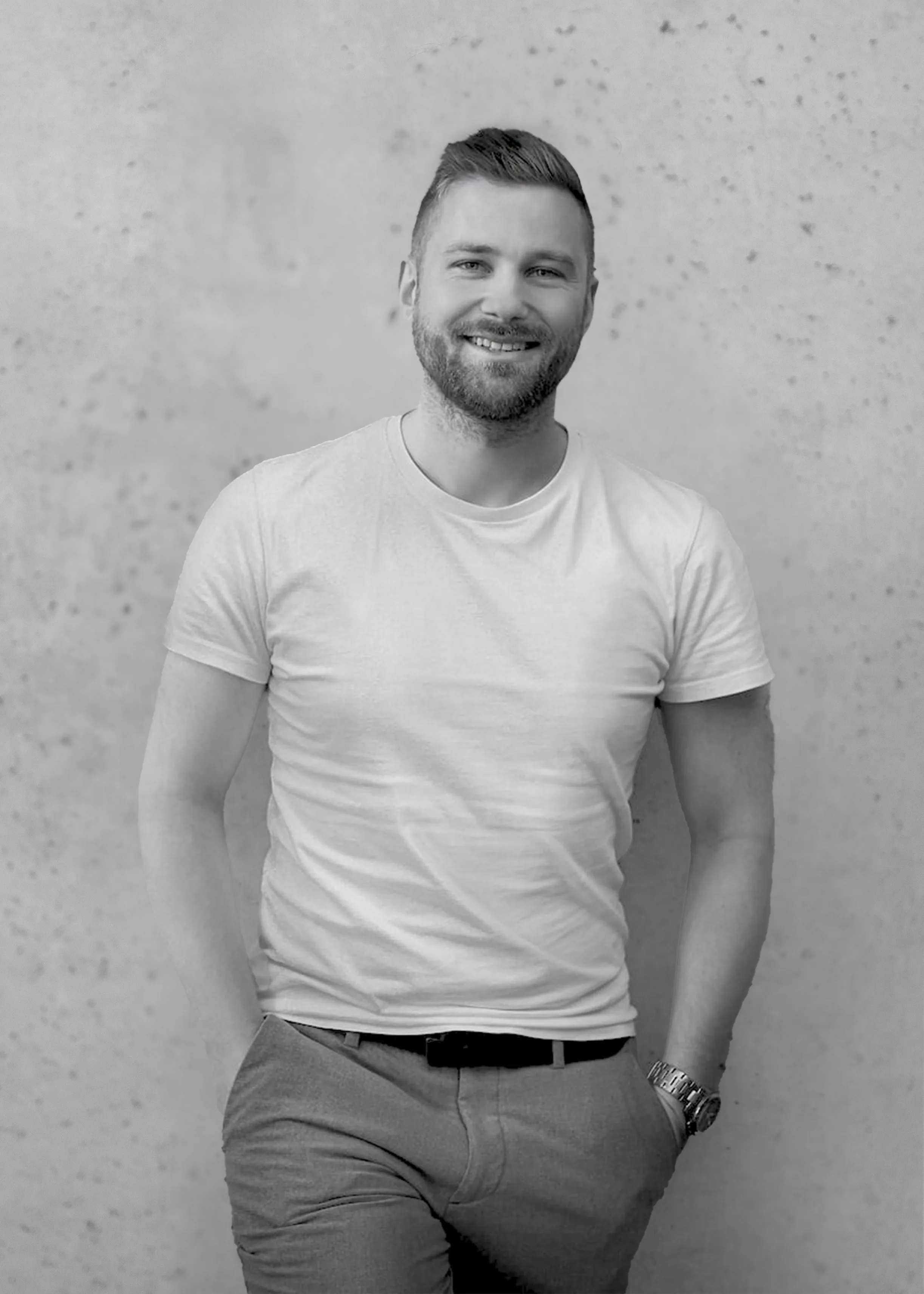
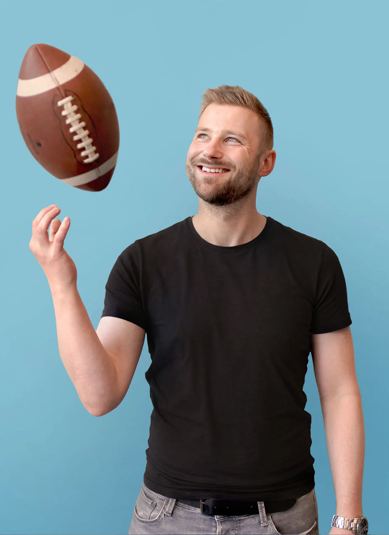
The format in practice, classic and in the context of a personal hobby, here American football. I shot and edited both images in Adobe Photoshop.
For the fixed shooting spot, I first experimented with a mobile photo backdrop, but dropped that idea quickly: the backdrop absorbed a lot of light and noticeably distorted exposure and facial shadows, which also made post-processing more work. Instead, I used a spot in front of a bright concrete wall near a large window in the loft corridor, where employees were naturally lit by daylight, with a noticeably better and more even result.
I shot everything with my own equipment, a Sony A7 III with several lenses I acquired and got to know through this work: a wide-angle lens, a 35mm, and an 85mm lens. The 85mm became my favorite for portraits, because it lets me shoot with some distance, which makes employees noticeably more relaxed during the shoot, and because it delivers soft, isolated bokeh that simplifies post-processing. In the often tightly cut office spaces, that distance wasn't always possible, so for portraits in smaller rooms and for work situations I mostly switched to the 35mm lens, while the wide-angle came in mainly for tight spaces and general room photography. I still use this equipment privately for photography today, though no longer for KMH: KMH has since invested in its own camera equipment, so company photography can continue independently of me long-term, and I can fully focus on my actual role as a UX designer.
Since not every employee had an immediate idea for how to visually express their own hobby, I also set up a consulting format for the shoots: preliminary conversations about the image idea, prop suggestions, and an accompanying Confluence page with FAQs on the process and preparation. Initially, I planned for about 30 minutes per person including buffer time. Thanks to this format, plus growing experience from the shoots themselves, the actual time per person shrank over the course of the project to 5 to 10 minutes. In total, around 43 employees were portrayed this way over the years.
It mattered to us not to pressure anyone into a public photo on the website. Everyone could instead choose between a real photo and a neutral placeholder image.
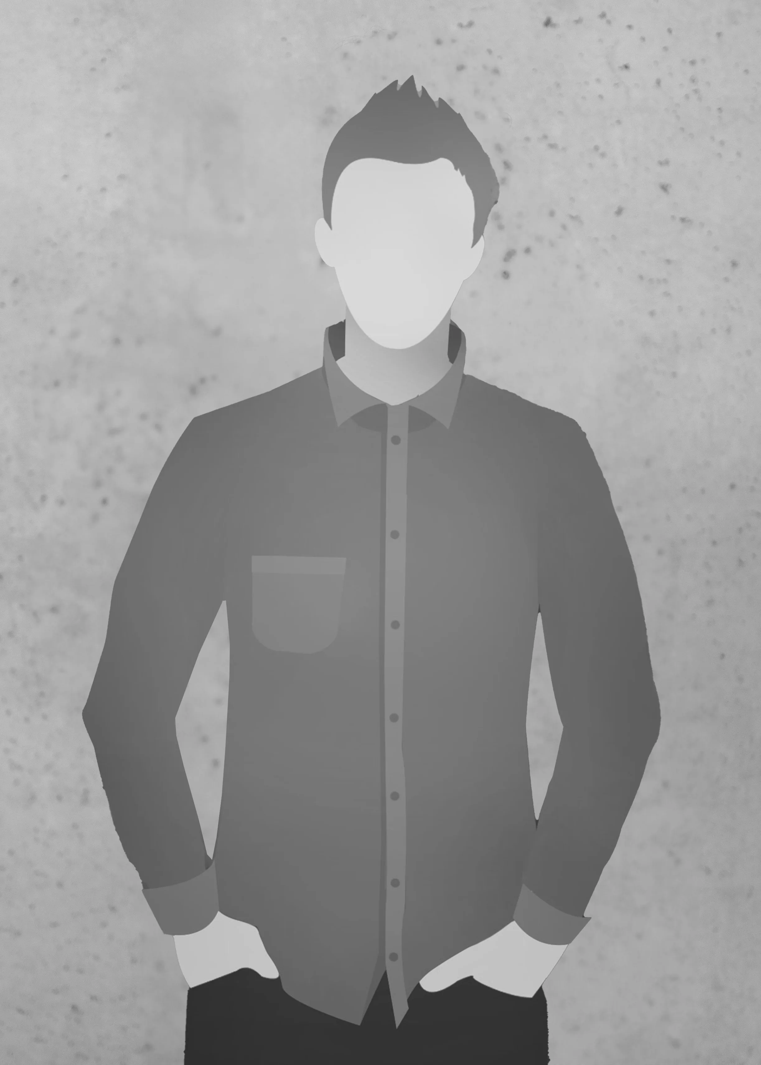
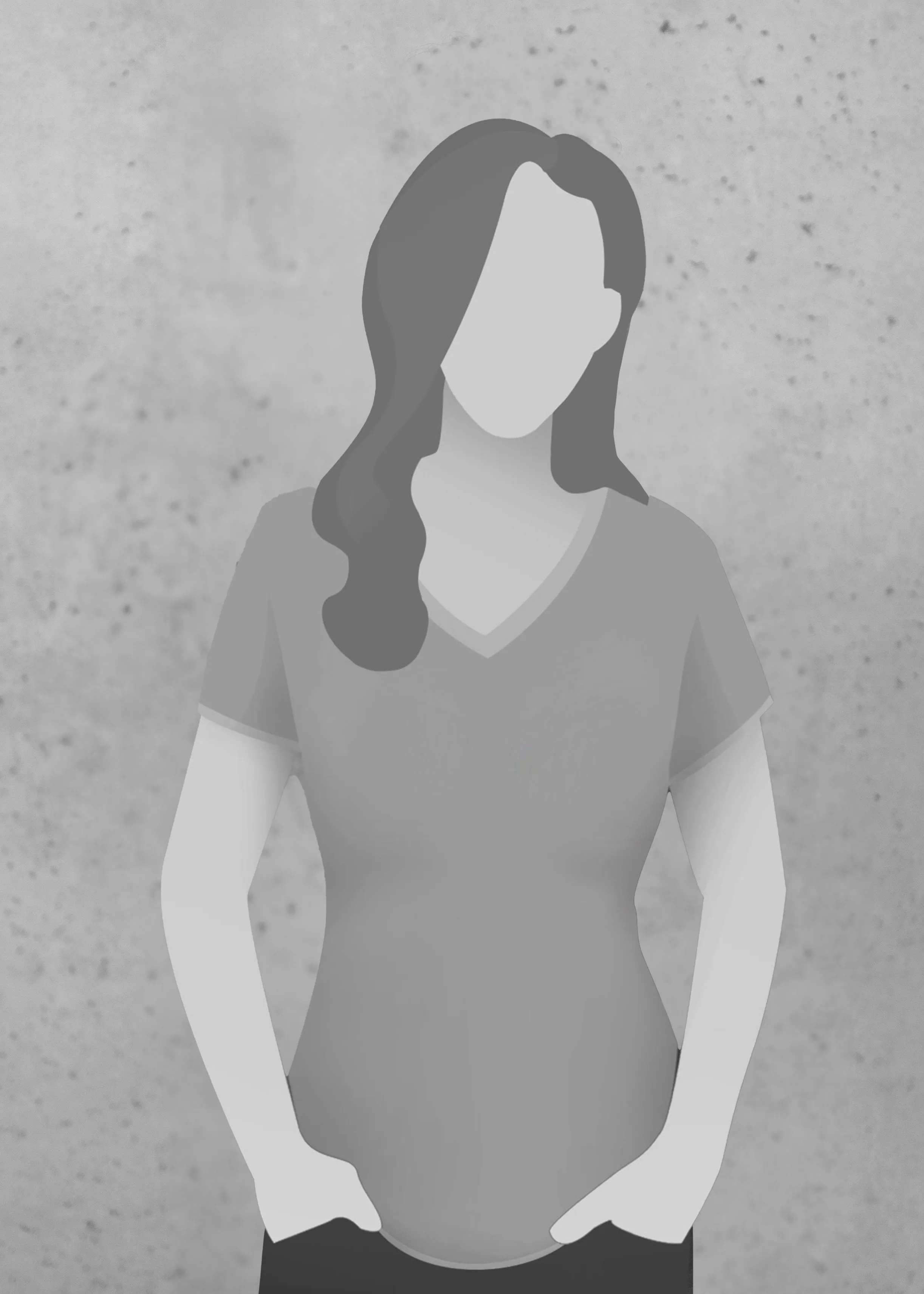
The alternative placeholder graphics for employees who didn't want a personal photo on the website. I recreated the shown variant as a vector graphic in Illustrator.
As a result, there was a small group effect: the more colleagues chose a real photo, the more others followed, until eventually everyone chose the photo over the placeholder. Many clearly enjoyed coming up with their own image idea and becoming a visible part of the team that way.
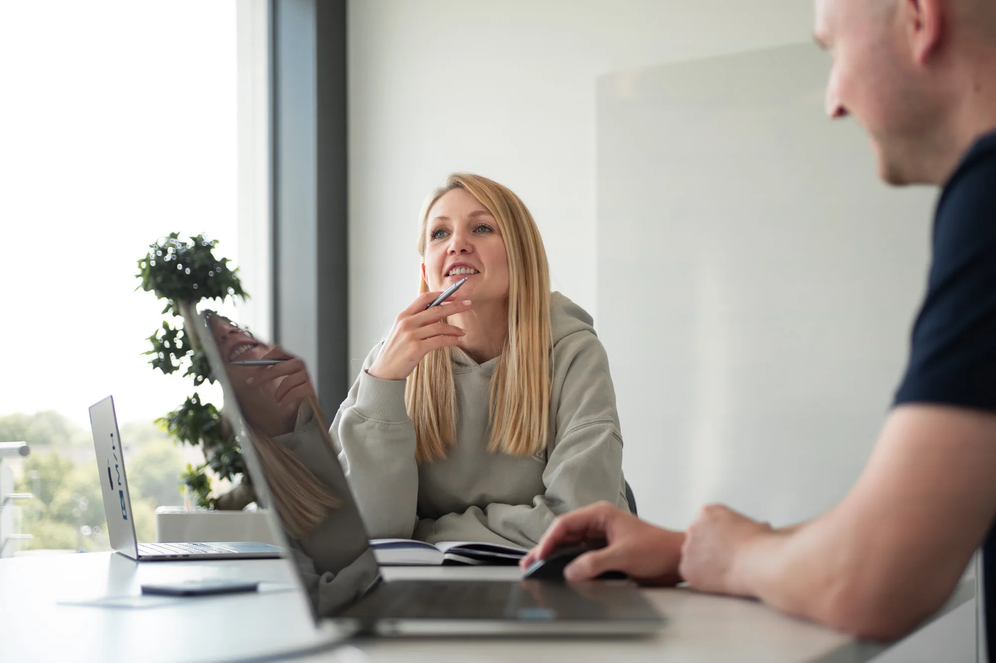
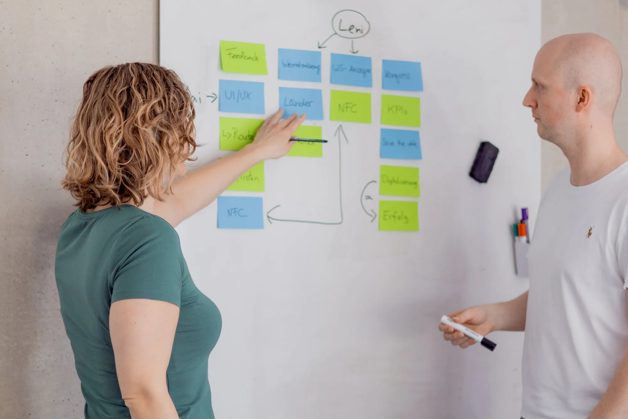
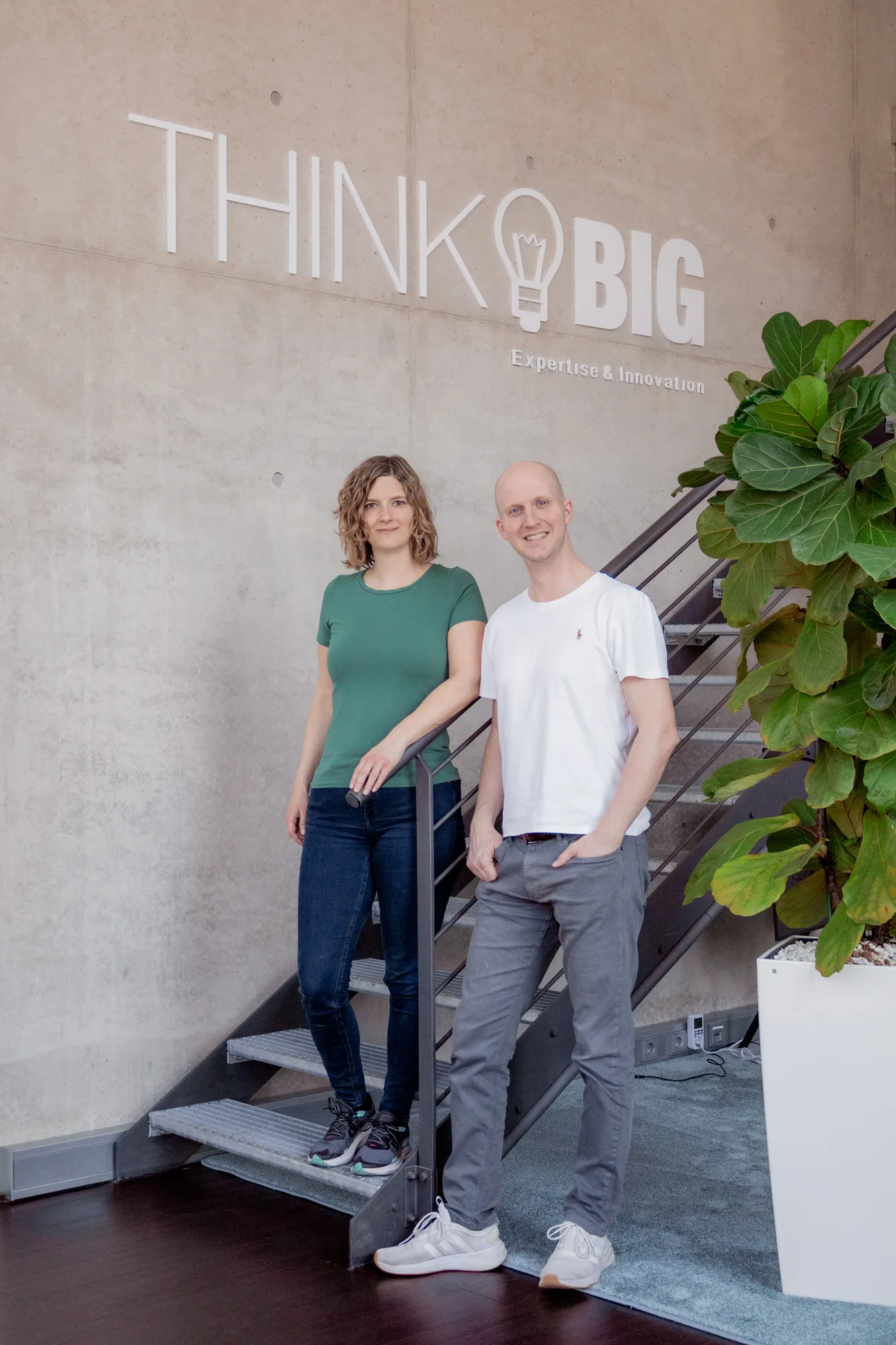
Separate from this classic employer branding shoot per employee, there were additional company photos: shots of multiple people in real situations, like conversations in a room or group photos. These photos were meant to show KMH's way of working and its people together, to build additional trust, and could also be reused for job postings.
Layer 2 – Space: glimpses of the work environment
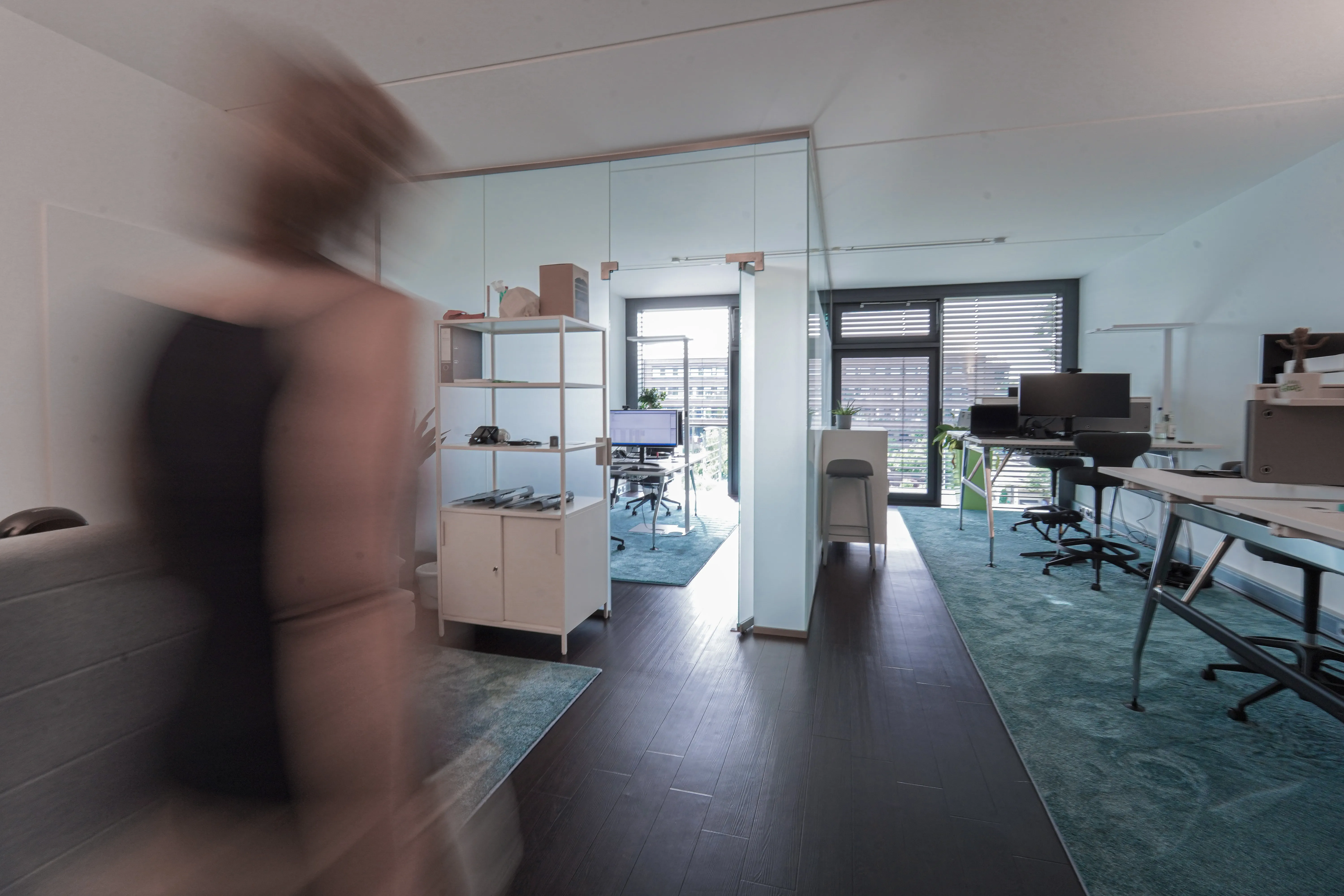
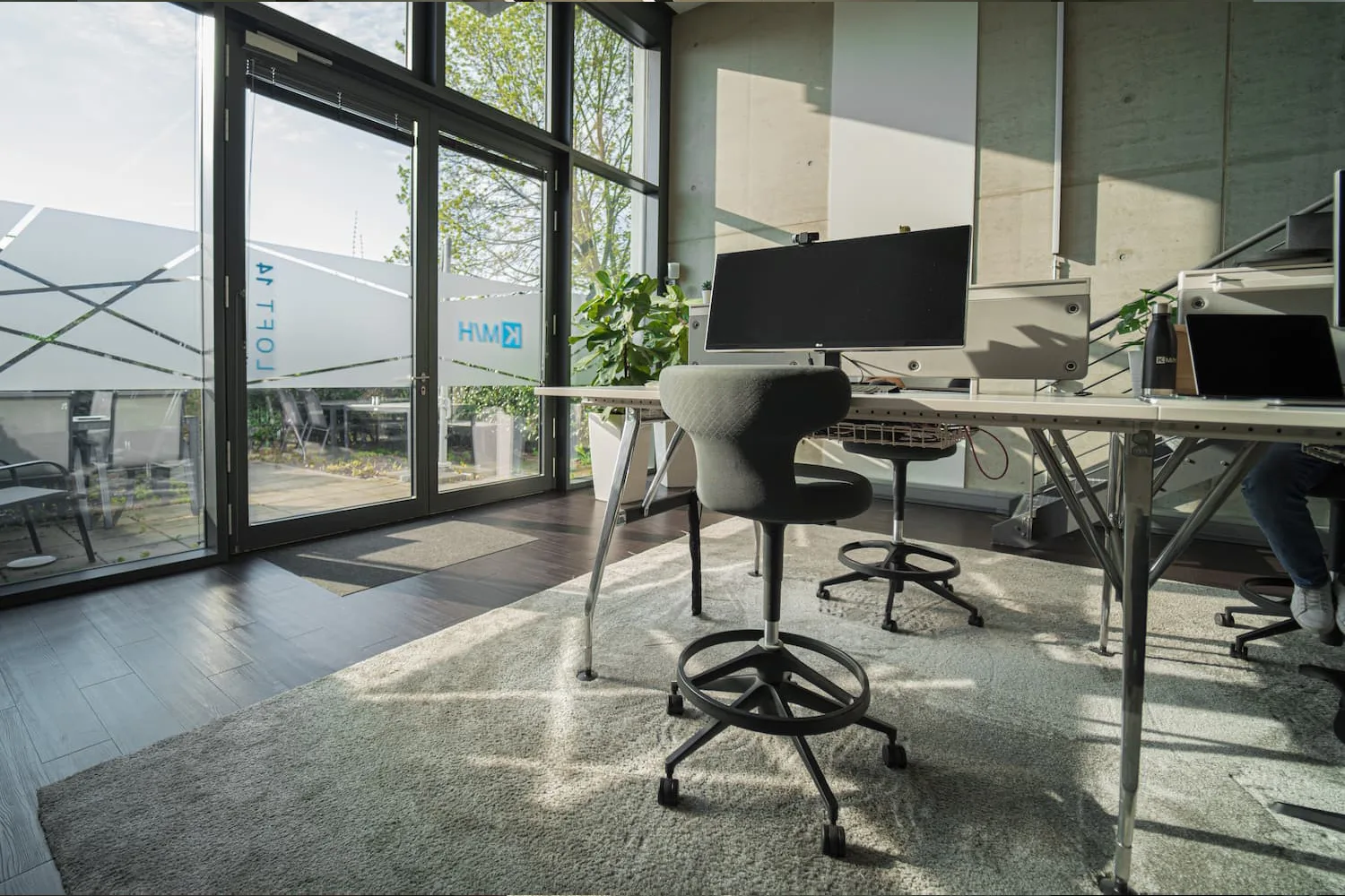
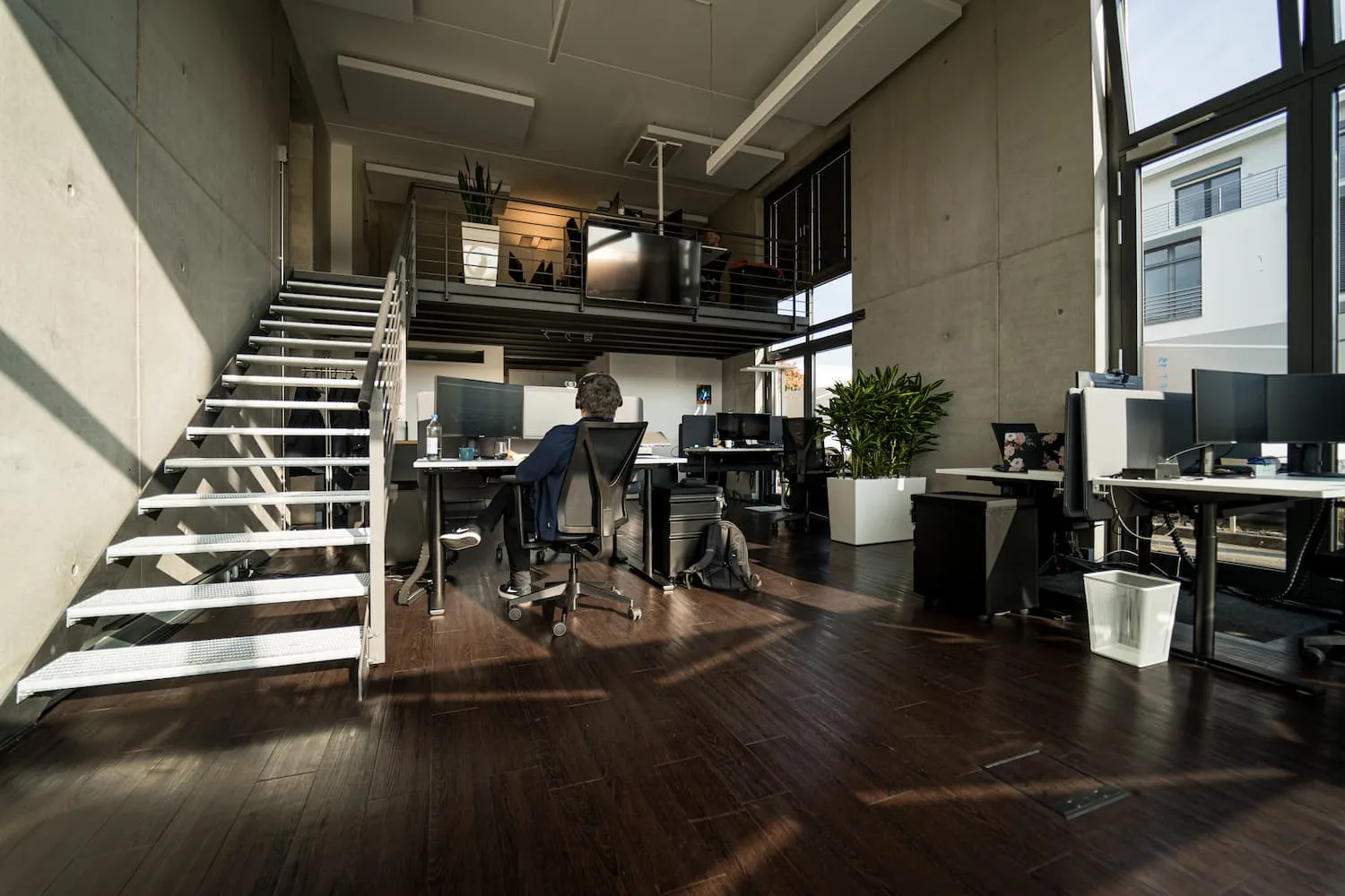
Alongside the portraits, I documented KMH's office and loft spaces photographically, to bring this second concept layer, a glimpse of the work environment, onto the website. Applicants should be able to get a real picture of the environment they'd be working in, since a concrete impression of the space directly affects the motivation to apply in the first place.
As the team grew, KMH kept renting and furnishing additional spaces over the years, so there were regularly new rooms to photograph. Some of the shots shown here capture rooms in a state that no longer exists today, which is part of why they're among my personal favorites.
The window film in one of our lofts, designed by the marketing team, cast beautiful light patterns into the room on sunny days, which I especially enjoyed photographing. In practice, employees usually lowered the blinds anyway, so the sun wouldn't glare on their screens.
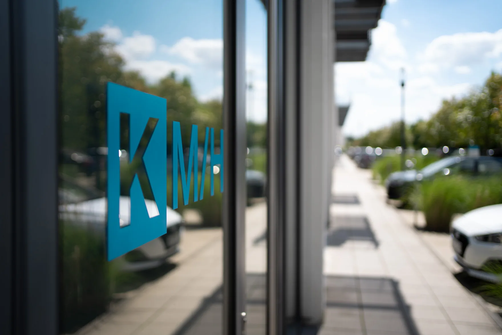
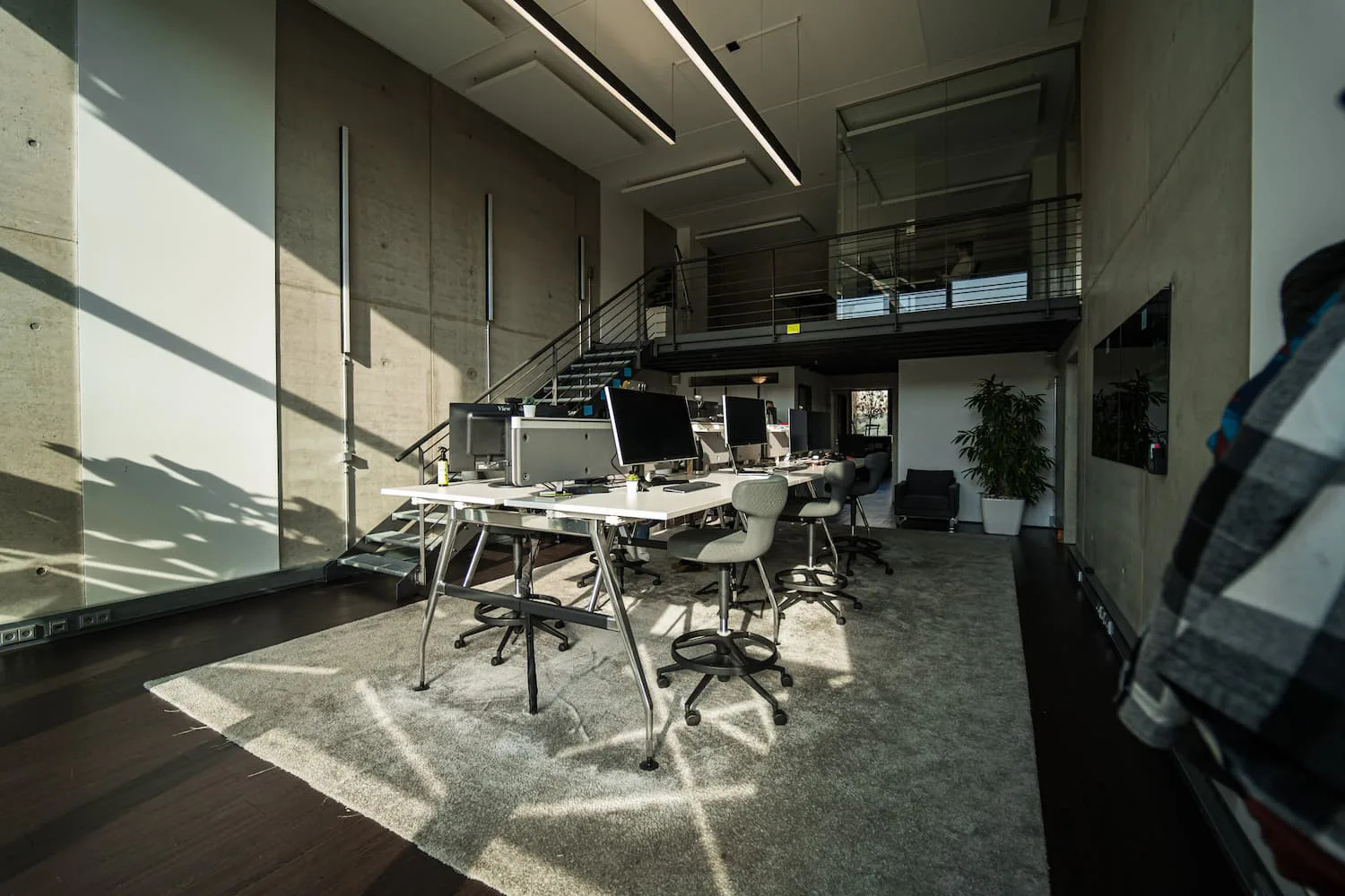
The entrance, KMH's front door, and an office room with the light patterns from the window film.
Layer 3 – Work culture and benefits
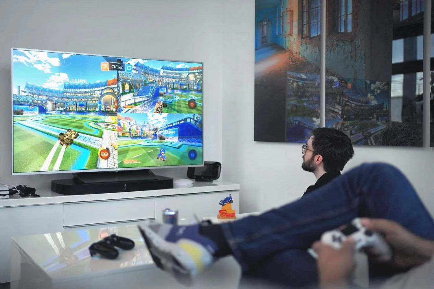
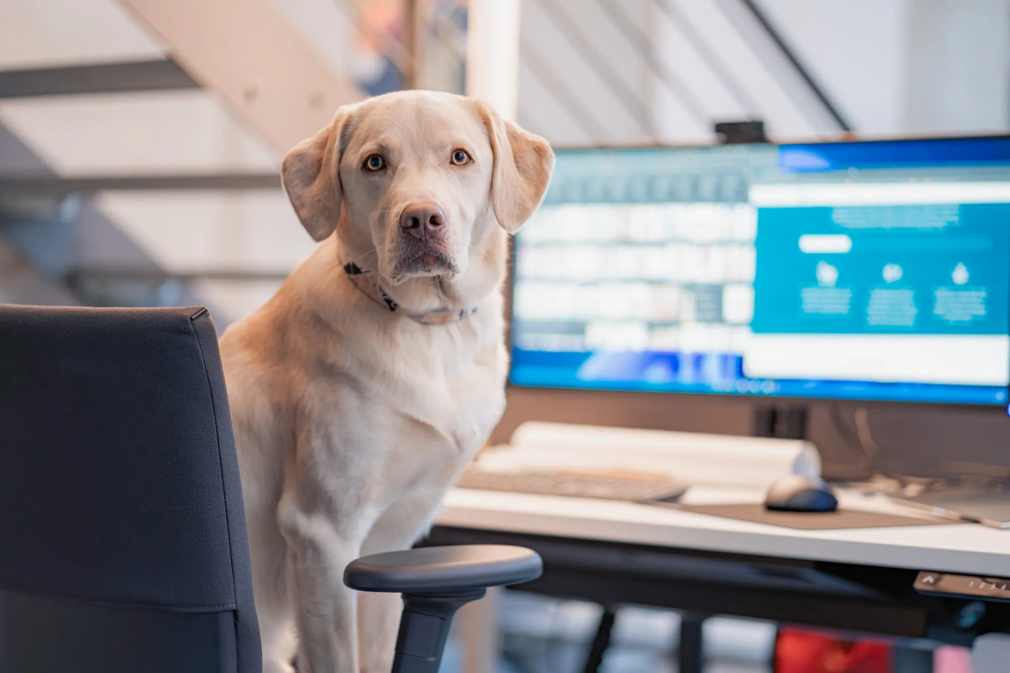
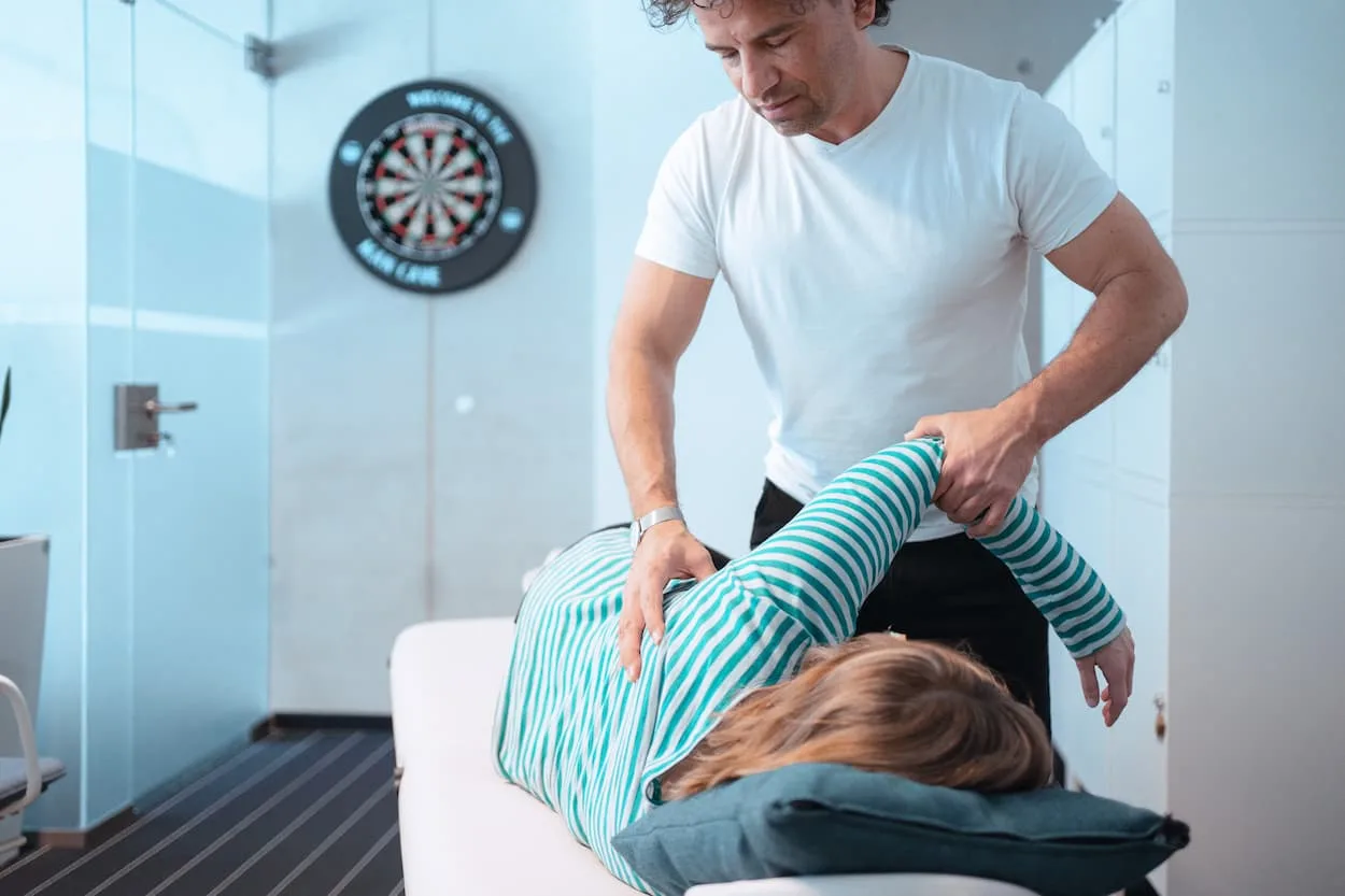
KMH offers a number of benefits and follows a deliberate work culture to attract new employees: from massage and health offerings at the workplace to darts and table tennis to free drinks. Dogs are also warmly welcome in the office. I documented this third concept layer with my own photos as well, to show what you can experience during working hours at KMH.
Unlike a plain list, such offerings land much stronger as images built around concrete, individual moments: the office dog looking straight into the camera at someone's desk sticks in memory more than a generic list of benefits, and it also works well for social media reuse, much like event photography.
Layer 4 – Products: references, logos and testimonials
The fourth layer of my storytelling concept was products. Featuring client references on the website matters for two reasons: to build trust, and to show both clients and applicants concretely what KMH builds and for whom.
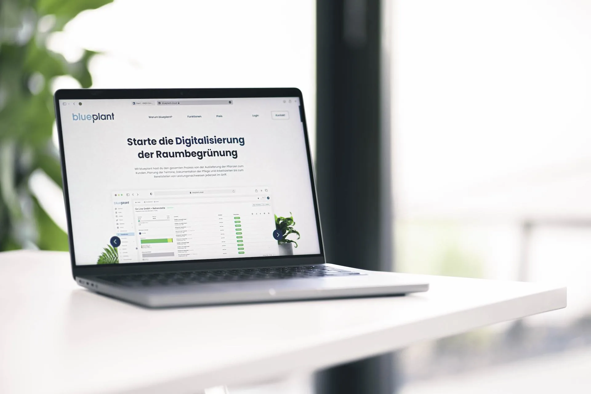
One example was blueplant, a product I helped shape for a while. During the period described here, we still featured blueplant as a reference on the KMH website, to show that KMH also develops its own products. Since then, KMH has stepped back from that, as blueplant has become a standalone product with its own marketing. Because of that, we also started featuring more logos and testimonials from our clients on the website, to show applicants what we offer and who we work with.
Event photography as part of employer branding
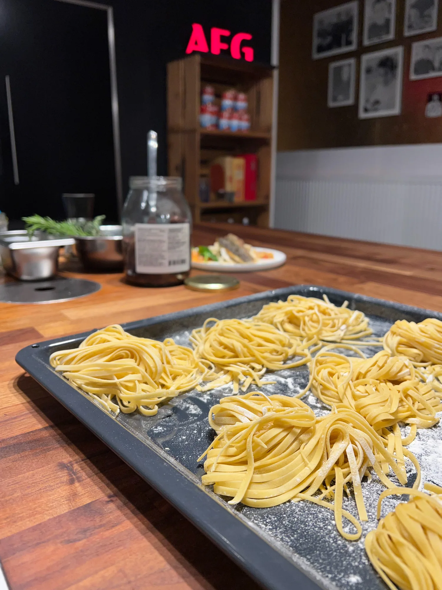
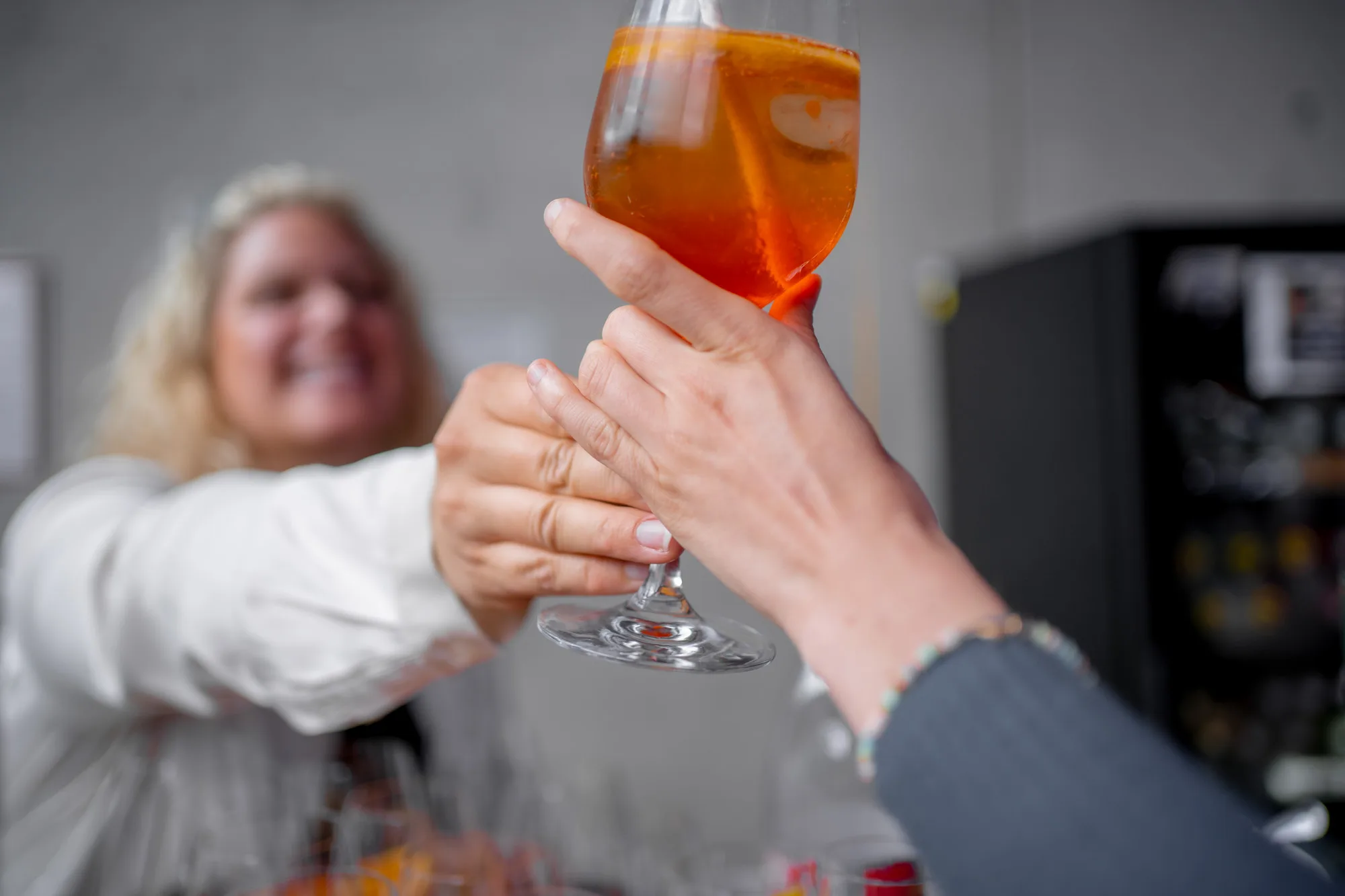
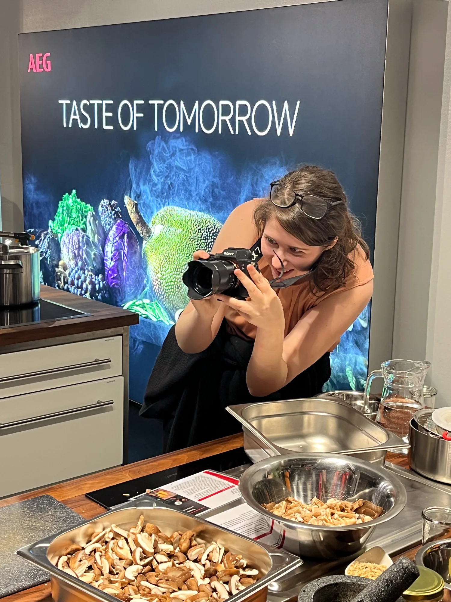
Beyond the four concept layers, I also covered company events photographically, like the Christmas and summer parties. Unlike portraits or spaces, these events can't be reshot afterward, so I could only draw on material from parties that actually happened. That's why I list this section here as a complement, not as an equal fifth layer. I see this as part of employer branding too: when a company hosts something, it's worth capturing that experience photographically, since the shots can then be reused for social media, the website, or internal communication, and show an authentic picture of the team together. I deliberately focused here on scenes rather than individual employee portraits, to keep the focus on the experience itself.
What drew me most to event photography was food photography in particular, but also tangible, emotional moments: steam rising while cooking, reaching for finger food, a fresh cocktail. Shots like these are among my absolute favorites, because they spark emotion and make you want to be there yourself. That's exactly what I enjoyed most about event photography: capturing experiences and emotions in a way that makes you feel right in the middle of it when looking at the photo. Since it fell outside my actual working hours and came with noticeably more effort, I eventually stopped doing it. Still, I had a lot of fun trying it out.
Ongoing operations, photo management and handover
Over the years, I was also responsible for the website's ongoing operations: web hosting, updating WordPress and its plugins, and expanding the site with new content all ran through me as the central point of contact. As I increasingly wanted to focus on my work as a designer, only limited resources were available for further technical development. The website grew historically over the years, additional plugins, especially for tracking, were added, and the site got slower over time. As a result, we increasingly reduced and handed off tasks around the website.
As the team and the photo archive grew in parallel, the effort involved in managing and distributing image files to marketing and management grew too, which I raised in early 2025. We decided on PicDrop as the central solution for managing and releasing the photos together with the marketing team, to make photos quickly available for job postings, marketing, and other channels.
In the same period, the website was fully migrated to a new CMS by an external freelancer. In my role as UX designer, I supported project management and ran a UX audit of the new website. Based on my recommendations from that audit, adjustments were made in favor of user experience and, in particular, accessibility.
I handed off the photography itself in the same period to a new colleague from marketing, for which I prepared an onboarding document covering my workflow for editing and retouching, the individual steps, and points of contact for questions. The handover went unusually fast: in the very first week, I unexpectedly couldn't lead a jointly planned shoot myself, where she was initially meant to just observe, because my car had been damaged by a truck in the parking lot. My colleague took over the shoot on her own and ran it successfully. The ongoing company photography has been her responsibility ever since.
Lasting impact on outward presence and hiring
The new website, and especially the team page with authentic employee portraits, received consistently positive feedback from applicants. Over the project period, KMH also grew from around 20 to more than 55 employees, with the revamped outward presence being a relevant factor in that growth, though not one to view in isolation from other factors.
The fact that individual design decisions and shots from the original concept are still part of the current website today speaks to the longer-term durability of the decisions made. I'm very grateful to have had this experience at KMH GmbH. It was a huge amount of fun, and it let me really show what I can do.