Surreal Postcard Design: Trapped in the Now, Driven by the Possibility
The assignment
In my communication design studies, the assignment was to design a surrealist postcard interpreting my own personality. The self-portrayal was part of the brief, not my own idea.
What surrealism is NOT
At the start, this was harder than expected. I initially thought in very realistic images: sky, clouds, clear scenes, all close to what's familiar. Color-wise, too, I stayed in a fairly classic blue for a long time. The problem was, it felt coherent, but not really surreal.
Only through discussion and several discarded drafts did I realize I needed to consciously detach from this reality. Surrealism means deliberately estranging things and recontextualizing them, not just placing them in an atypical setting.
The core idea
The design is built on a contrast that runs through the entire image: a light, soft side and a darker, more serious side. The pink and blue clouds stand for lightness, calm, and something playful. The transition to the darker side marks a different reality, more serious and less controllable. For me, this contrast mirrors life itself: not one clear mood, but opposites that exist side by side.
Central elements and their meaning
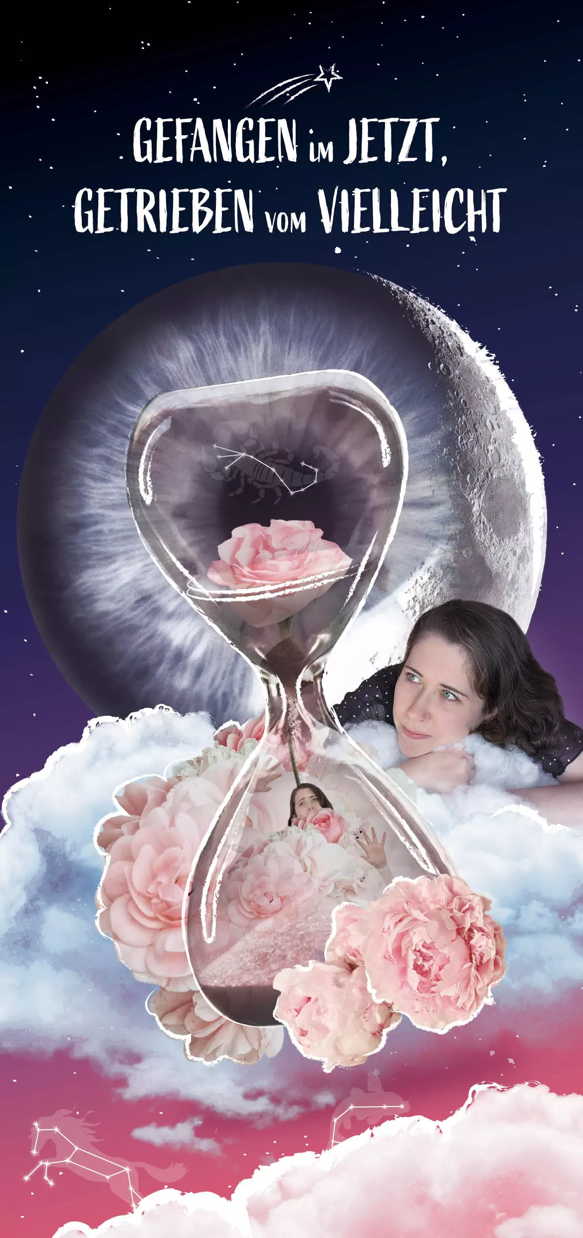
The clouds form the foundation and stand for softness and tenderness. At the same time, they create a space that isn't graspable, detaching itself from reality.
Part of this layer are the hinted zodiac signs in the sky. At first glance they seem subtle, but for me they stand for personal interests, hobbies, and traits. A horse and a fish appear, both strongly tied to my private life. Both are deliberately placed in the lighter, dreamlike layer and stand for things that bring me joy and stay with me long-term.
The scorpion sits inside the hourglass. There, it no longer represents this free, idealized space, but the present and the decisions I have to make.
I myself appear as a figure within the scene, rather calm and observing. My gaze goes toward the sky and the hourglass, into the space between wish and reality. For me, that represents thoughts, dreams, and the feeling of sometimes losing yourself in your own head.
The hourglass is one of the central elements. It stands for time, but also for limitation. While everything outside looks calm and aesthetic, a different dynamic shows itself inside the hourglass. There, I am trapped, pushing against the glass, threatened by the falling sand and the rose petals. Combined with the scorpion, this layer becomes even more personal: time is no longer an abstract concept, but something that directly concerns me.
The flowers, especially the peonies, hold a very personal meaning for me. They stand for my childhood and the time spent with my grandmother in the garden, for closeness, familiarity, and something very positive. Especially in combination with the hourglass, this creates a tension between memory, impermanence, and the present.
The eye that transitions into a moon is, for me, a kind of observer. It stands for self-reflection and for the feeling that things are part of a bigger picture, not in a religious sense, but as the thought that not everything happens by chance.
The chalk lines around many elements are deliberately imperfect and are reminiscent of something childlike. For me, that's a connection to my creative side: drawing, shaping things, and helping to design my own reality.
Why this title?
The title "Trapped in the Now, Driven by Maybe" sums it up for me. The "Now" stands for the moment you can't simply break out of. The "Maybe" stands for wishes, possibilities, and thoughts that constantly accompany and drive you. Especially at the time I created this piece, a lot was still open for me. That state between certainty and uncertainty is reflected in the work. The shooting star picks this up again: it stands for wishes and goals that can drive you, and for how you deal with them.
For me, this project was more than a design exercise. I learned to detach myself from a purely realistic depiction and to use meaning more deliberately. Above all, I understood that design is carried by decisions you can explain.
For this collage, I altered, cut out, and recomposed elements from several third-party photographs. Since this is a photo montage rather than standalone images, I'm listing all sources used here instead of individual figure numbers.
- Cut-out self-portrait (own work, 2025).
- Moon, cleanly cut out. Source: Daniel Ramírez on Unsplash, untitled, 2019, unsplash.com/de/fotos/blick-auf-den-mond-aus-den-wolken-q4TfWtnz_xw [Last accessed: 01.03.2025]
- Pink flowers, cleanly cut out. Source: Marina Reich on Unsplash, untitled, 2019, unsplash.com/de/fotos/rosa-bluten-tagsuber-pbY3BCZGkRA [Last accessed: 01.03.2025]
- Cut-out clouds. Source: Daniel Ramírez on Unsplash, untitled, 2019, unsplash.com/de/fotos/blick-auf-den-mond-aus-den-wolken-q4TfWtnz_xw [Last accessed: 01.03.2025]
- White clouds, cleanly cut out. Source: Engin Akyurt on Unsplash, untitled, 2020, unsplash.com/de/fotos/weisse-wolken-und-blauer-himmel-tagsuber-A9_IsUtjHm4 [Last accessed: 02.03.2025]
- Hourglass, cut out using the pen tool and color selection. Source: Nathan Dumlao on Unsplash, untitled, 2018, unsplash.com/de/fotos/klare-sanduhr-5Hl5reICevY [Last accessed: 01.03.2025]