Product Design for a CIM System for Municipal Utilities and Energy Providers
A customer interaction management tool for municipal utilities and energy suppliers
intellivend is a customer interaction management tool (CIM) by KMH, built for municipal utilities and energy suppliers. Instead of classic next best actions, intellivend relies on what we call interaction opportunities, referred to below as sales tasks. These are data-based recommendations that help sales and service teams get the most value out of every customer interaction. That ranges from contract renewals to cross- and upselling to customer retention.
In my role as UI/UX designer, I first set up a style guide for intellivend and, in parallel, developed early product ideas as sketches and mockups. Once we had a first vision for the product, building our marketing website became another part of my job. As I gained experience, my focus shifted increasingly toward UX. I started looking more critically at our product and applying the first user research methods.
The biggest challenge was the early phase. The idea behind intellivend wasn't tangible enough for me at the start. Before I could do any real design work, I first had to build a basic understanding of how the future users work and what purpose the product was meant to serve. Without that understanding, an idea is hard to implement consistently across a team. At the same time, product development ran in sprints from day one, so my designs were created alongside development. As a small team, our priority back then was getting a working MVP out the door as fast as possible. On top of that, we had no users yet, and marketing came first to win our first customers.
It wasn't until 2025 that I could run my first user observations, which helped me understand the product much better. In parallel, I started a part-time UX degree and successfully applied for a spot in German UPA's mentoring program. That's how I largely taught myself the theoretical foundations I needed, which in turn made me look more critically at design and features, resulting in noticeably fewer correction loops.
One particularly instructive learning from the first observations in 2026 concerned a feature where I used an animation to deliberately draw agents' attention to a specific piece of information. The observation showed that an animation meant to direct attention would actually have disrupted the agents' workflow during a live customer call. I removed the animation afterward. For me, that experience was one of the moments that, after several years in product design, made clear why I no longer want to work without user research: without direct contact with actual users, every design decision remains an assumption, one that can turn out to be an expensive mistake and make the product inefficient or unusable for customers, even if it looked well thought out at first glance.
Designing and building a marketing website
Once the first design drafts were in place, the next step was building an actual brand for intellivend. To win our first users at all, we first had to communicate what intellivend is and what it stands for.
Working closely with marketing, I first built a design system for intellivend. For the color palette, I chose a combination of dark blue and a lighter blue, complemented by shades of gray. The goal was a sober, professional look that builds trust with municipal utilities and energy suppliers as a serious target audience.
Building on that, the intellivend website came together. It was meant mainly as a fast landing page for promoting intellivend at conferences and trade fairs. I built it on the same tech stack as the other websites I created for KMH. I also implemented a custom CSS extension in the WordPress child theme that lets a HubSpot form slide out sideways on a button click, an interaction that WordPress alone couldn't handle.
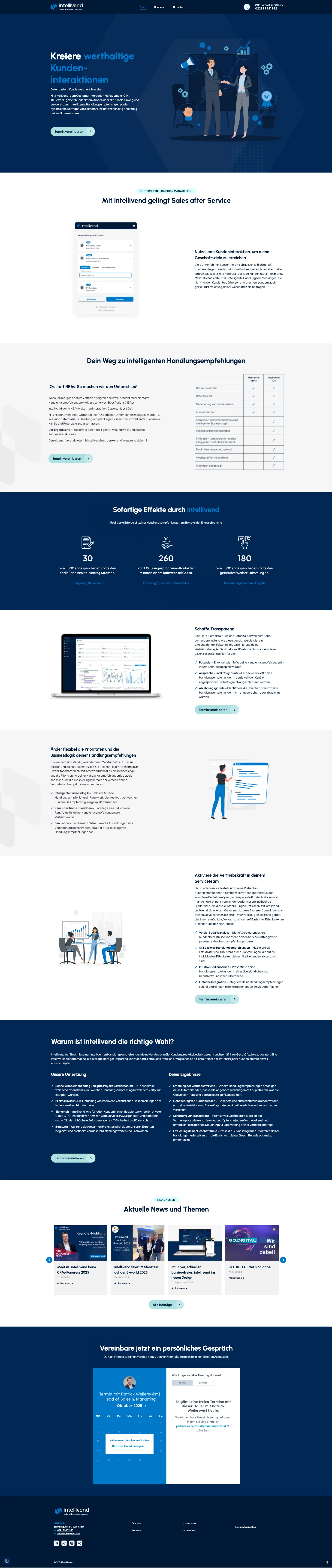
The marketing strategy for intellivend keeps evolving: starting in 2026, the standalone website will be discontinued, and the product will be marketed directly through KMH GmbH's main website instead.
Designing the intellivend sidebar from 2024 to 2026
The sidebar for agents was a central part of intellivend from the very beginning. It supports sales and service agents directly during a customer call. To use it, agents first pull up the relevant customer through the customer search, after which the sidebar shows that customer's data along with their open sales tasks as a task list, each tagged by category such as sale, insight, or lead.
For each task, the agent can enter additional information directly in the sidebar, such as the outcome of a call or further customer details, and then close the task as successful, unsuccessful, or not addressed. Tasks that are no longer relevant can also be actively disqualified, keeping the list manageable for the next customer interaction.
I developed the sidebar iteratively over the entire project. Comparing the very first draft from 2024 with the current state in 2026 makes the progress easy to trace, both in feature scope and in how deliberately I now apply design principles like grouping, hierarchy, and color.
The comparison shows a few notable improvements:
- Consistent coloring per category (sale, insight, lead) instead of individual colorful badges with no underlying system, for clearer visual hierarchy and a more recognizable brand
- Tasks grouped by category, each with its own section heading, icon, color, and counter, so it's clear at a glance which sales tasks belong together
- Reduced border and icon stroke weights, more consistent font sizes, and more deliberately placed background colors, to make important information stand out more
- Tab navigation between available and already-recorded tasks, to hide already qualified or completed tasks and reduce cognitive load while working
- A dedicated detail view with a clear click-through instead of an inline expanding form, for more visible progress and less information to process at once
- A new tariff comparison feature that lets agents compare a customer's current tariff directly in the sidebar against cheaper internal or market-standard alternatives, for better advice during the call
- A stronger focus on microcopy, to describe actions meaningfully and help agents navigate the application more easily
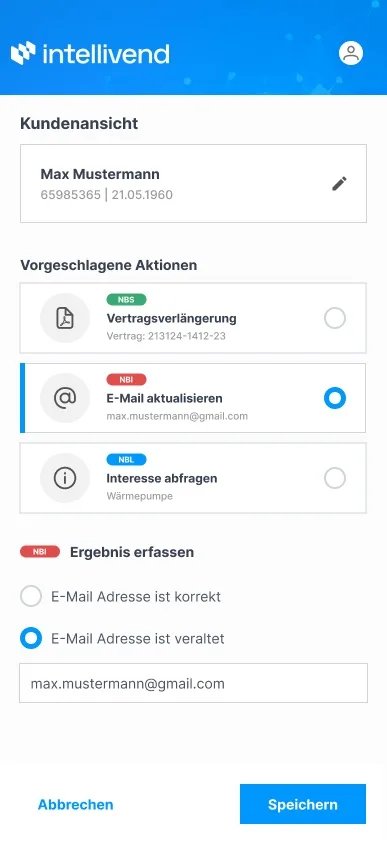
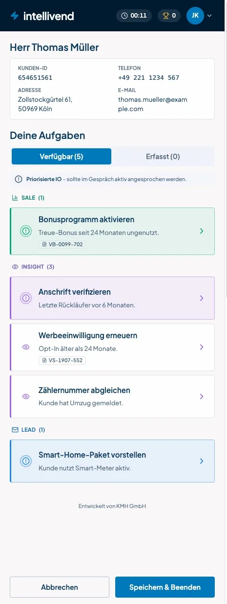
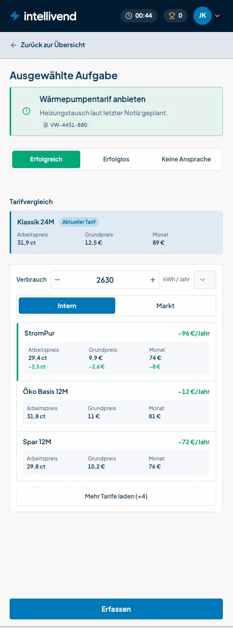
As the only designer at the company, I had to stay efficient across multiple products while still ensuring consistency. I documented requirements and design decisions directly in tickets through user stories and design specs, then implemented them with AI support, as with the current state shown above, built with the AI tool Lovable. In the process, I quickly had to learn to communicate clearly what should actually be taken from an AI prototype, otherwise unplanned details tend to slip in as well.
One remaining hurdle was that development often had no visibility into the generated code, and it didn't always match our existing tech stack and design system, which made parts of the implementation harder. I've since switched to prototyping directly in Claude Code. Because that only lets me work with components that actually exist, my prototypes are close to what's technically feasible from the start, which has noticeably simplified the handoff to development.
The current state also shows a pulsing ring, the still frame of the animation I mentioned earlier. A similar thing happened with another idea meant to boost motivation, a small confetti animation on completing a task, which was deprioritized early on. That deprioritization was only confirmed once we observed agents in their daily work. Agents barely have time for animations; their actual motivation lies in closing contracts and their own commission, not in playful elements. Without those observations, we would likely have spent time on a feature that would have disrupted the customer call more than it helped.
A look at how I work in the intellivend cockpit
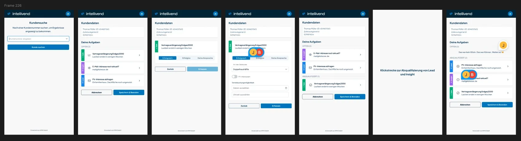
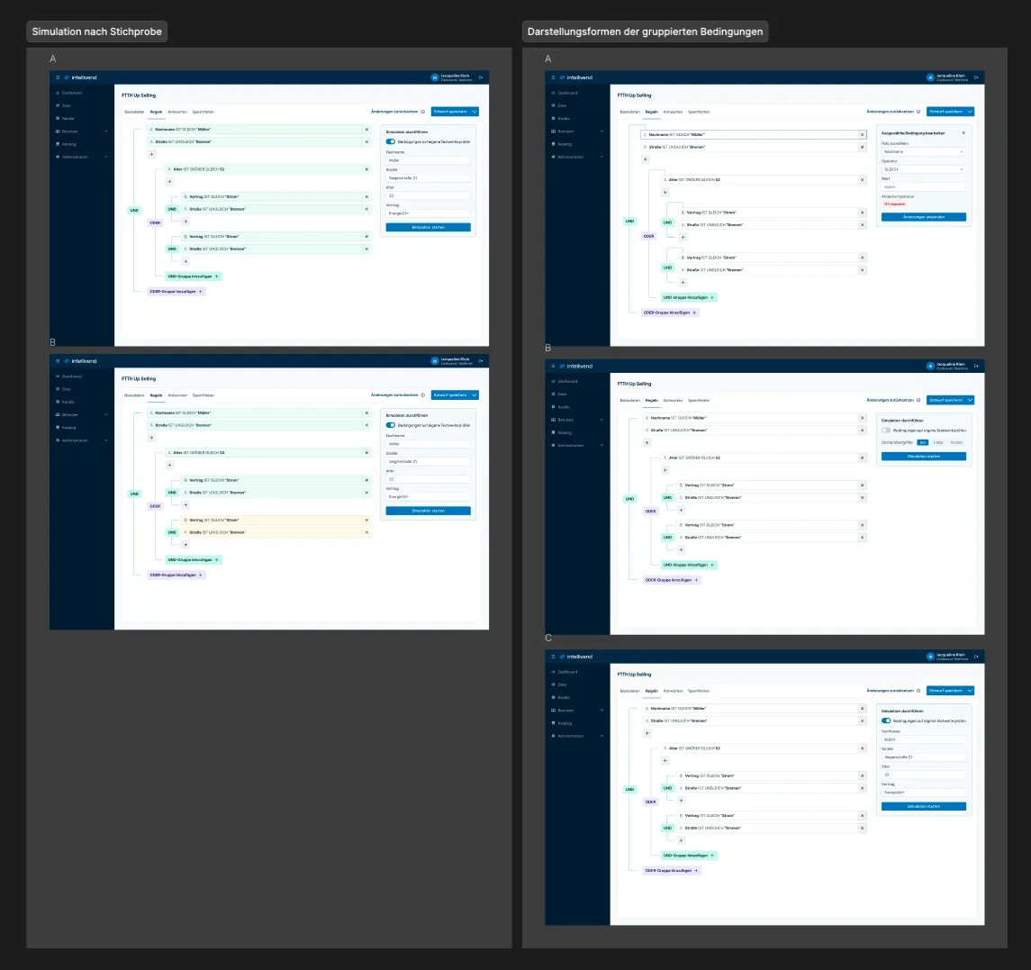
Besides the sidebar for agents, intellivend also includes a cockpit for sales managers, used to manage goals, catalogs, users, and roles, among other things. What I'm showing here is a deliberate selection, not the complete documentation of my work on it. For the click-throughs in the cockpit, I first built my prototypes in Figma. For more complex cases, I additionally arranged the click-through in a grid, horizontally for the different use cases and vertically underneath for the individual steps or actions within a flow. The following screenshot shows an example from an area where sales managers define complex rules for how agents should approach customers.
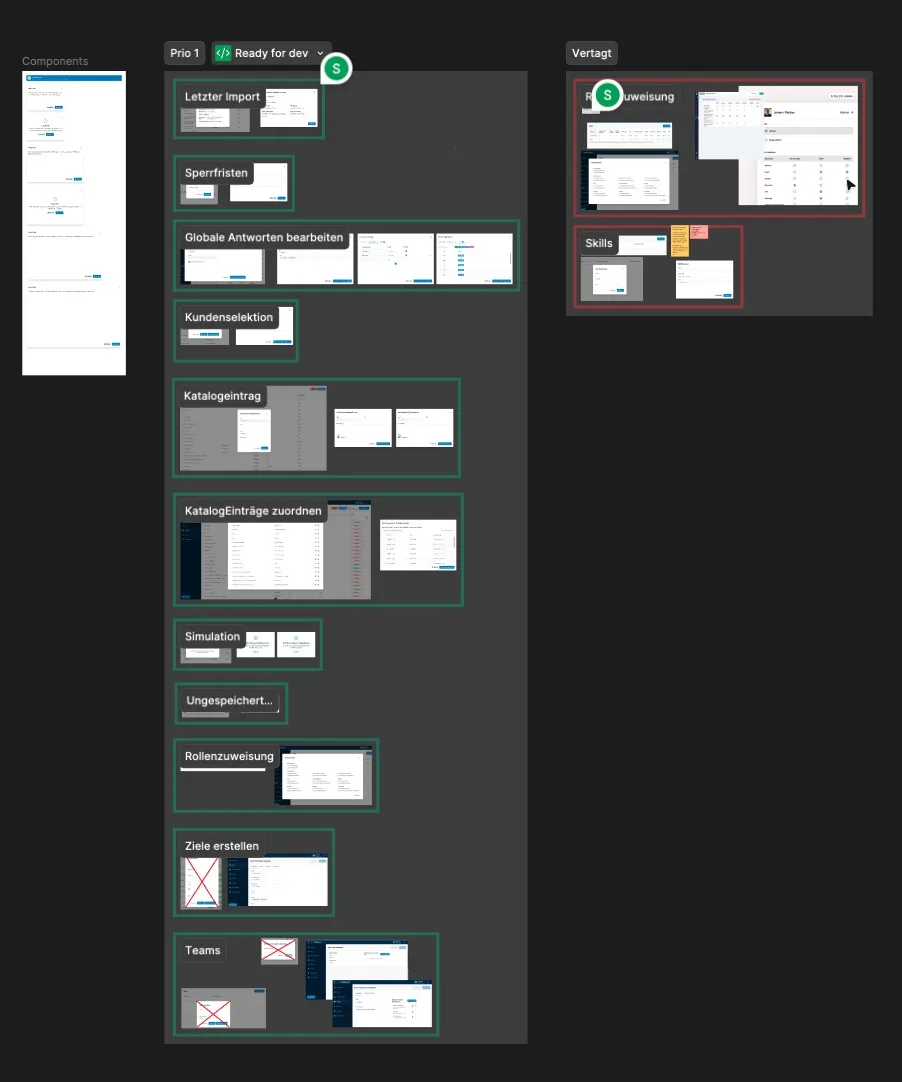
One of my favorite tasks is the interface inventory, where an application is systematically searched for its components, which are then documented. I had already used this approach on blueplant to find UI inconsistencies. For intellivend, I used it to specifically capture every modal used in the product. For each one, I asked myself whether a modal made sense at that point at all, or whether another solution, such as a dedicated detail page, would fit better, and used that to decide which modals needed reworking, which should be dropped, and which could wait.
I can generally recommend an interface inventory to anyone who wants to make an application more consistent or specifically find inconsistencies. Putting together the screenshots yourself gives a very direct visual overview of what actually exists, compared with a plain list of components or URLs. Today, though, this step can be automated much faster with AI tools like Claude Code, which can search an application for components on their own.
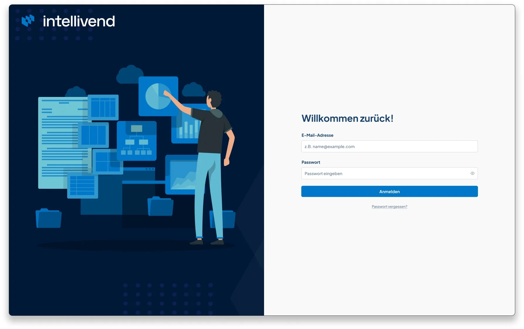
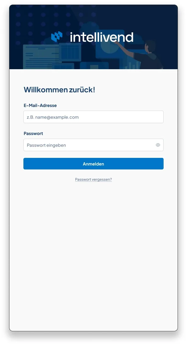
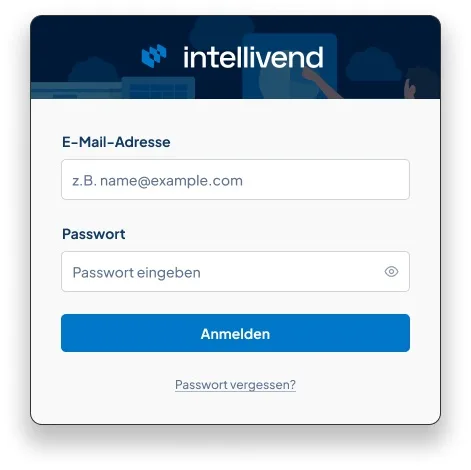
Depending on the context, I also consider responsive use cases in my designs, as with intellivend's login screen. I designed it for multiple responsive resolutions, from the full-format display on ultra-wide and full-HD monitors down to a very small login widget. The comparison shows a few notable decisions:
- No additional required-field markers, to avoid overloading the login screen unnecessarily. That email address and password need to be filled in is clear either way
- "Forgot password?" placed small and below the "Log in" button, rather than right next to the password label, to match the more common mental model of a login screen and avoid diluting the primary action
- No "stay logged in" feature, to avoid unnecessary effort for now. It only becomes worthwhile once users stay in the application long enough that an automatic logout would disrupt the workflow
- A compact login widget as the smallest resolution, so intellivend can be embedded into another system even with very little available space, such as a CRM system
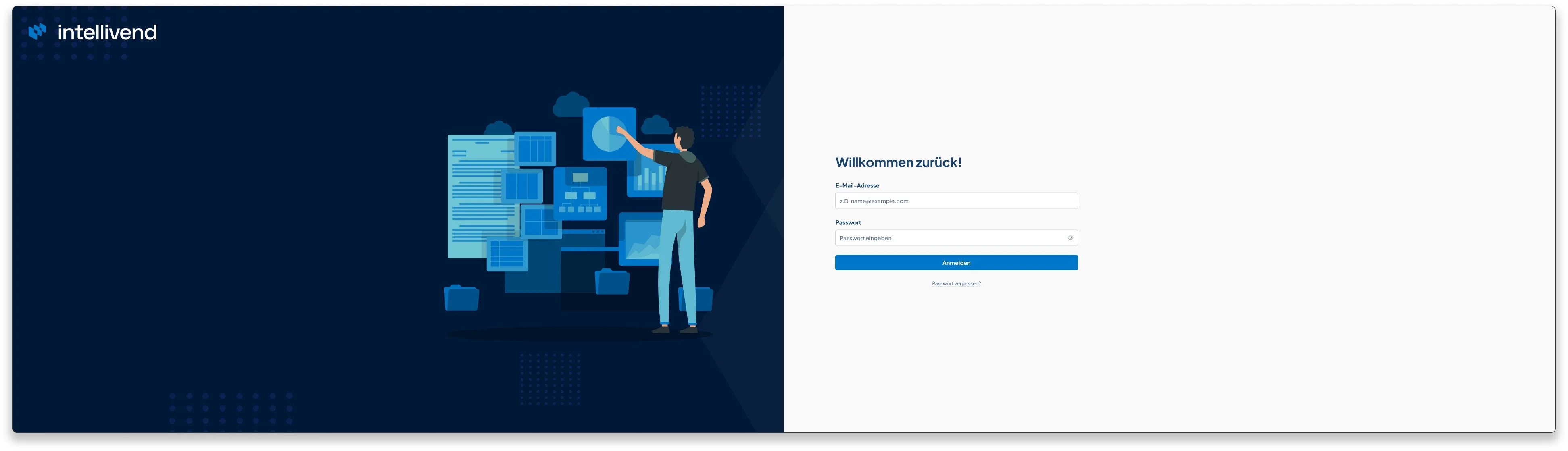
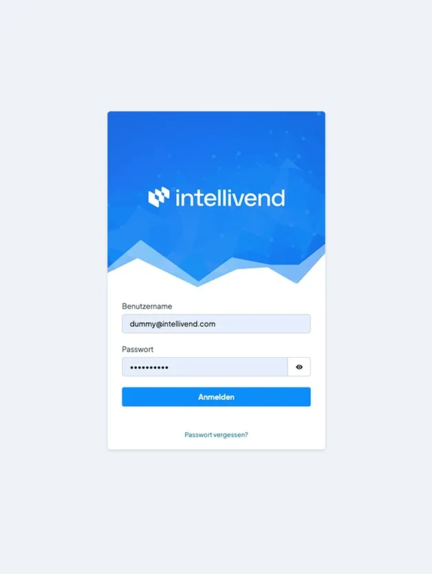
For the very first login screen draft, I chose a visual language of converging spikes and dots, loosely inspired by connected neurons, to hint at the intelligence behind intellivend's recommendations. We later switched the originally very bright, bold blue to a darker blue, partly for accessibility reasons, for more contrast between text and background. I've since moved away from the dynamic, spiky visual language, since it didn't fit intellivend's rounded logo mark.
Redesigning goal prioritization
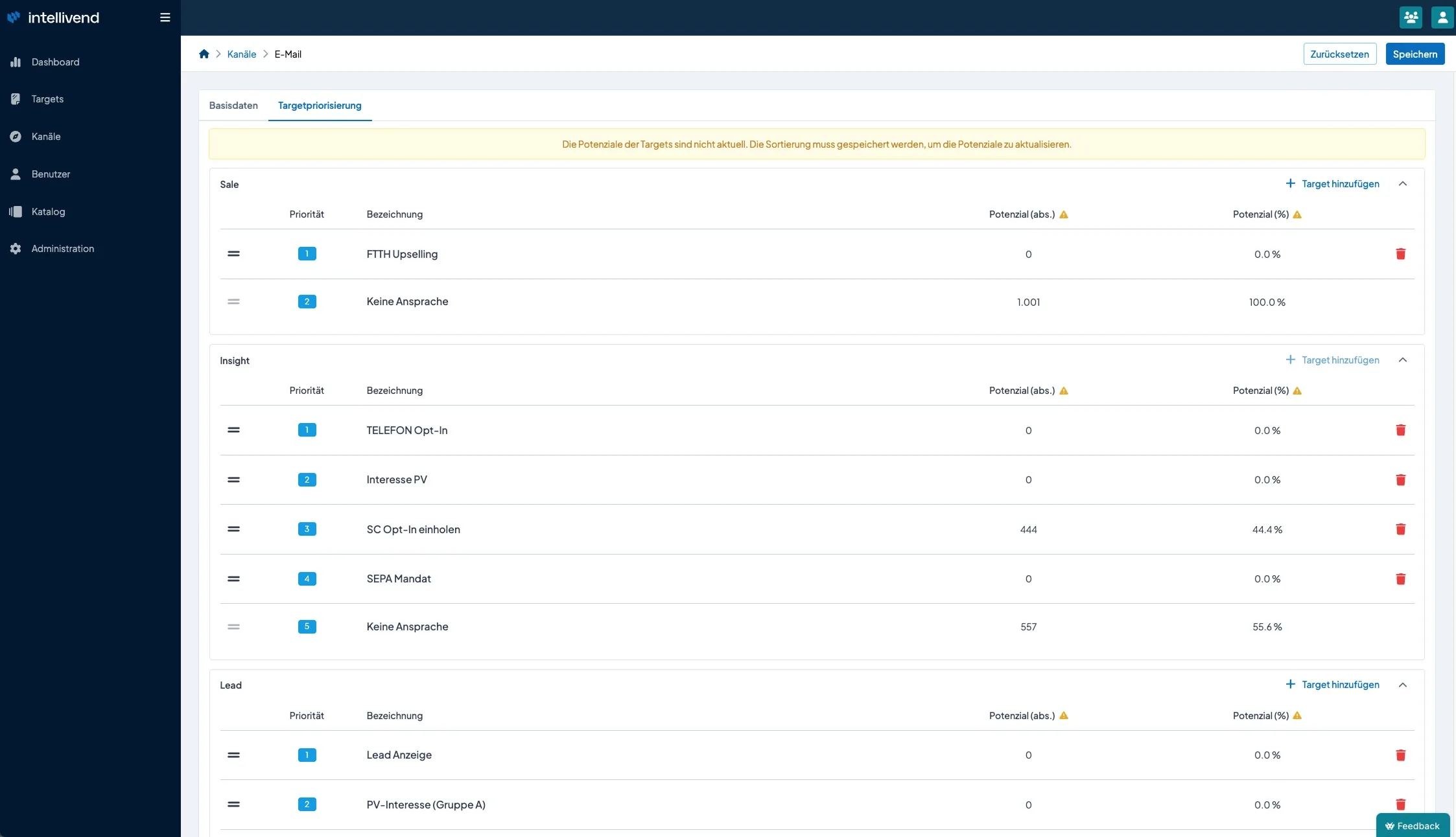
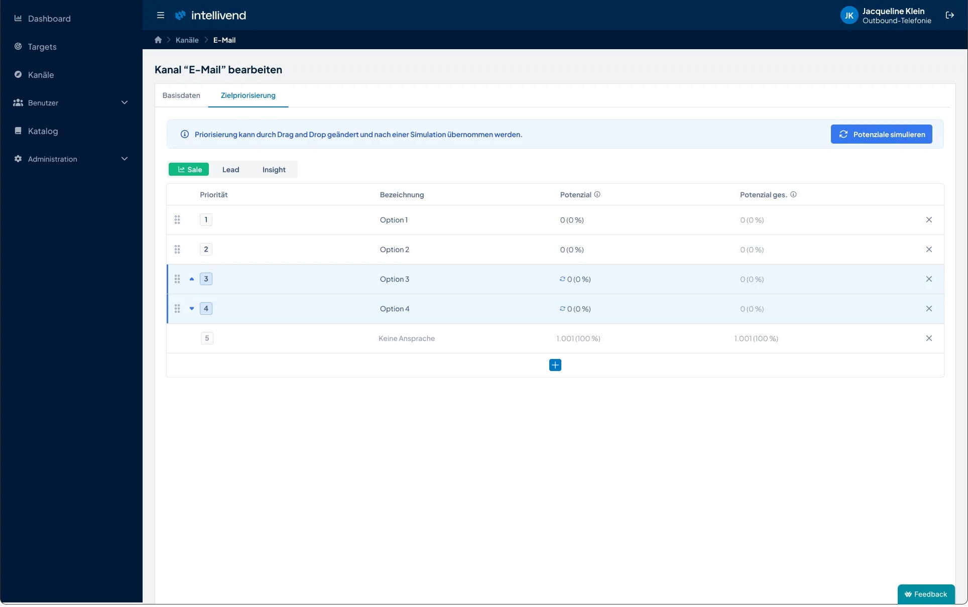
One example of my work as part of intellivend's ongoing feature optimization is goal prioritization. Sales managers can create and prioritize their own goals, which determine which sales task gets suggested to agents next. A simulation lets them check in advance how many customer records a prioritization would affect and how often agents would likely address a given goal, before the setting actually takes effect.
When redesigning this view, my goal wasn't to reinvent everything, but to deliberately improve the existing solution in several places. The comparison shows a few notable improvements:
- A six-dot handle instead of lines for the drag-and-drop of priority, to match users' mental model for this function and make the interaction clearer
- A subtle X instead of an eye-catching red trash icon to remove a goal, since a goal is only actually removed once saved, and the red trash icon drew more visual attention than the action deserved at that point
- Even column spacing, so the eye has to jump between columns less while scanning the table
- The row's color and icon change immediately when a goal's priority changes
- A neutral info icon instead of a colorful warning triangle, since these hints are purely informational, not errors or warnings
- A prominent plus button instead of a separate text button, placed exactly where a new goal is actually inserted, removing a layout redundancy
- New filtering as a button group, letting the categories that were previously stacked be called up individually in their own views, reducing scrolling and cognitive load while editing
- A persistently visible simulation hint, shown whenever a simulation is possible or hasn't been run yet, so it's clear before saving that a prioritization first needs to be simulated
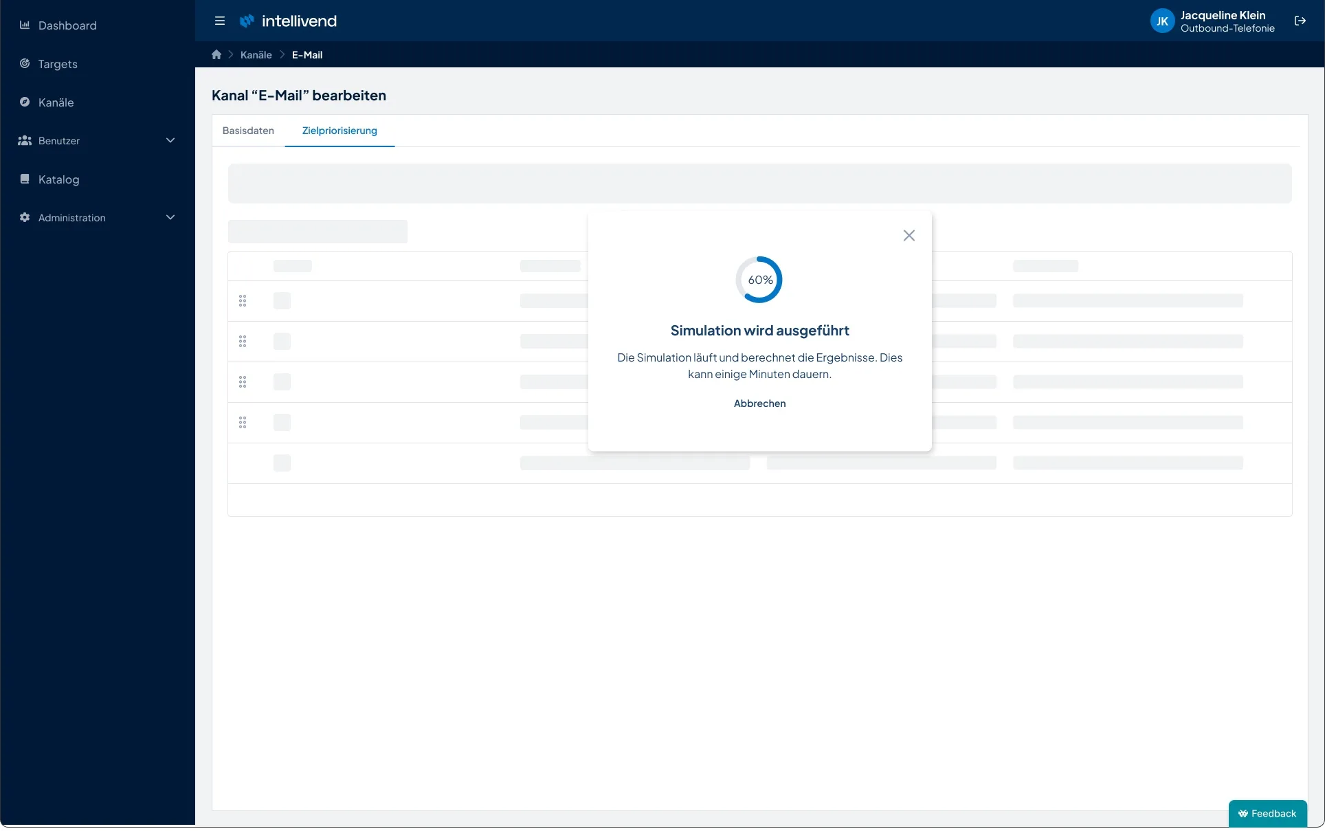
- A progress bar and animated skeletons during the simulation, so users stay continuously informed about the system's status while waiting
Onboarding email templates
For intellivend's onboarding process, I also designed the transactional email templates, including the welcome email sent when a new user account is created and the password reset email.
I made the following design decisions:
- Illustrations matched to each email's context, to quickly convey what it's about: two people helping each other up a slope for the welcome email, symbolizing that intellivend helps sales managers lift their success, and a lock with a password form for the password reset email
- The login button automatically appends the credentials to the URL, so nothing needs to be typed manually to log in
- The credentials shown in the email itself are purely for documentation, for instance in case someone wants to change their password later
- The password reset link is valid for only 60 minutes, for security reasons
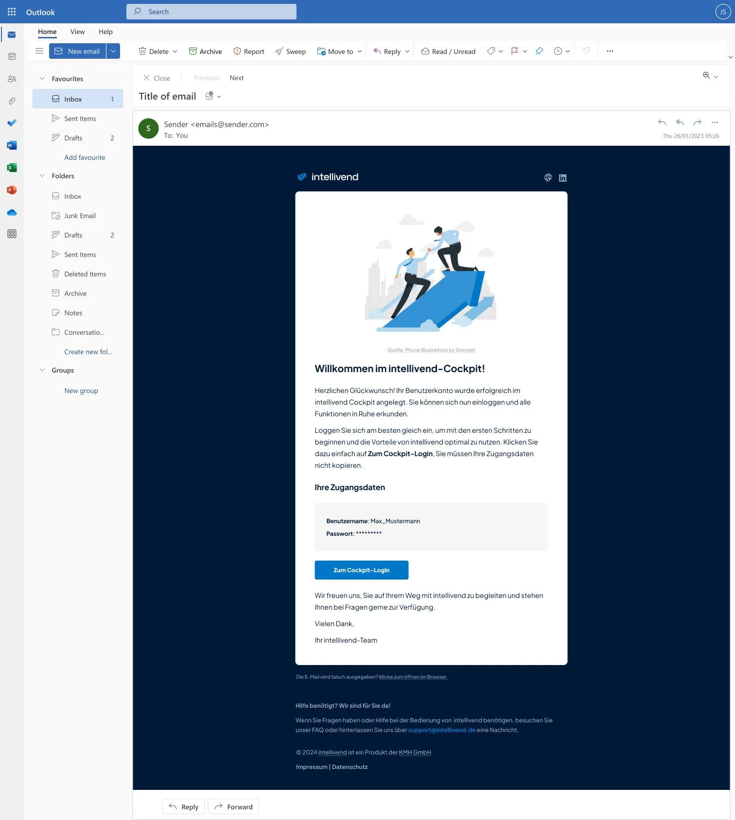
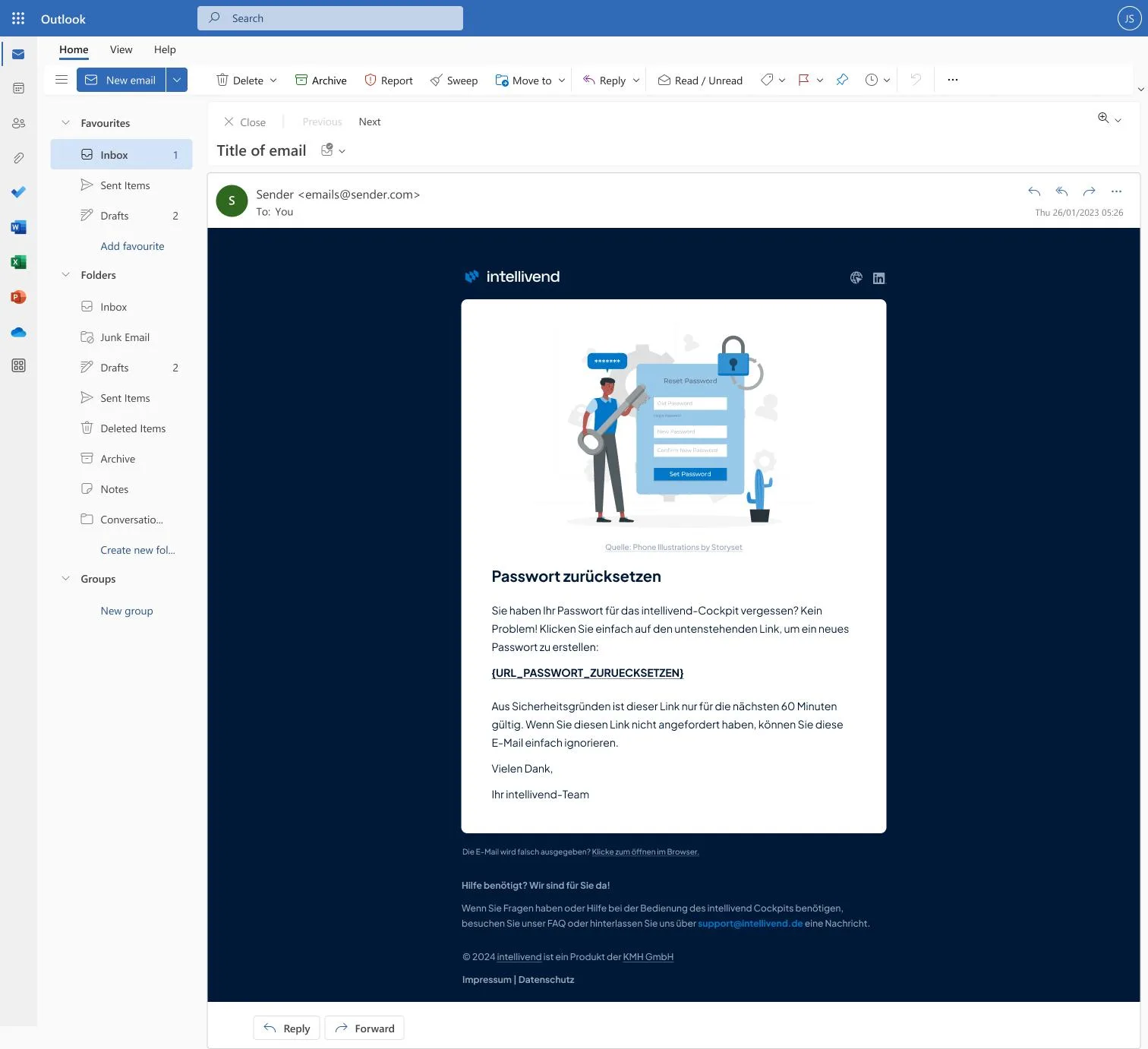
I designed the mockups in Figma, using an Outlook email template from the Figma Community as a base, along with illustrations from Storyset.
Yearly goals and looking back on intellivend
This year, the team set several yearly goals aimed at anchoring UX more firmly as a discipline and making our way of working more data-driven.
Strengthening UX visibility: Since I only advised on most of our other products in 2026, the team felt it was important to build understanding of UX beyond our own team across the company. To that end, I ran workshops introducing the human-centered design process, with one hour set aside for the basics each time. To see whether the content landed, I ran a short interactive survey before and after each workshop, where participants rated their understanding on a scale from 1 to 10. This quantitative data was meant to help me compare results over time as the number of workshops grew.
Establishing design principles: So that design decisions across the team would rest on jointly defined, usage-based principles rather than individual opinions, I ran three workshops on design principles, company-wide for our main products. It mattered to me to convey that design principles, like personas, aren't a one-time result but need to be reviewed and iterated on regularly. Target audiences and usage change over time, and principles set once can otherwise quickly stop applying or even work against you.
Introducing usage metrics: To base decisions more strongly on actual usage data going forward, introducing usage metrics was another yearly goal, especially for intellivend as our own product. Google Analytics and Microsoft Clarity were also on the table, but we chose PostHog, for its data-protection compliance and the ability to tag buttons with events and use further UX methods like session recordings or A/B tests, which the other tools didn't offer to the same extent. Curious about it, I familiarized myself with PostHog privately even before the rollout and integrated it directly into my own portfolio and projects. The first insights from that were eye-opening.
Expanding user research: To shorten communication paths through more context and better justify design decisions, I ran more user research for intellivend this year. Contextual observations, usability tests, and guided interviews with agents about our designs all helped with that. What stood out most was how important distraction-free, quickly operable design is when agents are advising customers over the phone in just a few minutes, where every second counts.
Looking back, intellivend is the product that pushed me furthest from pure UI work toward a user-centered way of working, detours included. That development, from the very first login draft to today's sidebar, is what shows me most clearly how much I've learned over the past two years.