Email and landing page redesign for a northern German energy provider's online offers
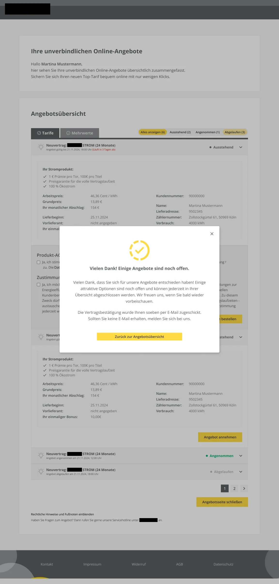
Redesign of the email templates and the associated landing page through which a northern German energy provider's customers can view and bindingly accept their contract offers online, as part of a client project for KMH GmbH.
This project was covered by a non-disclosure agreement (NDA). The energy provider's name has therefore been anonymized throughout, and all screenshots have redacted anything that could reveal which company it is.
Binding offers only by email, not by phone
To understand why this process exists in the first place, it helps to look at the legal background: under the so-called confirmation solution (§ 7a UWG), contracts initiated by phone as part of telephone marketing in the energy sector only become valid once they're additionally confirmed in text form. An offer discussed on the phone alone isn't enough, it also has to be sent to customers in writing by email, so they can review it and then bindingly accept it online.
That's exactly where this project comes in: the energy provider's customers receive their individual offers by email and can then view and bindingly order each one through a dedicated landing page.
For this client project, I designed the email templates for this process shortly after joining KMH. Over the years, the energy provider had built up its own design system, which led to the request to reflect that in our email and landing page design as well. For this adaptation, I was asked to create the mockups that would go to our development team for implementation.
Email template for the offer
At the start, I used Loveable in an exploratory way to get ideas. That often helps me just as much by showing what clearly doesn't work, so I know what to do better, or to arrive at solutions I wouldn't have immediately thought of myself. A first AI draft, though, is usually not directly usable without a designer's eye, and the AI also doesn't reliably stick to the style guide it was given.
Cards were given a border radius, for instance, even though that wasn't explicitly requested, and colors weren't taken over as intended. The hierarchy isn't consistently clear, the overall impression is very colorful and overloaded with many different font sizes and capitalizations, so the actually relevant information doesn't immediately catch the eye. The information itself also isn't always placed where you'd expect it, some places are missing buttons that are present and useful in the original, while elsewhere icons were added without real added value. My own implementation, by contrast, consistently follows the energy provider's design system: a clear hierarchy and a color scheme that clearly separates individual sections, so it's obvious at a glance that this is several separate offers rather than one connected block, rounded off with a classic CTA to the landing page.
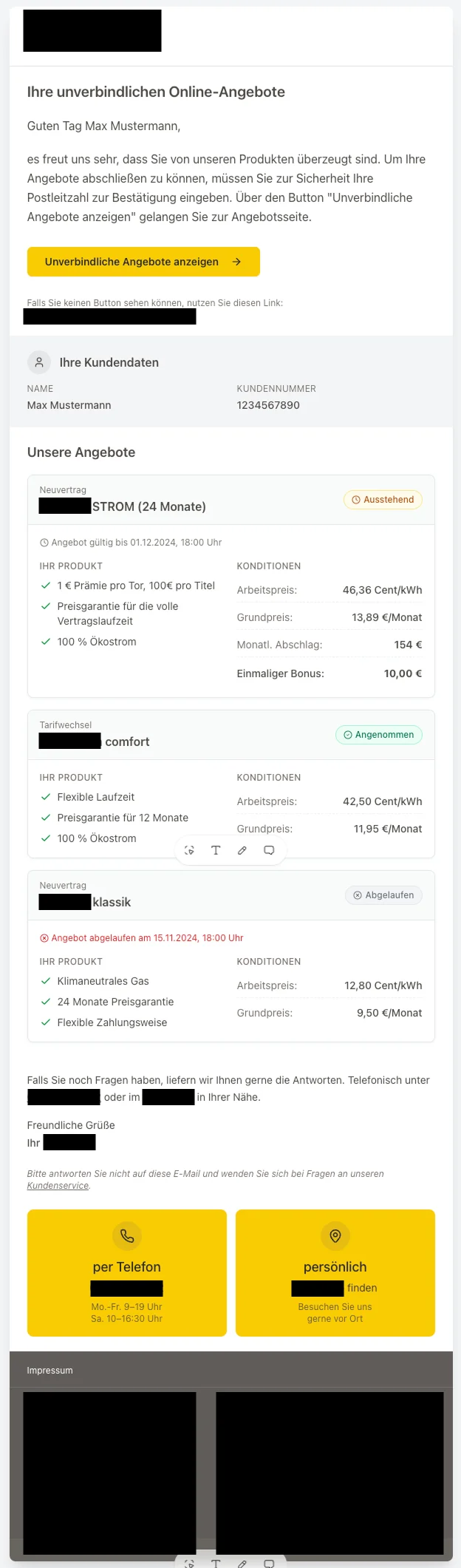
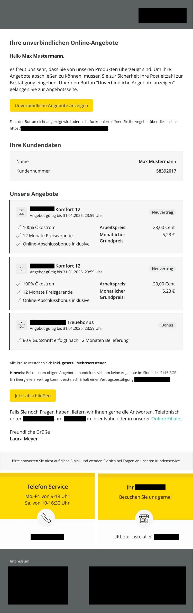
The AI-generated proposal for the same requirement on the left, the final email template I implemented within the energy provider's design system on the right.
Reminder email before the offer expires
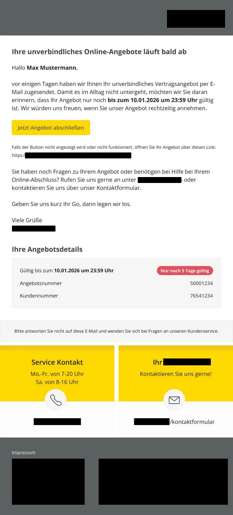
In addition to the original offer email, I designed a reminder email that's automatically sent to customers shortly before their offer expires, so they can still accept it in time. What I particularly liked was the idea of using a red banner to directly show how many days the offer is still valid, conveying urgency without detours: it's expiring soon, but there's still time to act. The email deliberately shows only the information needed for that, and besides the button also offers an alternative link in case it isn't clickable in the given email client, which happens fairly often in practice. Otherwise, it follows the same style as the original offer email.
Landing page with the offer overview
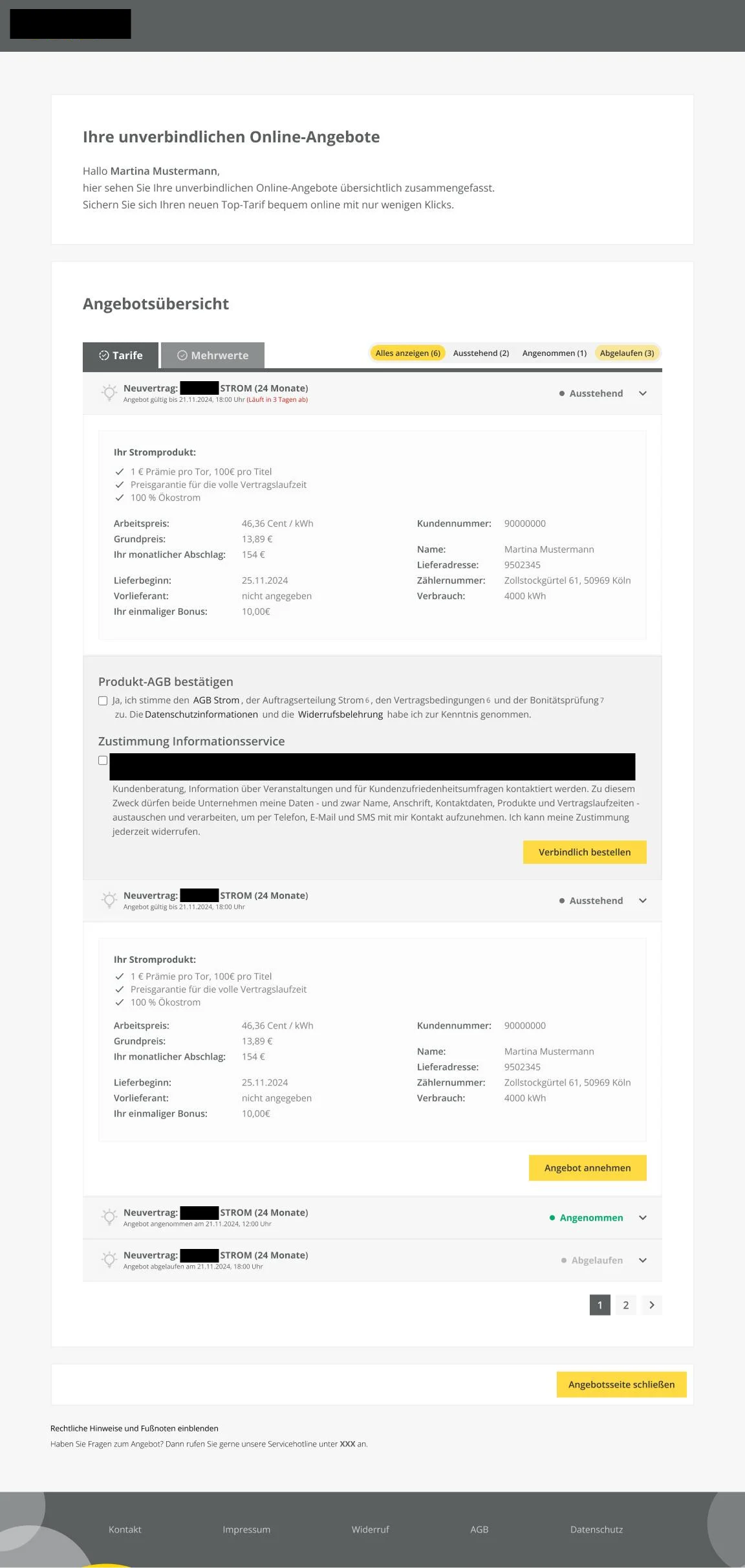
The button in the email takes customers to a landing page within the energy provider's design system, where all sent offers are shown in an overview. Filtering by pending, accepted, and expired offers keeps the current status quickly graspable. Besides classic tariffs, this also shows so-called added values, extra bonus benefits that can result from combining several tariffs. Via "Accept offer," customers first open the detail information for a single offer; only from there can they actually complete it via "Order bindingly."
I went with an accordion view. Looking back, I'd solve some details differently today, such as making the values bold and keeping the corresponding labels more subdued, so the actually relevant information stands out even more, and having the icon in front of each offer change depending on the product, for example between electricity and gas.
Success message after completion
As an alternative, I first worked out a modal that opens directly on the offer overview: it thanks the customer for completing an offer, but also points out any offers still open, instead of immediately taking customers away from the overview. Once all available offers have actually been accepted and nothing is left open, customers instead land on a dedicated success page confirming completion. The contract confirmation is additionally sent to them by email.
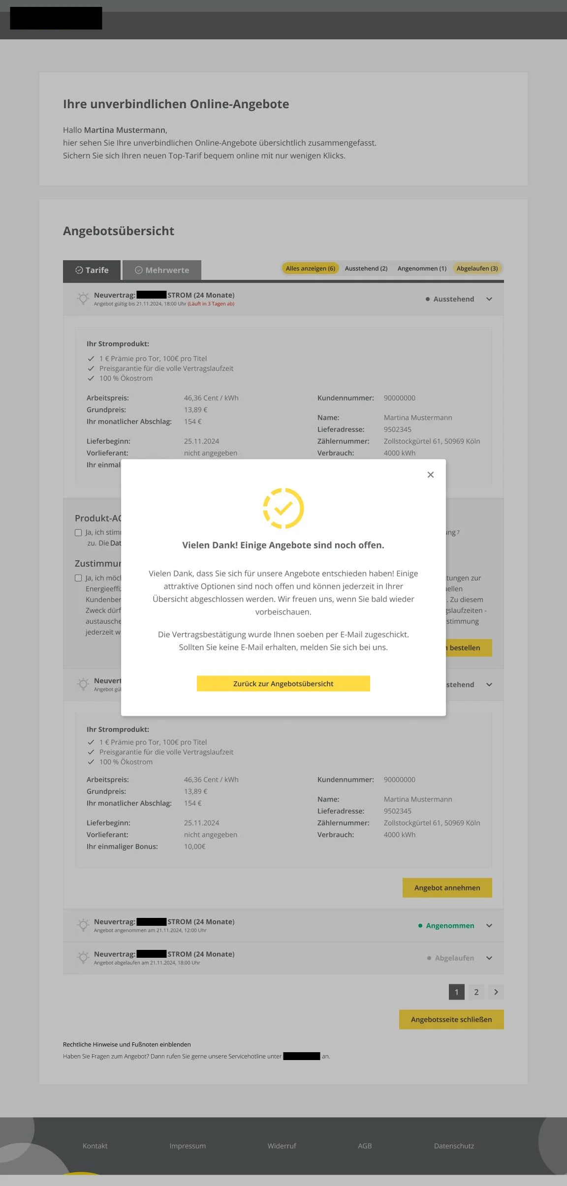
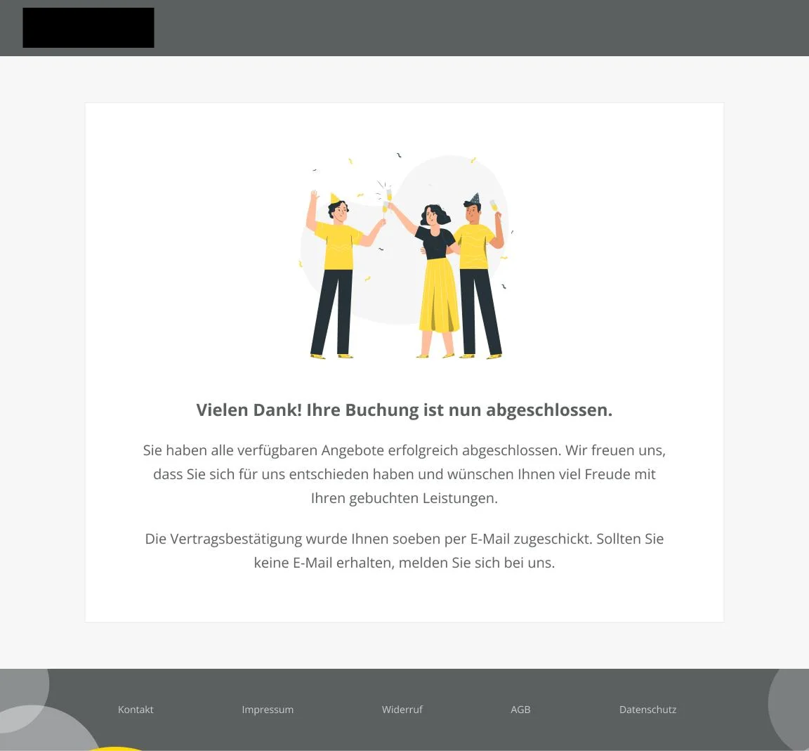
The modal pointing out remaining open offers on the left, the dedicated success page after completing all offers on the right.
Responsive layout for mobile devices
Since many customers open their offers on their smartphone, I also designed the overview responsively for mobile devices. Information is stacked here, and individual offers are collapsed into accordions, so all relevant data still stays easy to grasp at a glance. In this variant, I highlighted the status with color in the title to save space. Looking back, I'd design this differently today, since it's not accessible: people with color blindness or low vision can't reliably distinguish the status by color alone, so it would have been better to also use icons or patterns.

Looking back with some distance
With some distance, there are a few things I'd design differently today. The accessibility of the status labeling is one example, but also the question of how I'd label status at all, or whether I should distinguish primary and secondary buttons more clearly. "Close offer page," for instance, is more of a secondary action than a primary one, which is why I wouldn't emphasize it as strongly in hindsight.
I also later wondered whether it would have made more sense to only allow one open accordion at a time on the offer overview, so customers only ever see what they actually need right now. That would have had the downside that several offers could no longer be compared as easily, and my hypothesis is that customers need exactly that to make a good decision. Without prior usability testing or user research, though, I'd hold off on a change for now, since that's exactly where the next step would come in, to answer that question.
The combination of yellow and gray works well to deliberately draw attention through strong contrast and bright, luminous colors. If you liked this reference and need something similar, feel free to reach out.